Graphs and matched pairs results
Exercise 7.3.5.
Statistics for Ecologists (Edition 2) Exercise 7.3.5
these notes accompany Chapter 7 and are about using graphs to display matched pairs data (as in the Wilcoxon matched pairs analysis).
Using graphs to visualise matched pairs results
Introduction
Usually you’ll use a bar chart or box-whisker plot to display data when looking at differences between samples. When you have a matched pairs situation however, these sorts of graph may not always be the best way to summarize your data/results.
An alternative is to use a scatter plot, where you plot one sample against the other. If you add an isocline (a straight line with slope 1 and intercept 0) you can see more clearly how the pairs of observations match up with one another.
These notes show you how to prepare such a scatter plot.
Make a scatter plot
When you have matched pair data you obviously have matched pairs. These data could be plotted as a scatter graph with one sample against the other. You can do this easily in Excel or in R.
Scatter plot in Excel
In Excel you can simply select the two samples and then click the Insert > Scatter button. The chart really comes into its own if you add an isocline (a line of parity). To do this you need to add a straight line with a slope of 1 and an intercept of 0. To add an isocline, you need two values:
- The maximum data value (across the combined dataset).
- A minimum value – set this to 0 if your axes start from 0 or set the value to whatever the lowest axis value is.
To add the isocline, you:
- Click the chart to activate the Chart Tools
- Click the Design > Select Data
- Click the button to Add a Legend data series.
- Select the values (there are two) in the x-values section.
- Select the same values again in the y-values section.
- Click OK.
- Now format the data series: turn off the points but add a joining line, this is the isocline.
Once you’ve formatted the chart and tidied up a bit you’ll have a scatter plot and isocline.

Scatter plot in R
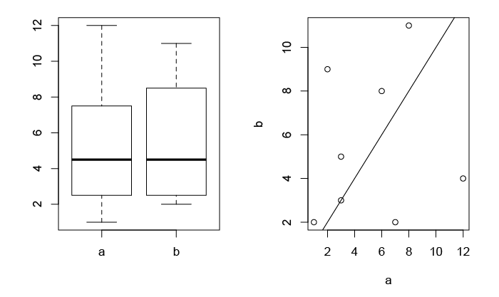
In R you can use the plot() command to chart one sample against the other. The isocline can be added using the abline() command, set a = 0, b = 1 to get an intercept of 0 and a slope of 1.
a;b
[1]  8  6 12  2  3  3  1  7
[1] 11  8  4  9  3  5  2  2

plot(a,b)
abline(a = 0, b = 1)
This produces a simple scatter with an isocline.
There are many additional graphical parameters you can add to these basic commands, to alter the plotting character, colours and the style of the isocline for example.
Compare to a boxplot
The scatter plot shows your matched pairs data in a different way to a box-whisker plot or a bar chart. The isocline is the key to the plot. The further from the isocline the points are the more “different” the pairs of data are. If all the point lay on the line, then there would be no difference between the pairs. If all the points were to one side, then one sample would be different from the other. The further from the line, the more different.
Sometimes a basic bar or boxplot is all you need, at other times you may decide that the scatter plot and isocline is the way to go.

Show the IQR
With a little bit of tinkering you can show the averages and variability for your matched pairs data right on the scatter plot.
What you need to do is to plot an additional point with co-ordinates that take the average for one sample vs. the average for the other. Then add error bars to the vertical and horizontal.
In Excel the error bars are calculated as an amount, so you need to determine the “deflection” from the average.
In R you add error bars by drawing on the plot so you need the co-ordinates of the extremes of the variability.

For example, if you wanted to show median and inter-quartile range in Excel you’d need to work out how far “above” the median the upper quartile was, and how far “below” the median the lower quartile was. In R you simply calculate the quartiles and use the appropriate values to draw the error bars.
With a bit of tinkering you can get a plot something like this (in Excel):
It is easy to get Excel error bars: click the chart then the Design menu and the Add Chart Element button. Choose the More Error Bars Options and then select the values for the vertical bars.
You should also see horizontal error bars appear in the chart, click them to activate the Horizontal Error Bars options. If you don’t see the horizontal erorr bars, try the Chart Tools > Format menu and select the error bars from the drop-down menu on the left in the Current Selection section.
In R you can use the lines() or arrows() command to draw the error bars in place, once you have the appropriate values, such as from the quantile() command.
Comments are closed.