
Spine plots using R
Spine Plots using R
A spine plot is similar to a mosaic plot and stacked bar chart. Use spineplot() function to draw spine plots using R. There are quite a number of potential arguments you can use:
spineplot(x, y = NULL,
          breaks = NULL, tol.ylab = 0.05, off = NULL,
          ylevels = NULL, col = NULL,
          main = "", xlab = NULL, ylab = NULL,
          xaxlabels = NULL, yaxlabels = NULL,
          xlim = NULL, ylim = c(0, 1), axes = TRUE, ...)
The major parameters are:
| Parameter | Result |
|---|---|
x |
data (x,y) or formula y~x |
breaks |
passed to hist() |
off |
space between bars |
ylevels |
order of levels in x |
col |
colors |
xaxlabels |
labels for x-axis |
Your data might be in one of two forms, which affects the kind of plot you get:
category ~ categoryresults in a spine plot (like a 100% stacked bar chart).factor ~ numericresults in a spinogram (like a histogram).
Spine plots
If your data are category ~ category your spineplot results in a kind of stacked bar chart.
Look at the VADeaths dataset (a matrix) as an example:
VADeaths
      Rural Male Rural Female Urban Male Urban Female
50-54       11.7          8.7       15.4          8.4
55-59       18.1         11.7       24.3         13.6
60-64       26.9         20.3       37.0         19.3
65-69       41.0         30.9       54.6         35.1
70-74       66.0         54.3       71.1         50.0
spineplot(VADeaths)
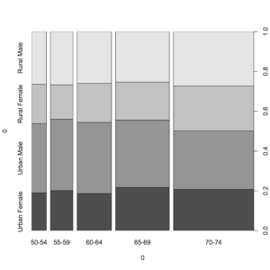
A simple spine plot from a categorical matrix
You can tinker with the graphical parameters to make the chart look “nicer”:
# Custom colours, bar space, and axis labels
spineplot(VADeaths, col = terrain.colors(4),
          off = 5,
          xlab = "Age Class",
          ylab = "Category")
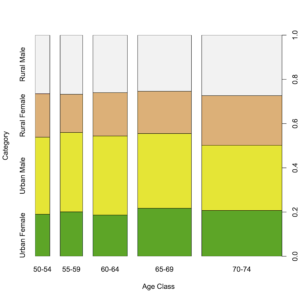
Graphical parameters used to prettify a spine plot
It is hard to resize name labels, as cex, las and so on do not work! The solution is to set these parameters globally using par() and reset them after drawing your plot.
In the following example custom names are also used to help “fit” labels in the plot:
opar <- par(cex.axis = 0.6, las = 2)
spineplot(USPersonalExpenditure,
          xlab = "", ylab = "",
          xaxlabels = c("FT", "HO", "MH", "PC", "PE"))
par(opar)
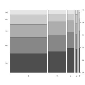
Axis labels are set using par() before drawing a spineplot
Multi-dimensional tables
The spineplot() function can only deal with 2-dimensional objects. If you have a multi-dimensional table you need to collapse the table to 2D.
spineplot(HairEyeColor)
Error in spineplot.default(HairEyeColor) :
  a 2-way table has to be specified
x <- margin.table(HairEyeColor, margin = c(1,2))
x
       Eye
Hair    Brown Blue Hazel Green
  Black    68   20    15     5
  Brown   119   84    54    29
  Red      26   17    14    14
  Blond     7   94    10    16
spineplot(x, col = c("brown", "blue", "tan", "green"))
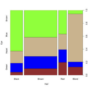
A multi-dimensional table needs to be collapsed to 2D for plotting
Spinograms
A spinogram is a spineplot where the data is in the form factor ~ numeric. A spinogram is analogous to a histogram.
spineplot(tension ~ breaks, data = warpbreaks)
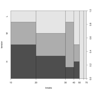
A spinogram is a form of histogram
If you have numeric data you can use factor() to convert the data:
# Use factor(x) to "convert" numeric
spineplot(factor(Month) ~ Ozone,
          data = airquality,
          col = heat.colors(5))
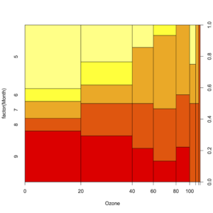
A spinogram where numeric data are converted to a factor before plotting
caption: : A spinogram where numeric data are converted to a factor before plotting
Use the breaks argument as you would for hist() to change the breakpoints (you can enter a single integer or a numeric vector).
spineplot(feed ~ weight, data = chickwts, breaks = 4)
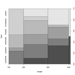
Using the breaks argument to alter the breakpoints in a spinogram
It can be tricky to read a spinogram and it is not trivial to add a legend for the colors. See Tips and Tricks article about legends here.
- This article is partly in support of my book An Introduction to R see the publications page for more information.
- An Introduction to R will be published by Pelagic Publishing. See all my books at Pelagic Publishing.
- For more articles visit the Tips and Tricks page and look for the various categories or use the search box.
- Visit our other site at GardenersOwn for a more ecological matters.
This article is partly in support of my book An Introduction to R see the publications page for more information.
Comments are closed.