Comparing diversity

Exercise 12.1.4.

Statistics for Ecologists (Edition 2) Exercise 12.1.4

This exercise is concerned with comparing diversity (Section 12.1.4) and in particular how to carry out a modified version of the t-test designed to compare the Shannon diversity index of two samples.

Comparing the Shannon diversity index of two samples using Hutcheson t-test

Introduction

When you have two samples of community data you can calculate a diversity index for each one. The Shannon diversity index is a commonly used measure of diversity. However, you cannot compare the two index values using classic hypothesis tests because you do not have replicated data.

The Hutcheson t-test is a modified version of the classic t-test that provides a way to compare two samples. The key is the formula that determines the variance of the Shannon index. These notes will show you how to conduct the Hutcheson t-test and so get a statistical significance of the difference in Shannon diversity between two samples. There is also a spreadsheet calculator, that you can download and use for your own data.

The Hutcheson t-test

The Hutcheson t-test was developed as a method to compare the diversity of two community samples using the Shannon diversity index (Hutcheson 1970, J. Theor. Biol. 29 p.151). The basic formula is similar in appearance to the classic t-test formula.

Formula for the Hutcheson t-test.

In the formula H represents the Shannon diversity index for each of the two samples (subscripted a and b). The bottom of the formula refers to the variance of each of the samples.

Computing variance for the Shannon diversity index

Computing the variance of the Shannon diversity is done using the formula shown below.

Formula to calculate variance in Shannon diversity. S is the species richness; N is the total number of individuals.

In the formula S is the total number of species, whilst N is the total abundance. The p is the proportion that each species makes towards the total. The formula is fairly easy to evaluate; it looks fairly horrid but the components are easily computed.

Getting a t-value

It is easiest to use a spreadsheet for the calculations. The computations are relatively straightforward. You can use the example spreadsheet Shannon diversity t-test calculator.xlsx rather than make your own! Here is an example of how the calculations appear in the spreadsheet.

Example of calculations in Shannon diversity t-test spreadsheet.

Site Name: E1
Taxon Count P Ln(P) P*Ln(P) P*Ln(P)2
388 0.543 -0.611 -0.332 0.203
1 0.001 -6.572 -0.009 0.060
2 0.003 -5.879 -0.016 0.097
13 0.018 -4.007 -0.073 0.292
3 0.004 -5.474 -0.023 0.126
1 0.001 -6.572 -0.009 0.060
59 0.083 -2.495 -0.206 0.514
3 0.004 -5.474 -0.023 0.126
2 0.003 -5.879 -0.016 0.097
2 0.003 -5.879 -0.016 0.097
210 0.294 -1.225 -0.360 0.441
4 0.006 -5.186 -0.029 0.150
3 0.004 -5.474 -0.023 0.126
1 0.001 -6.572 -0.009 0.060
1 0.001 -6.572 -0.009 0.060
21 0.029 -3.528 -0.104 0.366
1 0.001 -6.572 -0.009 0.060
0
0
0
Total 715 1 -83.972 -1.267 2.934
Richness 17
SS 2.934
SQ 1.606
H 1.267
S2H 0.002


The species names are not essential but the spreadsheet has room for them. You need the total abundance in order to calculate the proportions. To compute the Shannon diversity, you need the next column, labelled Ln(P), but to assist in the variance calculations it is convenient to calculate two others, which you can see in the table.

Using the spreadsheet for calculations

The spreadsheet Shannon diversity t-test calculator.xlsx will carry out the calculations for you. There are worksheets for two samples. You can enter a site name and your abundance values as well as species names if you like. The spreadsheet is protected (although there is no password) but you can add additional rows to accommodate extra data (row 23 is empty and that’s where you can start adding).

I advise that you don’t remove the worksheet protection, as it is easy to inadvertently change a formula! I’ve designed the spreadsheet so you can add extra rows without needing to remove the protection.

Enter the data for the two samples and the final t-test results will appear in the Results worksheet.

Calculating degrees of freedom

Once you have a value for t you need to determine if it is statistically significant. In order to do that you’ll need to work out the degrees of freedom. This is computed using the following formula.

Formula to calculate the degrees of freedom in the Hutcheson t-test.

In the formula you need the variance for each sample and the total abundance for each sample. The final value is close to the total abundance for the two samples added together.

Assessing statistical significance

Once you have your value for t and you have the appropriate degrees of freedom you can determine if the result is statistically significant. You can use the degrees of freedom to look up a critical value. If your calculated t-value exceeds the critical then your result is significant.

You can use Excel to calculate a critical value using the =TINV function. You need the level of significance (usually 0.05) and the degrees of freedom.

You can also determine the probability directly using the =TDIST function. You need your calculated t-value and the degrees of freedom.

The Shannon diversity t-test calculator.xlsx spreadsheet will display all the t-test results in the Results worksheet. The spreadsheet will also calculate confidence intervals and produce a couple of graphs (which you can edit).

Computing confidence intervals

It is useful to be able to calculate confidence intervals to your results. The confidence intervals allow you to compare multiple samples and to visualize how “different” samples are to one another.

You can compute a reasonable confidence interval using the standard deviation of the Shannon index (that is the square root of the variance) and multiplying by 2. With most communities you will have fairly large degrees of freedom and the critical value (for t) will approach 2 (the critical value for t at infinity is 1.96).

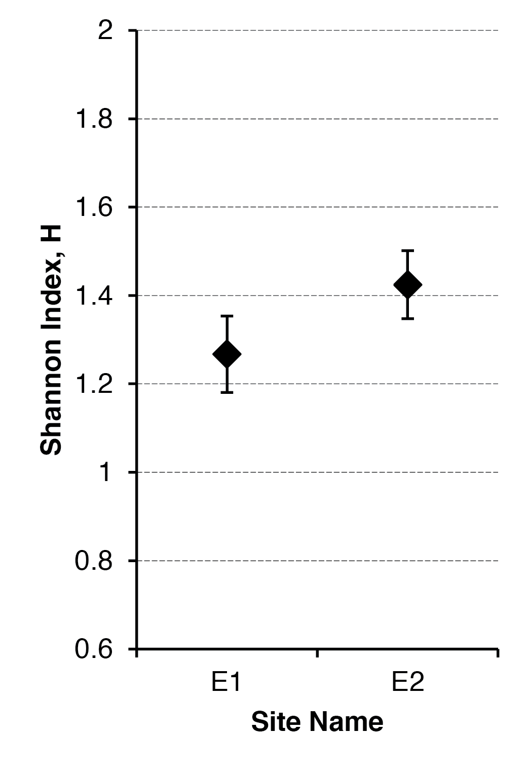
Once you have your confidence interval(s) you can add them to a graph to show the variability and possible overlap between samples. The Shannon diversity t-test calculator.xlsx will produce two charts (a bar chart and a point chart) with error bars based on the confidence intervals. You can edit the charts.

Graphing the results

It is useful to chart your results, the Shannon diversity t-test calculator.xlsx will produce two graphs, which you can edit. The error bars are based on the confidence interval.

Two ways to represent the difference between Shannon diversity. Error bars are 95% confidence intervals.

The bar chart is a “classic” form of graph to show differences between samples. The point chart is a good alternative, as it allows you to see difference between samples more easily, especially if you customize the y-axis scale. The chart shown here would benefit from having the axis run from 1.0 to 1.6 for example.
Abundance-based dissimilarity metrics

Exercise 12.2.2.

Statistics for Ecologists (Edition 2) Exercise 12.2.2

In these notes you’ll see some of the more commonly used measures of dissimilarity used when you have abundance data.

Abundance-based dissimilarity metrics

Introduction

When your community data samples include abundance information (as opposed to simple presence-absence) you have a wider choice of metrics to use in calculating (dis)similarity. When you have presence-absence data you use the number of shared species (J) and the species richness of each sample (A & B). Measures of (dis)similarity obtained are therefore slightly “crude”.

When you have abundance data your measures of (dis)similarity are a bit more “refined” and you have the potential to pick up patterns in the data that you would otherwise not see using presence-absence data.

There are many metrics that you might use to explore (dis)similarity, in this exercise you’ll see four of the more commonly used ones:

  • Bray-Curtis
  • Canberra
  • Manhattan (City Block)
  • Euclidean

The exercise shows you how you can carry out the calculations using Excel (in the book you also see how to do this using R). You can get the sample spreadsheet here: Distance metrics.xlsx.

Notation

When you have presence-absence data you use the species richness of each sample, calling these values A and B. The number of shared species is designated J. When you have abundance data you use a slightly different notation. The abundance of an individual species is given as x. Now you are comparing two samples so you call one i and one j. Subscripts are used to differentiate the abundances between the two samples, so you get xi and xj.

Generally speaking it does not matter which sample is i and which is j.

You’ll also see the ∑ symbol (meaning sum, you add things together) and the vertical bars e.g. |x – y|, which indicate that you ignore any negative sign and simply use the magnitude of the result.

Bray-Curtis

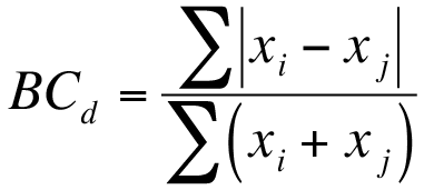
The Bray-Curtis metric uses two components: |xi – xj| and (xi + xj).

In the first case you subtract the abundance of one species in a sample from its counterpart in the other sample but ignore the sign. The second component is the abundance of a species in one sample added to the abundance of its counterpart in the second sample. If a species is absent, then its abundance should be recorded as 0 (zero).

The equation for the Bray-Curtis dissimilarity is shown below:

Bray-Curtis dissimilarity is easy to calculate in Excel but there are no shortcuts to working out the main components, |xi – xj| and (xi + xj).

You might have your data arranged in rows or columns; in the following example the data are in columns.

Species Si Sj |xi – xj| (xi + xj)
Spp1 6 4 2 10
Spp2 5 3 2 8
Spp3 7 4 3 11
Spp4 2 6 4 8
Spp5 3 0 3 3


So, the 4th column is easily calculated by subtracting values in the 3rd column from the 2nd. Use the =ABS function to get the absolute value (i.e. ignore the sign). So for example the 4th data row would be 2 – 6 = -4 but the ABS function ignores the -.

The last column is even easier, as it is the sum of a value in the 2nd column with its counterpart in the 3rd column.

You don’t need to compute the sum of the 4th or 5th columns because your final calculation can do that in one go:

=SUM(column4) / SUM(column5)

You can use the mouse to highlight the values in the columns in place of the column4 and column5 items in the formula (which represent the cell ranges).

If you calculate the Bray-Curtis dissimilarity for these data, you get a result of 0.350.

If your data were arranged in rows the calculations are more or less the same (the spreadsheet shows both methods).

Canberra

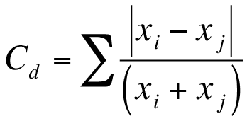
The Canberra dissimilarity uses the same components as Bray-Curtis but the components are summed differently:

In the Canberra metric each |xi – xj| result is divided by the corresponding (xi + xj) value.

In the following example the data are shown in rows but the calculations are more or less the same for data in columns (the spreadsheet shows both).

Calc Spp1 Spp2 Spp3 Spp4 Spp5
Si 6 5 7 2 3
Sj 4 3 4 6 0
|xi – xj| 2 2 3 4 3
(xi + xj) 10 8 11 8 3


This time you need to evaluate each |xi – xj| ÷ (xi + xj) then adding them together.

This means you need to work out 2/10 + 2/8 + 3/11 + 4/8 + 3/3 for the current example. There is no shortcut for this (obviously you will use the cell references) so when you have a lot of species the formula is quite long. You can get around this by making a new row (or column, depending how your data are arranged) for the |xi – xj| ÷ (xi + xj) values. You can then copy/paste the results and then do a final =SUM to get the Canberra distance.
In this case the result works out to be 2.223.

Manhattan (City Block)

The Manhattan (or City Block) dissimilarity uses the |xi – xj| component only.

This is the simplest dissimilarity metric to compute:

Manhattan (City Block) dissimilarity.

You can use the =ABS function to ignore any negative signs (and retain the value only). Then the =SUM funtion can simply total them to give the final result. In this case you get: 2 + 2 + 3 + 4 + 3 = 14.

As you can see, City Block dissimilarity is easy to work out using Excel.

Euclidean

The Euclidean dissimilarity metric uses a different component (xi – xj) from the other metrics.

Here the abundance of a species from one sample is subtracted from its counterpart in the other sample. Instead of ignoring the sign, the result is squared (which gives a positive value):

In this case you can use the =SUMXMY2 function to eliminate any intermediate calculation steps (although you can of course do those intermediate steps if you like).

=SUMXMY2(range1, range2)

What the function does is to take two ranges of cells, it subtracts one value from its counterpart in the other and squares the result, then gives the total. This is exactly what you want to calculate the Euclidean dissimilarity. All you need to do is to use =SUMXMY2 and then SQRT the result. You can of course do this in one formula.

The spreadsheet gives an example of the calculation in action for data in columns and in rows (there is little difference).

If you already had calculated |xi – xj| values, then you can use them. Simply square each one, add the squares together, there is a function to do that =SUMSQ. Then take a square root. You might as well use the =SUMXMY2 function!

In the example here the |xi – xj| values are 2, 2, 3, 4, 3.

Their squares would be 4, 4, 9, 16, 9 giving a total of 42.

The final Euclidean dissimilarity is √42 = 6.481.

Which metric to use?

Good question! There is no definite “correct” metric to use in most cases. As a rule of thumb you should use the metric that gives the best separation of samples. This runs a little counter to the idea in statistics that you decide on the proper test to apply before you begin. However, this is not a statistical “test” but a method of separating samples into meaningful groupings. Your distance values should be visualized using a dendrogram (see this exercise on drawing dendrograms in Excel). You choose the metric that gives the most useful results.

The choice of dissimilarity metrics is something that occasionally sparks low-level holy wars amongst ecologists. Hopefully you will use several and the results will all give broadly the same ecological meaning!

Example data and files

You can get examples from the book from the support pages. There are also some specific examples used for the exercises in addition to those shown in the book. You can also download the spreadsheet file Distance metrics.xlsx, which shows how to carry out the calculations using Excel.

Visualizing similarity

Exercise 12.2.1.

Statistics for Ecologists (Edition 2) Exercise 12.2.1

This exercise is concerned with looking at similarity between ecological communities (Section 12.2). This exercise shows you how to visualize the similarity between several communities using a dendrogram drawn using Excel.

Visualizing similarity. Using Excel to build a (dis)similarity dendrogram

Introduction

When you have two or more ecological communities you can use the presence-absence of species (or abundance information, if you have it) to determine measures of similarity (or the corollary, dissimilarity). In the case of presence-absence data you use the species richness of each sample and the number of shared species to calculate an index of (dis)similarity. Once you have a matrix of (dis)similarity you can visualize the relationship between the community samples using a dendrogram. Think of it as being like a family tree, with communities most similar being “near” one another in the diagram.

You can carry out calculations for (dis)similarity using Excel, although things can get rather tedious when you have more than a few samples. There is no built-in chart type that will create a dendrogram in Excel so you must use other drawing tools. R is able to carry out the calculations and dendrogram rather easily but it is a worthwhile exercise to use Excel as it helps you understand how the (dis)similarity is “converted” to a dendrogram and therefore helps you to understand more clearly what you are looking at.

You can get the sample data here: Dendrogram Exercise.xlsx. There are three worksheets:

  • Raw Data – the raw data as a list of plant species for several sites.
  • Pivot and Similarity – contains a Pivot Table showing the presence-absence of species in each sample as well as the species richness and the Jaccard similarity calculations, with results as a similarity matrix. There is also a dissimilarity matrix (1-Jaccard), which will be used to draw the dendrogram.
  • Dissimilarity – the dissimilarity matrix by itself, you will use this as the basis for the construction of the dendrogram.

Although this exercise focusses on the Jaccard dissimilarity (presence-absence data) the principles apply to any matrix of (dis)similarity.

The raw data

The raw data (Dendrogram Exercise.xlsx) are arranged simply in biological recording layout, with a column for the sample/site name and a column for the species name.

Raw data for the dendrogram exercise.

Site Species
ML1 Achillea millefolium
ML1 Centaurea nigra
ML1 Lathyrus pratensis
ML1 Leucanthemum vulgare
ML1 Lotus corniculatus
ML1 Plantago lanceolata
ML1 Prunella vulgaris
ML1 Ranunculus acris
ML1 Trifolium repens


In this example the data are simply lists of species, that is presence-absence. If you had abundance information this would be in a separate column.

Rearrange data into samples

Using Excel, the Pivot Table tool is an easy way to rearrange your data. In the example spreadsheet the Pivot Table has already been created for you (the Pivot and Similarity worksheet). If you want to have a go for yourself then:

  1. Click once in the block of data, there is no need to highlight/select any data, just click once.
  2. Click the Insert > Pivot Table
  3. Choose to place the Pivot Table in a new worksheet and click OK. This opens the Pivot Table Fields dialogue window/box.
  4. Drag the fields from the list at the top to the appropriate sections at the bottom to create the table.

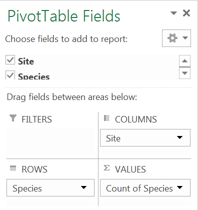
The table in the example requires the fields to be arranged like so:

This will produce a table with a list of species (the Rows) down the left. Each column will be a separate sample/site (the Columns). If you had abundance data you’d use this in the Values section, but you don’t so place the Species field again to get a count (frequency), which essentially places a 1 if the species is present and blank if it is absent.

You can use the Pivot Table Tools menus to help reformat and present the Pivot Table. Column totals give the species richness for each sample.

In the example shown here some of the rows have been hidden so you can see the table structure. The totals for the columns give species richness. The row totals are less useful, essentially you get the frequency of occurrence for each species (so the first species occurs in 50% of the samples: 5/10). Where a species is present you see a 1. If a species is absent you see a blank (but you can alter the settings/options to display 0 if you prefer).

Similarity calculations

Now you have the data rearranged by sample you can calculate the similarity (and/or dissimilarity) for each pair of samples. This can get a bit tedious in Excel because you cannot simply drag a formula across rows or columns (you need both). However, it is possible and the example spreadsheet shows the results. Have a look at the example and see how the calculations were performed.

It is easiest to make a matrix (table) of the shared species first, then a second matrix of similarity values from that: recall that the Jaccard index is J/(A+B-J), where J = shared species and A, B are the species richness of the two samples being compared.

It is best to end up with a matrix of dissimilarity (1-similairty) as this will be the y-axis of the dendrogram.

A dissimilarity matrix (Jaccard).

The final dissimilarity matrix is what you’ll use to construct the dendrogram. In the example spreadsheet there is a copy in the Dissimilarity worksheet.

Excel tools for drawing

There are no built-in charts that you can coerce Excel to use for your dendrogram. You must use the matrix of (dis)similarity and the drawing tools. This is somewhat tedious but the results can be very good. The exercise also gives you a good insight into what the relationships between samples are.

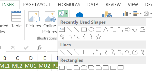
The tools you need are in the Shapes button of the Insert menu (Excel 2013 and 2010).

The Insert > Shapes button provides the tools you need to construct a dendrogram in Excel.

You are going to need some kind of text box or shape (that you can enter the sample name into) to display the sample names and elbow connectors to join them together. Because of the way the elbow connectors work you’ll also have to use a small shape as a “node”; a kind of joining block if you like.

The dendrogram

Now you are ready to start constructing the Dendrogram.

Joining the first two samples

You’ll need to identify the first pair of samples to join together. These will be the pair that have the smallest (dis)similarity. In our current example this is 0.42, which represents the Jaccard dissimilarity between ML2 & MU2.

  • Make a text box or shape for the ML2 sample and place it somewhere near the middle/bottom of the screen. If you choose a plain text box you can display the sample name only, otherwise you can have a shape with the name inside.
  • Click on the box you created to activate the Drawing Tools You can then format the object as you like.
  • Once you are happy you can copy to the clipboard and paste, to make a duplicate.
  • Edit the name of the sample to MU2 (click in the shape or right-click and select Edit Text).

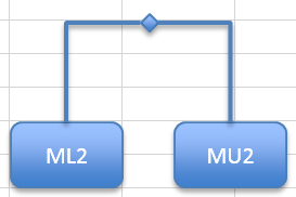
Now you need to make a small shape to use as a node. A diamond works well.

  • Use the Insert > Shapes button to make a small shape.
  • Use the Drawing Tools menu to format the shape how you want.
  • Drag the node shape to a spot between the first two boxes and a little above them.

Now you need to join the node and the two sample boxes.

  • Use the Insert > Shapes button and select a plain elbow connector.
  • Hover over the ML2 shape and you’ll see “edge markers”, click the top one and hold down the mouse button.
  • Drag the mouse to the node shape, when you “arrive” you’ll see the edge markers for the node. You can then release the mouse button to “fix” the connector.

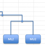
The elbow connector should automatically take the shape you want (an inverted L shape) but if not you can use the mouse to tweak the shape. Repeat the process to join the node to the other (MU2) shape with a fresh elbow connector.

You’ll find that if you click the node you can use the arrow keys (or the mouse) to reposition the node; the elbow connectors move too so that the connection remains intact. You are going to use the “crossbar” through the node to indicate the index of (dis)similarity. This will be done later but it is worth keeping in mind as you build the dendrogram.

I chose a rounded rectangle as a shape in tis example but you could use a text box and display the label only (i.e. without a rectangle). Once you have the first pair “entered” it is a good idea to “mark off” the dissimilarity in the matrix of values. You can simply click the 0.42 value in the spreadsheet and make the text a different colour or alter the format in some other way.

Second connection

Now you’ve got the first pair joined you want to scan the dissimilarity matrix for the next largest value. There are subtly different methods of selecting which items to select – you are going for the simplest, which is called single linkage.

If the next largest value would join two completely different samples then proceed as before and join these items together. You can place them to one side or the other of the first pair and the crossbar will be a little higher, because it represents a larger dissimilarity. One of the difficulties about dendrograms is that you do not know how much room each item will require, so you may well have to move items around. You’ll see this situation later…

If the next largest dissimilarity joins a new sample to an existing pair, then you make a new shape for the sample label and join that to the pair already joined. You will still need another node shape. In this case that is exactly what you need to do as the next largest dissimilarity is 0.46, which is the MU1 & ML2 pairing. The MU1 sample is “new” but ML2 is already in the dendrogram. So:

  • Copy one of the sample shapes to the clipboard and paste it to a convenient spot.
  • Edit the text to represent the MU1 sample.
  • Drag the new MU1 shape to the left of the existing pair (you could go the other side but I choose left). You can place the MU1 shape to be in-line with the other pair or slightly higher. It is easier to line then up.
  • Now make a new node shape; just copy an existing one and paste it to a convenient spot. You want to move the node so that it lies between the new shape and the other pair, and a bit higher than the other crossbar.

Now you need to add elbow connectors:

  • Use Insert > Shapes and select an elbow connector.
  • Hover over the MU1 box and then click and hold over the top edge marker.
  • Drag the mouse to the new node and connect.
  • Now make a new elbow connector and join the new node to the previous one.

You can click the new node and move it to get the lines how you want.

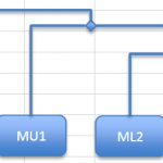
The height of the “crossbars” will represent the level of dissimilarity. A new sample item is joined to an existing pair via the joining node(s).

Hopefully, you will now see why the nodes are required; you cannot join an elbow connector to another elbow connector.

Now you can “mark off” the dissimilarity (the 0.46 item) in the matrix and carry on building.

Existing pairings

Now look for the next largest dissimilarity, it is the 0.48 between MU1 & MU2. However, these items are already on the dendrogram. So, you can mark off the 0.48 item and move on to another.

This method is the so-called single linkage method and is the simplest to operate. An alternative is to find the average dissimilarity between potential pairings. This generally has little effect except to alter the position of the crossbars. Another method is “complete” linkage. In this case you look for all potential joins and join pairs when you can, then join these pairings with the “spare” dissimilarities. It is easy to make errors with these alternative methods and the single linkage method is the simplest. If you are using Excel (like here) then stick to single linkage. If you use R then the “complete” method is the default method, although you can easily specify single linkage.

Third connection (fourth item)

The next largest dissimilarity is 0.5, the MU1 & ML1 pairing. Since ML1 is not on the dendrogram you can add it in the same way you added the MU1 item.

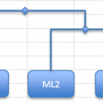
The fourth item extends the dendrogram. Note that the crossbars denote dissimilarity.

Now you can mark off the 0.5 dissimilarity and keep on building.

Making room

At some point it is almost inevitable that you’ll need to move items around to make space for new ones. You can click a shape with the mouse to select it. If you hold the control key, you can select multiple objects. The trick is to be systematic; select the sample name shapes first then all the nodes. Then go for the elbow connectors, as you select these you should see some small (probably green) selection “knobs” appear at the ends of the elbow lines, these help to spot that you’ve selected them. Once you have got all the items you want try an arrow key and the items should move together.

Fourth connection

The next dissimilarity is 0.55 but this is between ML1 and MU2, which are already represented. Similarly, 0.59 (ML2 & ML1) is represented. The next “available” dissimilarity is 0.61 between SU1 and SU2. This will make a completely new pair.

Make new shapes for the SU1 and SU2 samples and join them as you did for the very first pair. Place them to the right of the existing block of samples. The crossbar needs to be a bit higher, as the dissimilarity is larger.

The latest pair does not connect to any existing samples. Eventually the blocks will be connected.

You can now check off the 0.61 item from the dissimilarity matrix.

More connections

The next largest dissimilarity is 0.66 between SL1 & SU1. This means that you’ll need to make a new shape for SL1 and join it to the pair on the right.

You can now check-off the 0.66 dissimilarity.

The next largest dissimilarity is 0.69, between SL2 & SU1. You need to make a new shape for SL2 and join it to the right-hand block.

Now check-off the 0.69 dissimilarity.

The next largest dissimilarity is 0.72, between PU2 and MU1. Now, MU1 is already represented so you’ll need to make a new shape for PU2 and join it to the left-hand block.

Now check-off the 0.72 dissimilarity.

The next largest is 0.75, which is there twice (if you are looking at 2 decimal places). Both pairings are already represented. Keep going, you’ll check off 0.76 and 0.77.

The next largest is 0.79, between PL2 and SL1. This means you’ll need to make a new shape for PL2, which you can place on the right and join to the right-hand block.

PL2 is the final sample you need to add but you still have two blocks of samples in the dendrogram. Use the top two node shapes and join them with a single elbow connector. Alternatively, make a new node in the middle and two connectors. This is not necessary but makes it a little easier to shift things around if you need to tweak the positions.

Now the dendrogram is completed. You can check to see that the remaining dissimilarity values are represented but you can see that there are 10 samples in the data and 10 in the dendrogram.

Final touches

The dendrogram is completed but it would be good to have an axis to show the dissimilarity. The simplest way is to draw a vertical line and add some text annotations to show the dissimilarity. The gridlines in the worksheet are useful aids to help you align the crossbars.

Rearranging branches

The important thing about the dendrogram is the connections between the sample blocks and the nodes, as well as the position of the crossbars. You could draw the dendrogram with the samples in a different order. Essentially you could “reflect” or rotate the branches around any of the nodes, as long as the objects have the “correct” joins the appearance can alter.

Look at the following dendrogram, drawn using R.

Dendrogram produced using R.

It is essentially the same as the example done with Excel but the branches are arranged subtly differently. This makes it appear different

Logistic regression: model building

Exercise 11.3.2.

Statistics for Ecologists (Edition 2) Exercise 11.3.2

This exercise is concerned with how to build a logistic regression model (Section 11.3.2). The processes are very similar to those described in Section 11.1.2, where you saw a stepwise building process used with regular multiple linear regression. The data for this exercise are available as a separate file newt regression.RData. The file will open in R and create a data object, gcn.

Model building in logistic regression

Introduction

When you have several (or indeed many) predictor variables you want to find a regression model that best describes the relationship between the variables. You should not incorporate every variable that you’ve got. Eventually you’ll explain all the variability in your response variable simply because you’ve got so many explanatory predictors.

The process of model-building allows you to select the “best” variable to add to your current regression model. In the book you see how to carry out stepwise model building using a regular multiple regression (Section 11.1.2). In this exercise you can have a go at building a logistic regression model. The process is much the same as described in Section 11.1.2.

The example data

The data you’ll use comes from a survey of an amphibian (great crested newt) in southern England. You can get the data separately as newt regression.RData, which will load the gcn object to your console.

head(gcn)
  presence area dry water shade bird fish other.ponds land macro  HSI
1        0  100   1     2    10    2    1           2    1    30 0.53
2        0   40   1     2    90    1    3           1    1     0 0.47
3        0  150   1     3    20    2    3           4    1    80 0.69
4        0   25   1     2    90    1    3           4    1     0 0.51
5        1  800   1     2    90    1    4           5    3     0 0.70
6        0  275   1     3     5    2    1           2    4    50 0.72

The first column, presence, gives the presence or absence of newts as a binary variable (0 = absence, 1= presence). The researcher used standard survey methods to detect the presence (or otherwise) of newts at 200 ponds. The other variables are habitat factors:

  • area – the pond area in square metres.
  • dry – pond seasonality (1-4 with 1 being non-seasonal and 4 being most seasonal).
  • water – a subjective measure of water quality (1-4, 1 = bad).
  • shade – the shadiness of the pond as a %.
  • bird – presence of waterfowl (1-3, 1 = absent).
  • fish – presence of fish (1-4, 4 = absent).
  • ponds – number of other ponds within 1km.
  • land – terrestrial habitat quality (1-4, 4 = good).
  • macro – cover of macrophytes as a %.
  • HSI – habitat suitability index (0-1). This is a standard measure compiled from other habitat measures.

In this kind of survey, the various habitat factors are converted to an index, the indices are combined to make a final HSI (habitat suitability index). The HSI is used to make it easier to assess waterbodies for their potential to support populations of the great crested newt and to give a measure of reproducibility to surveys.

The example datafile is a “real” survey conducted on 200 ponds in Buckinghamshire in the UK. I’ve cut down the variables a little (the original data had the indices for each habitat variable) but essentially the dataset is unmodified.

The research task

The research task is twofold:

  • To find the most important (and significant) habitat factors affecting the presence or absence of the great crested newt.
  • To compare the “predictive power” of a habitat factor-based model against one using the HSI alone.

The first task will involve building a logistic regression model, which will determine that will show the habitat factors that are “most influential”.

The second task will be to make a simple regression model using the HSI variable as a single predictor. The multiple-factor model and the HSI model can then be compared to see if there is any substantial difference in deviance explained.

Building a multiple regression model

To build the model you’ll need to use the glm() command, which carries out the logistic regression (when you set family = binomial). You’ll also need to use the add1() command. The command takes an existing regression model and adds all the variables you specify, one at a time. The results are then displayed.

You then use the AIC values (a measure of how bad the model fit is) to select the next best variable to add to your model. You’ll want to pick the variable with the lowest AIC value. With many potential variables you can of course end up with a comprehensive list. It is therefore helpful to see the significant variables. You can tell the add1() command to carry out a significance test too.

  • For linear models (family = gaussian) you use test = “F”.
  • For logistic models (family = binomial) you use test = “Chisq” (or test = “LRT”).

Start with a blank model

The starting point for your regression model should be one with an intercept only and no terms except the response. In our example the response is the presence variable.

gcn.glm <- glm(presence ~ 1, data = gcn, family = binomial)

You could use the summary() command to look at the result but it would not be very informative at this stage as you have not incorporated any variables (model terms).

Add the first term

Now you have a blank model (intercept only) you will need to look at the effect of adding each variable in turn. The variable that has the lowest AIC value will be the one you want to incorporate (replace the intercept with the variable).

The add1() command will “interrogate” the regression model and return a list of variables (from a source you specify, usually the original dataset). To make the selection process easier you can carry out a significance test at the same time. You’ll want to include only variables that are significant.

add1(gcn.glm, scope = gcn, test = “Chisq”)
Single term additions
Model:
presence ~ 1
            Df Deviance    AIC    LRT  Pr(>Chi)
<none>           261.37 263.37
area         1   258.88 262.88  2.492 0.1144364
dry          1   261.31 265.31  0.054 0.8159993
water        1   255.07 259.07  6.295 0.0121104 *
shade        1   248.52 252.52 12.844 0.0003386 ***
bird         1   261.03 265.03  0.338 0.5611190
fish         1   257.16 261.16  4.207 0.0402523 *
other.ponds  1   252.05 256.05  9.317 0.0022700 **
land         1   260.80 264.80  0.568 0.4508771
macro        1   246.55 250.55 14.818 0.0001184 ***
HSI          1   228.67 232.67 32.701 1.075e-08 ***

Note that the HSI variable has the lowest AIC value. Ignore that for the moment (we’ll return to it later). For now, just focus on the habitat variables.

The macro variable has the lowest of the other AIC values (250.55) and is significant too. So you can use the up arrow on the R console to recall the earlier command and edit it to change the regression model. Replace the intercept with the macro variable.

gcn.glm <- glm(presence ~ macro, data = gcn, family = binomial)

Now you’ve got a model with a single term.

Add subsequent terms

To add more terms, you:

  1. Run add1() on your existing model.
  2. Choose the variable with the lowest AIC.
  3. If the variable is significant then use it. If the variable is not significant then stop.
  4. Edit the regression formula to include the new variable.
  5. Repeat the steps until no significant variables remain.

If you follow the process, you’ll end up with a model like so:

gcn.glm <- glm(presence ~ macro + other.ponds + fish + shade, data = gcn, family = binomial)

The water variable shows up as being significant if you run add1() on this model but we’ll stop because the p-value is only 0.044. When building a multiple variable model, it is not a bad thing to set a more rigorous cut-off value.

The final model can be summarised:

summary(gcn.glm)

Call:
glm(formula = presence ~ macro + other.ponds + fish + shade,
family = binomial, data = gcn)

Deviance Residuals:
Min       1Q   Median       3Q      Max
-1.8022  -0.9099  -0.5447   0.9757   2.0516

Coefficients:
             Estimate Std. Error z value Pr(>|z|)
(Intercept) -2.909742   0.704410  -4.131 3.62e-05 ***
macro        0.018963   0.006368   2.978  0.00290 **
other.ponds  0.241031   0.078685   3.063  0.00219 **
fish         0.494789   0.172173   2.874  0.00406 **
shade       -0.014619   0.005284  -2.767  0.00566 **

Signif. codes:  0 ‘0.001’ 0.01 ‘’ 0.05 ‘.’ 0.1 ‘ ’ 1
(Dispersion parameter for binomial family taken to be 1)
Null deviance: 261.37  on 199  degrees of freedom
Residual deviance: 222.57  on 195  degrees of freedom
AIC: 232.57
Number of Fisher Scoring iterations: 4

Explained deviance

The logistic regression does not return an R-squared value. What you see is Null deviance and Residual deviance. You can use these values to get a value that is equivalent to the R-squared, let’s call it the D-squared value:

1-(model$deviance/model$null.deviance)

Where model is your regression model result.

1 – (gcn.glm$deviance / gcn.glm$null.deviance)
[1] 0.1484474

You can see the result is about 0.15, which is not really great when you consider that there are 4 explanatory variables in the model!

D-squared calculator

You can make a simple custom command to calculate the D-squared value. Type the following into your console to set-up a custom command called d2:

d2 <- function(model, digits = 4) {
     round(1 - (model$deviance / model$null.deviance), digits = digits)
   }

Now you can use d2(model) to carry out the calculations simply and easily. Just give the command the name of your regression model (you can also use the digits parameter to view different numbers of decimal places).

Compare models

You can compare models in two main ways:

  • Are two models significantly different? Use the anova()
  • Compare the D-squared values. Is the explanatory power of one model better than another?

First of all, let’s make some alternative models to compare:

mod1 <- glm(presence ~ macro, data = gcn, family = binomial)
mod2 <- glm(presence ~ macro + other.ponds + fish + shade, data = gcn, family = binomial)
mod3 <- glm(presence ~ HSI, data = gcn, family = binomial)

The first model uses the single predictor macro (cover of macrophytes). This was the variable identified as the “best” of the habitat-based variables.

The second model is the multiple variable model using the 4 best habitat-based variables.

The third model uses the HSI variable alone. Recall that this is a composite index that uses information from several habitat factors in its construction.

Use anova() to compare models

The anova() command can compare models. The name of the command is slightly misleading as it is not really analysis of variance. Rather it compares deviance of models that are based on the same set of variables. You can get a “test” of significance; with the logistic regression you need test = “Chisq” as you did with the add1() command.

You can only really compare models that are based on the same subset of variables. You cannot really get meaningful results by comparing models that each contain only a single predictor variable. If you look at the logistic regression models for the newts:

anova(mod1, mod2, test = "Chisq")

Analysis of Deviance Table
Model 1: presence ~ macro
Model 2: presence ~ macro + other.ponds + fish + shade

  Resid. Df Resid. Dev Df Deviance Pr(>Chi)
1       198     246.55
2       195     222.57  3   23.981 2.52e-05 ***

You can see that there is a significant difference between the two models. We would expect this of course, since we’ve been adding significant variables to the original model. Now look at the habitat-based model and the overall index-based one:

anova(mod2, mod3, test = "Chisq")

Analysis of Deviance Table
Model 1: presence ~ macro + other.ponds + fish + shade
Model 2: presence ~ HSI

  Resid. Df Resid. Dev Df Deviance Pr(>Chi)
1       195     222.57
2       198     228.67 -3  -6.0985   0.1069

This time there is no significant difference. Neither model is “better” than the other. This is interesting because the first model is based on only 4 habitat variables but the HSI index is formed from 9 different habitat variables, each of which is itself converted to an index.

You cannot really use anova() to compare models with single variables:

anova(mod1, mod3, test = "Chisq")

Analysis of Deviance Table
Model 1: presence ~ macro
Model 2: presence ~ HSI

  Resid. Df Resid. Dev Df Deviance Pr(>Chi)
1       198     246.55
2       198     228.67  0   17.883

You can get a “result” but there is no significance value as the models are not directly comparable.

Use D-squared values

You can explore differences between models using a different approach, their explanatory power. You can calculate a D-squared value (equivalent to the R-squared value of a regular regression). This approach is not strictly a statistical one but gives you an idea of “how much” better one model is than another.

Look at the D-squared values of each of the newt models:

d2(mod1) ; d2(mod2) ; d2(mod3)
[1] 0.0567
[1] 0.1484
[1] 0.1251

The first model (mod1, macrophytes only) shows a D-squared a bit over 5%. The second habitat-based model (mod2) shows a value of nearly 15%, which is not great but is nearly 3 times better than mod1.

The index-based model was not statistically different from the habitat-based model. The D-squared value of mod3 is 12.5%, which is a little smaller than the 15% of mod2.

Summary

The more variables you add to a regression model the greater the “explanatory power”, in other words the D-squared value will keep increasing. However, it is rarely smart to keep adding variables just because you can measure them. The point of regression is to help you explain variability in the data. If variables are not significant they will only add a small fraction to the overall D-squared.

The best regression models explain as much of the variability as possible with the fewest variables. In this dataset it seems clear that the habitat-based model is the best of the options. It explains the most variability in the data with the fewest variables. The HSI model looks simpler but the HSI is calculated from 9 other variables.

As an additional exercise you might look at a regression model containing all the habitat variables. You will get a D-squared value of 17% and the model is not significantly “better” than the 4-variable model or the HSI one.

As a final note: the regression models here are based on newt presence or absence. Effectively a model “success” is the presence of a newt. It might be better to think of the model as a better predictor of the absence of newts, rather than their presence. A pond may be perfectly suitable for newts but they are not there simply because they have not found it. This historical component probably explains the low D-squared values.

Preparing & managing community data

Exercise 12.0.0.

Statistics for Ecologists (Edition 2) Exercise 12.0.0

This exercise relates to all of Chapter 12 (community ecology), and is primarily aimed at helping you to prepare data and assemble it in a form that allows you to carry out further investigation. This follows on from an earlier exercise in Section 3.2.7, where you used an Excel Pivot Table.

Preparing & managing community data

Introduction

I am text block. Click edit button to change this text. Lorem ipsum dolor sit amet, consectetur adipiscing elit. Ut elit tellus, luctus nec ullamcorper mattis, pulvinar dapibus leo.

It is important that your data are arranged and set out in a manner that allows you to carry out the analyses that you require. In general, a scientific recording layout is a good starting point (see Section 2.2). In the scientific recording layout (a.k.a. biological recording layout) you have a column for each variable (e.g. site name, species name, abundance). For most purposes this is the most “robust” way to record your data, as you can use the data most flexibly. For community analyses however, you’ll generally want to have the data arranged by site and species, with the rows being site names and the columns the species (with the body of the table being the abundance).

This exercise shows you how to take a dataset that is in recording layout and convert to community layout. Get the datafile for this exercise: Preparing and managing community data exercise.xlsx.

The exercise data

The exercise data are in the file Preparing and managing community data exercise.xlsx. There are several worksheets, with the Data tab being the main data. The other worksheets contain a note about the Domin scale (an ordinal scale of plant abundance), a completed Pivot Table and a dataset ready for export as CSV.

The data show the abundance of some terrestrial plant species at ten sites in Shropshire. These data are part of a series of NVC surveys carried out by student groups. Here are the first few rows of the dataset:

The first few rows of the example dataset.

Site Species Const Cover Imp
ML1 Achillea millefolium 5 6 6
ML1 Centaurea nigra 5 4 4
ML1 Lathyrus pratensis 5 5 5
ML1 Leucanthemum vulgare 5 5 5
ML1 Lotus corniculatus 5 7 7
ML1 Plantago lanceolata 5 5 5


The data are as follows:

  • Site = Site names as a simple label.
  • Species = Plant species names.
  • Const = Frequency of occurrence (a value from 0-5).
  • Cover = The maximum abundance in Domin scale (a value from 1-10) from the 5 quadrats at each site.
  • Imp = A combination of Const and Cover (Const * Cover ÷ 5) to give an abundance score.

These data are set out in scientific recording layout, that is, each column is a single variable and each row is a “record”. This gives the most flexibility and maximises the usefulness of the data. However, for community analysis we’ll need the data in community layout like so:

The example data laid out as a community dataset. Each column is a separate sample.

Species ML1 ML2 MU1 MU2 PL2 PU2 SL1 SL2 SU1 SU2
Achillea millefolium 6 3 5 4 0 3.2 0 0 0 0
Aegopodium podagraris 0 0 0 0 0 0 0 1.6 0 0
Agrostis capillaris 0 8 8 5.6 8 0 5 2 3.2 0
Agrostis stolonifera 0 0 0 0 0 5 0 0.4 0 0
Anthriscus sylvestris 0 0 0 0 0 0 0 0 1.2 3
Arctium minus 0 0 0 0 0 0 0 0 0 0.4


In this case the columns are the sites. It is easy to transpose the data, either in Excel or later on if you have exported the data to CSV.

Although this is the “ideal” layout for the purpose of community analysis there are other ways to manage the data, which you’ll see as you work through the exercise. The manipulations are illustrated using Excel 2013 (Windows) but you can follow along with most versions of Excel as well as Open Office or Libre Office.

Make a Pivot Table

The starting point for your data arrangement and management is a Pivot Table. This will allow you to arrange and rearrange your data in many (useful) ways. You can also use a Pivot Table to get summary information and to make exploratory graphs.

In Excel 2013 the Pivot Table button is in the Insert ribbon menu. In other spreadsheets you may find the appropriate function in the Data menu. Start by making a new blank Pivot Table in a fresh worksheet:

  1. Click once anywhere in the block of data; there is no need to highlight or select any data.
  2. Click the Insert > Pivot Table
  3. The Create Pivot Table dialogue box should open and you’ll see that the data are automatically selected. The default is to place the new pivot table in a new worksheet so you can simply click OK.

You should now see the new (empty) pivot table and the Pivot Table Fields dialogue box. In most versions of Excel you drag the items you want from the top (the list of variables) to the appropriate section at the bottom of the dialogue window (in some spreadsheets you drag items directly to the pivot table).

Now you are ready to build your dataset. There are many options and in the following exercise you’ll get to see several ways to present the data.

Make species lists

There are various simple lists you can make.

All species present

A good starting point would be to make a list of all the species present across the survey sites.

  1. Click on the pivot table (currently empty) to ensure that the Pivot Table Field dialogue box opens.
  2. Now drag the Species field from the list at the top to the area labelled Rows at the bottom of the dialogue box.

Now you have a simple overall species check-list. This is useful as a data validation tool, as you can look through it for spelling mistakes (two entries that are similar, one will probably be a mistake).

Species listed by site

It would also be useful to have a list of the species at each site. There are two ways you could try:

  • List all sites with their species
  • List sites and their species sequentially

Listing all the sites seems the most obvious.

  1. Click the Pivot Table to open the Pivot Table Field dialogue box.
  2. Drag the Site field item from the top to the Rows area at the bottom. Make sure that the Site item is above the Species item (you can drag to rearrange them anytime).

Now you have a compact table showing the species lists for all the sampling sites:

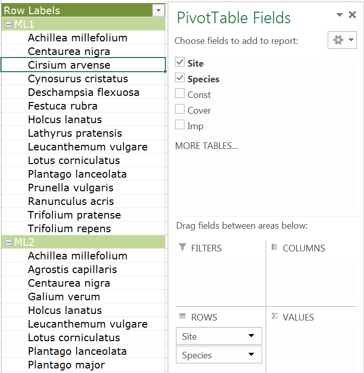
Species lists per sample site.

Try dragging the Site field so that it is underneath the Species field in the Rows area. You now get a list of which sites each species was present in.

You might also want to display a single site, rather than all of them. There are two simple options:

  • Filter the Site field to display one (or more) of the sites.
  • Move the Site field to the Filters area (sometimes called Report Filter), where you can apply the filter.

The first option allows you to keep the species lists separate per site.

  1. Click the pivot table to activate the Pivot Table Field dialogue box.
  2. Move the mouse over the Site field at the top of the Pivot Table list. You’ll see a triangle at the right end of the highlight, click that to open a sort & filter dialogue box.
  3. Click the box(es) beside the items you want to view or not. A ticked box will be displayed and an empty box will be not displayed!
  4. Click OK when you are done to apply the filter. Note that you’ll see a funnel icon by the Site field in the list area.

The second option allows you to combine lists across sites.

  1. If you applied a filter earlier clear it now. Click the Pivot Table then the triangle in the Site field to open the sort & filter dialogue.
  2. Click the Clear Filter from “Site” button to remove the filter.
  3. Now drag the Site field from the Row area at the bottom to the Filter area.
  4. Now you see the top of the pivot table read Site and to the right a label (All) and a grey triangle.
  5. Click the triangle to open the filter dialogue.
  6. If you click a single item, you’ll display the species for that site. If you click several sites, you’ll display a list encompassing all those sites.

This approach could be useful if you have “grouped” samples, perhaps from different habitats.

Presence-absence lists

Simple species lists are useful but for calculations of species richness or similarity you’ll need to make a presence-absence dataset. That is one where each species has a 1 for presence or 0 for absence.

This is easily done with the pivot table.

  1. If you have filters applied they will usually be cleared if you move a field to a new location. Alternatively, you can remove the fields and start afresh (drag the fields out of the lower part of the Pivot Table Field dialogue box or un-tick the fields in the list at the top).
  2. Drag the Species field to the Rows area.
  3. Drag the Sites field to the Columns area.
  4. Now you have a table arranged in a sensible fashion but no data! Drag the Species field from the list at the top to the Values area at the bottom (of the Pivot Table Field dialogue box).

Now you’ll have a table where the presence of species is shown by a 1. The absences are blank spaces. At the moment you’ll also have row and column totals.

  • Row totals show the frequency of each species across the samples.
  • Column totals show the species richness for each site.

If you need to carry out analysis, then you may well wish to remove the totals and also to replace the blank cells with 0. To do this you’ll need to use the Pivot Table Tools menus.

  1. Click once in the pivot table to activate the Pivot Table Tools ribbon menus. In Excel 2013 there are two: Analyze and Design. In older versions there were three menus but you should not have too much difficulty finding the right buttons.
  2. Remove the totals using the Design Click Grand Totals > Off for Rows and Columns.
  3. To replace blanks with 0 you need the Analyze Click Pivot Table > Options to open the Pivot Table Options dialogue box.
  4. On the Layout & Format tab (this should be in view by default) enter a 0 in the box labelled For empty cells show. The tick-box beside the label needs to be ticked but this is usually already activated.
  5. Now click OK to apply the changes.

Now your data are in a form that could be exported as CSV, although you’d need to remove the first three rows from the final CSV.

If you need to have the sites as rows, then you can simply rearrange the fields between the Rows and Columns areas. If you are going to use R then there is no need to do this as you can easily transpose data using the t() command.

Abundance lists

Since these data are accompanied by abundance data it is most likely that you’ll want to use the abundance instead of presence-absence. In the dataset the Imp variable is a measure of abundance derived from the frequency and maximum (Domin) cover. Each sample site is a combination of 5 quadrats but the individual quadrat data is not available.

To make an abundance-based community dataset you simply rearrange the pivot table:

  1. Click once on the pivot table.
  2. Now rearrange the fields so that Species are in the Rows area.
  3. Make sure the Site field is in the Columns area.
  4. Remove the item in the Values area; just drag it away and it’ll disappear.
  5. Drag the Imp field from the list at the top to the Values area at the bottom.

The Values item should read Sum of Imp. Since there is only one value per species/site combination this is fine. If the field does not show Sum, then click on it and use Value Field Settings to alter the summary to Sum.

You can arrange the Site and Species fields in different ways, just as you did when making simple lists. Try it out and see what you get. The most useful arrangement for community analysis is where you have Sites as columns and Species as rows. If you need to have the sites as rows, then you can simply rearrange the fields between the Rows and Columns areas. If you are going to use R then there is no need to do this as you can easily transpose data using the t() command once you have the data in R.

Constancy tables

A constancy table is used to display the survey results of a British NVC plant survey. For each site/sample the species are listed. The abundance data are given as a pair of values:

  • The constancy – that is the frequency of occurrence (1-5, absences are not shown).
  • The cover – that is the maximum abundance from the 5 sample quadrats) in domin scale (1-10).

Even if you are not reporting an NVC survey the process will help to show you how flexible the pivot table can be.

  1. Start by removing any previous data from the Pivot Table.
  2. Drag the Species field to the Rows area.
  3. Drag the Site field to the Columns area.
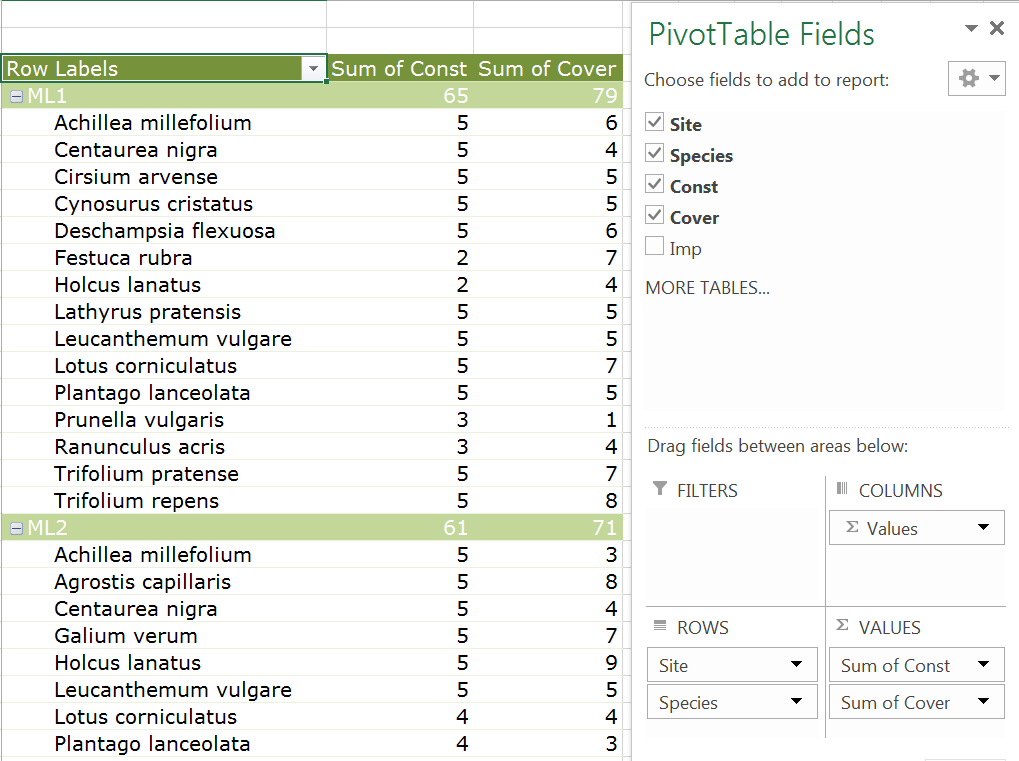
  4. Now drag the Const field to the Values area. You now have a table showing the frequency of each species by site.
  5. Now drag the Cover field to the Values area; drop it underneath the Sum of Const item that’s already there.

Now you have a table showing the Constancy (Frequency) and Cover (max abundance) for each species and site. This is not the most “readable” of tables, so try some modifications.

Try dragging the Site item in the Columns area so that it is underneath the ∑Values item. Now you have two tables side by side, one showing constancy, the other cover.

Move the Site item again, this time place it above the Species item in the Rows area. Now you have a much more useable table, with the sites being shown atop one another.

With a bit of tweaking you can recreate the original data layout!

  1. Click once on the pivot table to activate the Pivot Table Tools
  2. Click the Design > Report Layout button and select Show in Tabular Form.
  3. Now click the Report Layout button again and select Repeat All Item Labels.
  4. Click the Design > Subtotals button and select Do Not Show Subtotals.

Obviously it is a little silly to recreate the original dataset; this just goes to show how you can arrange and rearrange the data easily using a pivot table.

There is a lot more to Pivot Tables (as well as general data management) in my book Managing Data Using Excel!

Logistic regression: model prediction

Exercise 11.3.1.

Statistics for Ecologists (Edition 2) Exercise 11.3.1

These notes are about how to use the results of a regression model to predict the value of the response variable when you supply certain values of the predictor.

Predicting values from logistic regression and other models

Introduction

When you carry out a regression you are looking to describe the data in terms of the variables that form the relationships. When you’ve got your regression model you are able to describe the relationship using a mathematical model (which is what the regression model is).

You can use the regression model to make predicted values, which is where you use “new” values of the predictor (that is ones not observed in the original dataset) to predict the response variable.

These predicted values are especially important in logistic regression, where your response is binary, that is it only has two possibilities. The result you get when you “predict” response values in a logistic regression is a probability; the likelihood of getting a “positive” result when the predictor variable is set to a particular value.

These notes will show you how to use the predict() command in R to produce predicted values for regression models, particularly logistic regression.

The predict() command

The predict() command is used to compute predicted values from a regression model. The general form of the command is:

predict(model, newdata, type)
model A regression model, usually the result of lm() or glm().
newdata A data.frame giving the values of the predictor(s) to use in the prediction of the response variable.
type The type of prediction, usually you want type = “response”.


The model is simply the result of a regression model. You need to specify type = “response” so that your prediction predicts the response variable (note that this is not necessarily the default, so you must specify it).

The newdata parameter is where you specify the values of the predictor(s) that you want to use to predict the response variable. You can make a data.frame object containing the variables (with variable names to match the original dataset), or can specify it “on the fly”. You’ll see examples shortly.

Prediction in logistic regression

Logistic regression is carried out in cases where your response variable can take one of only two forms (i.e. it is binary). There are two general forms your response variable can take:

  • Presence/absence, that is, 0 or 1 (or some other binary form).
  • A success/failure matrix, where you have two frequencies for each observation (the “successes” and the “failures”).

The way your data are arranged does not make much difference to how you carry out the predictions but because of the different forms it is useful to see an example of each.

Logisitc regression and presence/absence

When you have the response variable as presence/absence (1 or 0) it is easy to see that your response is in binary form. The logistic regression converts the 1s and 0s to a likelihood (under the various levels of your predictor variables), so your result is in that form. So, when you use the predict() command you can get the probability of getting a success (a presence: 1).

The example file (Predict regressions.RData) contains a dataset that looks at the presence or absence of an amphibian (great crested newt) in ponds. The data are called gcn. Various habitat factors were measured. One factor is the percentage cover of macrophytes. You can use the logistic regression to explore the relationship between the presence (or absence) of newts and the cover of macrophytes.

Once you have the regression model you can use predict() to predict the likelihood of finding a newt given any value for the cover of macrophytes.

Make a regression model

Make a regression model result:

gcn.glm <- glm(presence ~ macro, data = gcn, family = binomial)

The result is that the macro variable is statistically significant:

Coefficients:
             Estimate Std. Error z value Pr(>|z|)
(Intercept) -1.135512   0.217387  -5.223 1.76e-07 ***
macro        0.022095   0.005901   3.744 0.000181 ***

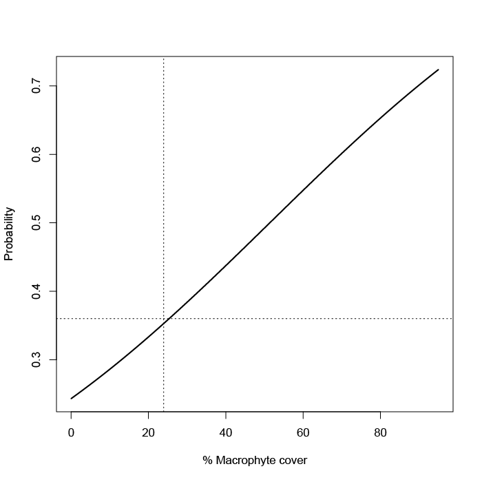
You can present a graph of the model (see the book text for the code):

Predict outcomes

Now you could look at the line on the plot (made using fitted values) and estimate the probability of finding a newt (presence = 1) for any percentage cover of macrophyte. Alternatively you can use the predict() command.

nd = data.frame(macro = c(40, 50, 60))
nd
  macro
1    40
2    50
3    60

predict(gcn.glm, newdata = nd, type = “response”)
        1         2         3
0.4374069 0.4923162 0.5474114

See that you first make a data.frame with a variable called macro, to match the original data. This new data is used to predict the response. However, the value you get is not exactly a response but it is the likelihood of “success”, that is finding a newt. You could have set the original response variable (presence) to have been 1 for absence and 0 for presence. Apart from being a little odd you’d be assuming that a “success” was the absence of the newts.

In any event your prediction is a probability of success. You might have chosen to create the prediction newdata data.frame directly in the predict() command, which is what you’ll see in the following example.
Logistic regression and success/failure matrix

Your data may be in a subtly different form to the 0 or 1 model. In the following example you have a predictor variable, latitude, and a response but the response is split into two frequencies:

cbh
  latitude Mpi90 Mpi100  p.Mpi100
1     48.1    47    139 0.7473118
2     45.2   177    241 0.5765550
3     44.0  1087   1183 0.5211454
4     43.7   187    175 0.4834254
5     43.5   397    671 0.6282772
6     37.8    40     14 0.2592593
7     36.6    39     17 0.3035714
8     34.3    30      0 0.0000000

Here you have two versions of an allele in the Californian beach hopper. The data are in the file (Predict regressions.RData) and are called cbh. For each sampling latitude a number of animals were collected. They can have one form of the allele or the other. So your response variable is split into the frequency of each. If you take those two variables you have a success/failure matrix.

The logistic regression can constrict the likelihood from the success/failure. It does not matter which allele you choose to be the “success” but here I’ve used the Mpi100 allele (because the proportion increases with latitude). The proportion of the “success” is shown in the final column. It won’t be used in the regression except to draw a plot.

Make a regression model

Start by making a regression model. You need to make a success/failure matrix but this can be done as part of the glm() command formula.

cbh.glm <- glm(cbind(cbh$Mpi100, cbh$Mpi90) ~ latitude, data = cbh, family = binomial)

The result shows that latitude is a significant variable:

Coefficients:
            Estimate Std. Error z value Pr(>|z|)
(Intercept) -7.64686    0.92487  -8.268   <2e-16 ***
latitude     0.17864    0.02104   8.490   <2e-16 ***

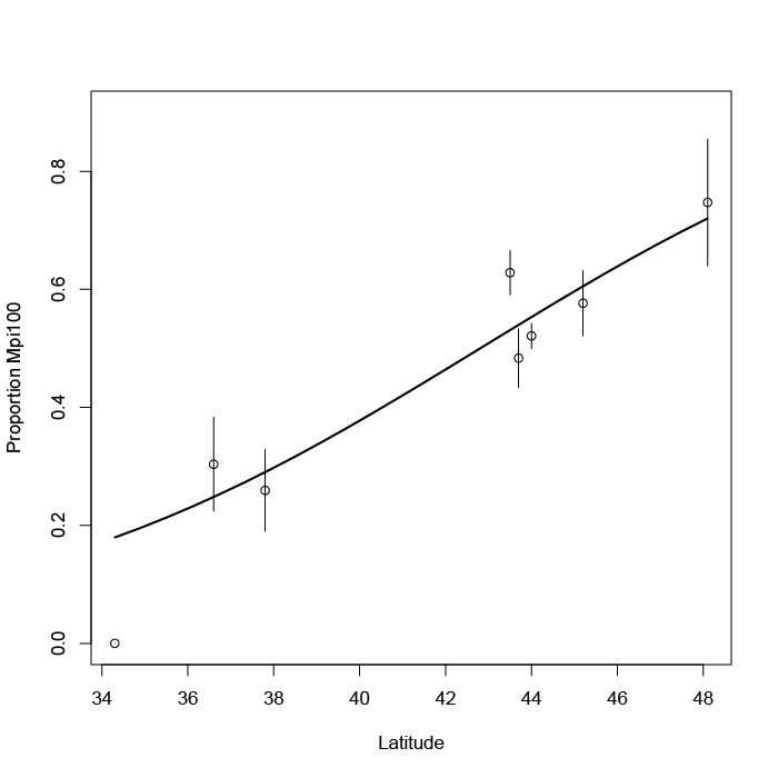
You can draw this as a plot (because of the replicates we can add error bars):

Predict outcomes

As before you could use the plot to predict the likelihood of “success”, the Mpi100 allele. You can also use the predict() command:

predict(cbh.glm, newdata = data.frame(latitude = c(35, 40, 45)), type = "response")
        1         2         3
0.1986945 0.3772411 0.5967457

Note that this time the newdata parameter used a data.frame created on the fly.

Prediction with multiple predictors

When you have multiple predictor variables you have to specify them all in the newdata parameter of the predict() command. It is easiest to make a new data.frame object to hold these “new” data unless you only have one or two values.

In the following data example there are four predictors and one response (Length).

names(mf)
[1] "Length" "Speed"  "Algae"  "NO3"    "BOD"

The data give the lengths of a freshwater invertebrate (a mayfly species) and some habitat conditions at the sampling locations where each observation took place. The data are in the file (Predict regressions.RData) and are called mf.

Your new data.frame has to have the same variable names but they do not have to be in any order. You only have to include variables that are in the regression model.

Make the regression model

Make the model:

mf.lm <- lm(Length ~ BOD + Algae, data = mf)

The result shows the coefficients (one variable is not significant but we’ll leave it in).

Coefficients:
            Estimate Std. Error t value Pr(>|t|)
(Intercept) 22.34681    4.09862   5.452 1.78e-05 ***
BOD         -0.03779    0.01517  -2.492   0.0207 *
Algae        0.04809    0.03504   1.373   0.1837

Predict the result

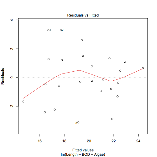
Because there are two predictors it is not practical to draw a plot (apart from diagnostics, see Exercise 11.1). So the predict() command is the way to go.

predict(mf.lm, newdata = data.frame(BOD = 20, Algae = 10), type = “response”)
       1
22.07199

You can of course make a separate data.frame containing BOD and Algae columns and populate it with values for which you want to get a prediction.

Data examples

The data examples used here are available as part of the support data for the book. I’ve also added a file Predict regressions.RData, which contains just the three datasets mentioned on this page.

Beta coefficients from linear models

Exercise 11.1.2.

Statistics for Ecologists (Edition 2) Exercise 11.1.2

These notes supplement Chapter 11 and explore the use of beta coefficients, which can be a useful addition to a regression analysis.

Beta coefficients from linear models

Introduction

In linear regression your aim is to describe the data in terms of a (relatively) simple equation. The simplest form of regression is between two variables:

y = mx + c

In the equation y represents the response variable and x is a single predictor variable. The slope, m, and the intercept, c, are known as coefficients. If you know the values of these coefficients then you can plug them into the formula for values of x, the predictor, and produce a value for the response.

In multiple regression you “extend” the formula to obtain coefficients for each of the predictors.

y = m1.x1 + m2.x2 + m3.x3 + ... + c

If you standardize the coefficients (using standard deviation of response and predictor) you can compare coefficients against one another, as they effectively assume the same units/scale.

The functions for computing beta coefficients are not built-in to R. In these notes you’ll see some custom R commands that allow you to get the beta coefficients easily. You can download the Beta coeff calc.R file and use it how you like.

What are beta coefficients?

Beta coefficients are regression coefficients (analogous to the slope in a simple regression/correlation) that are standardized against one another. This standardization means that they are “on the same scale”, or have the same units, which allows you to compare the magnitude of their effects directly.

Beta coefficients from correlation

It is possible to calculate beta coefficients more or less directly, if you have the correlation coefficient, r, between the various components:

Calculating beta coefficients from correlation coefficients.

The subscripts can be confusing but essentially you can use a similar formula for the different combinations of variables.

Beta coefficients from regression coefficients

In most cases you’ll have calculated the regression coefficients (slope, intercept) and you can use these, along with standard deviation, to calculate the beta coefficients.

Calculating a beta coefficient from a regression coefficient and standard deviation.

This formula is a lot easier to understand: b’ is the beta coefficient, b is the standard regression coefficient. The x and y refer to the predictor and response variables. You therefore take the standard deviation of the predictor variable, divide by the standard deviation of the response and multiply by the regression coefficient for the predictor under consideration.

There are no built-in functions that will calculate the beta coefficients for you, so I wrote one myself. The command(s) are easy to run/use and I’ve annotated the script/code fairly heavily so it should be useful/helpful for you to see what’s happening.

The beta.coef() command

I wrote the beta.coef() command to calculate beta coefficients from lm() result objects. There are also print and summary functions that help view the results. Here’s a brief overview:

beta.coef(model, digits = 7)
print.beta.coef(object, digits = 7)
summary.beta.coef(object, digits = 7)
model A regression model, the result from lm().
object The result of a beta.coef() command.
digits = 7 The number of digits to display, defaults to 7.


The beta.coef() command produces a result with a custom class beta.coef. The print() and summary() commands will use this class to display the coefficients or produce a more comprehensive summary (compares the regular regression coefficients and the beta).

Using beta.coef()

You will need the result of a linear regression, usually this will be one with the class “lm”.

mf.lm <- lm(Length ~ BOD + Algae, data = mf)
summary(mf.lm)

Call:
lm(formula = Length ~ BOD + Algae, data = mf)
Residuals:
 Min      1Q  Median      3Q     Max
-3.1246 -0.9384 -0.2342  1.2049  3.2908
Coefficients:
            Estimate Std. Error t value Pr(>|t|)
(Intercept) 22.34681    4.09862   5.452 1.78e-05 ***
BOD         -0.03779    0.01517  -2.492   0.0207 *
Algae        0.04809    0.03504   1.373   0.1837
Signif. codes:  0 ‘’ 0.001 ‘’ 0.01 ‘’ 0.05 ‘.’ 0.1 ‘ ’ 1
Residual standard error: 1.83 on 22 degrees of freedom
Multiple R-squared:  0.6766,  Adjusted R-squared:  0.6472
F-statistic: 23.01 on 2 and 22 DF,  p-value: 4.046e-06

Once you have the result you can use the beta.coef() command to compute the beta coefficients:

mf.bc <- beta.coef(mf.lm)

Beta Coefficients for: mf.lm
                 BOD     Algae
Beta.Coef -0.5514277 0.3037675

Note that the result is shown even though the result was assigned to a named object.

You can use the print method to display the coefficients, setting the number of digits to display:

print(mf.bc, digits = 4)

Beta coefficients:
              BOD  Algae
Beta.Coef -0.5514 0.3038

The command takes the $beta.coef component from the beta.coef() result object.

Summary beta.coef results

The summary method produces a result that compares the regular regression coefficients and the standardized ones (the beta coefficients). You can set the number of digits to display using the digits parameter:

summary(mf.bc, digits = 5)

Beta coefficients and lm() model summary.
Model call:
lm(formula = Length ~ BOD + Algae, data = mf)
          (Intercept)       BOD    Algae
Coef           22.347 -0.037788 0.048094
Beta.Coef          NA -0.551428 0.303768

The command returns the model call as a reminder of the model.

Add the commands to your version of R

To access the commands, you could copy/paste the code from Beta coeff calc.R. Alternatively, you can download the file and use:

source("Beta coeff calc.R")

As long as the file is in the working directory. Alternatively, on Windows or Mac use:

source(file.choose())

The file.choose() part opens a browser-like window, allowing you to select the file. Once loaded the new commands will be visible if you type ls().

The lm.beta package

After I had written the code to calculate the beta coefficients I discovered the lm.beta package on the CRAN repository.

Install the package:

install.packages("lm.beta")

The package includes the command lm.beta() which calculates beta coefficients. The command differs from my code in that it adds the standardized coefficients (beta coefficients) to the regression model. The package commands also allow computation of beta coefficients for interaction terms.

Use the command:

help(lm.beta)

to get more complete documentation once you have the package installed and running. You can also view the code directly (there is no annotation).

lm.beta
print.lm.beta
summary.lm.beta

The lm.beta() command produces a result with two classes, the original “lm” and “lm.beta”.

Graphing multiple regression

Exercise 11.1.

Statistics for Ecologists (Edition 2) Exercise 11.1

This exercise is concerned with how to produce and chart some diagnostics for regression models (Sections 11.1 and 11.2). The dataset used to illustrate these notes is available as a file: regression diagnostic.csv.

Graphing multiple regression/linear models

Introduction

When you only have two variables (a predictor and a single response) you can use a regular scatter plot to show the relationship. Even if the relationship is logarithmic or polynomial you can represent the situation, as long as there is only one predictor variable.

When you have two or more predictor variables it becomes hard to represent the situation graphically. You can try a 3D plot but they are rarely successful. Generally, you’ll stick to plotting the “most important” predictor variable and display the model as a standard regression table.

However, it can be helpful show some diagnostics from your regression model as graphics. These notes show you how you can produce some simple regression diagnostics and present them graphically.

The data used for these notes can be downloaded as a CSV file: regression diagnostic.csv. The data are the same as shown in the book (mayfly regression) but reproduced here to make it easier to follow the notes.

Fitted values

When you make a regression model you are trying to find the “best” mathematical fit between the variables. In a simple form the relationship will be:

y = mx + c

In this case there is a single predictor variable, x. The m is the slope and c is the intercept. Both m and c are known as coefficients. You might have a logarithmic or polynomial relationship but essentially the form of the relationship is the same:

y = m.log(x) + c
y = ax + bx^2 + c

In multiple regression you have more than one predictor and each predictor has a coefficient (like a slope), but the general form is the same:

y = ax + bz + c

Where a and b are coefficients, x and z are predictor variables and c is an intercept. You can add more and more variables:

y = m1.x1 + m2.x2 + m3.x3 + ... + c

Note that each predictor variable has a unique coefficient.

Once you have your “equation” you can use the observed values of the predictors and of the coefficients in your equation to produce new y-values. These values are “fitted” to the regression model. Think of them as being idealised values or “expected” values.

Note that you should not call these fitted values “predicted” values because they are based on your observed predictor variable values. If you insert predictor values that you did not observe into the equation, then you can call the resulting y-values predicted y-values. The values you insert to the equation could lie within the max-min range of observed predictor (interpolation) or be outside (extrapolation). In general, it is “safer” to go with interpolation than with extrapolation.

Calculate Fitted values using R

Fitted values are easy to compute in R. You can get them from the result of a lm() command in two ways:

model$fitted.values
fitted(model)

In both cases model is the result of a lm() command.

names(mf)
[1] "Length" "Speed" "Algae" "NO3" "BOD"
mf.lm = lm(Length ~ BOD + Algae, data = mf)

Then you can get the fitted values:

fitted(mf.lm)
1        2        3        4        5        6        7        8
16.71301 17.70924 19.40969 21.65981 21.79722 20.93840 21.88309 19.12458
9       10       11       12       13       14       15       16
17.22829 16.42101 19.50246 20.23417 21.14452 20.23417 17.79511 16.72331
17       18       19       20       21       22       23       24
17.57183 19.29977 22.31250 14.66902 16.47254 24.35649 22.90681 22.52893
25
22.36403

Once you have the values you can use them like any other numeric variable (the vector has a names attribute).

Calculate Fitted values using Excel

To get fitted values in Excel you’ll need to calculate the coefficients and plug the values into the spreadsheet to generate them:

  1. Arrange your data so that the predictor values are next to one another.
  2. Use the LINEST function to determine the coefficients:
    1. Highlight one block of cells in a row, you need one cell per coefficient.
    2. Type =LINEST and start the formula, inside the () you need
    3. The y-values, the x-values, 1, 0. Note that the final 0 suppresses additional regression stats, you only get the coefficients.
    4. Enter the formula as an array using Control+Enter
  3. The results of LINEST show the coefficients backwards! The intercept is last. The first coefficient shows the last of the predictor variables.
  4. Use the coefficient values and the observed predictors to make your predicted values.

Once you have the coefficients it is fairly easy to create the fitted values but you will need to “fix” the references to the coefficients using $ in the cell reference(s). Then you can copy/paste the formula down the column to fill in the fitted values for all the rows of data.

Use the Analysis ToolPak

If you have the Analysis ToolPak add-in you can use this to generate the regression statistics. The Regression routine will produce the coefficients as well as the fitted values.

  1. Arrange your data so that the predictor values are next to one another.
  2. Click the Data > Data Analysis
  3. Select the Regression option.
  4. Use the mouse to select the appropriate data (you can include the label headings).
  5. Choose the location for the results, which can be in the current worksheet or in another.
  6. Tick the box labelled, Residuals.
  7. Click OK to finish.

Residuals

Residual values are the difference between the fitted values and the actually observed values for your response variable. Think of the fitted values as being the “ideal” or “expected” values based on your regression equation. The residual values are (usually) not ideal and differ from the “perfect fit”.

So, the residuals are a way to see how bad the fit is between the ideal values based on your regression model and the real situation. In general, you want to see that the residuals are normally distributed, at least this is what you want when doing regular linear regression (and curvilinear). In diagnostic terms it is the normal distribution of the residuals that is the really important thing, not the distribution of the original data (although usually you do not get the former without the latter).

Calculate residuals using R

Residual values are easy to compute using R; you get them from the result of a lm() command:

model$residuals
resid(model)

Simply make your regression model result then away you go:

mf.lm = lm(Length ~ BOD + Algae, data = mf)

fitted(mf.lm)
1        2        3        4        5        6        7        8
16.71301 17.70924 19.40969 21.65981 21.79722 20.93840 21.88309 19.12458
9       10       11       12       13       14       15       16
17.22829 16.42101 19.50246 20.23417 21.14452 20.23417 17.79511 16.72331
17       18       19       20       21       22       23       24
17.57183 19.29977 22.31250 14.66902 16.47254 24.35649 22.90681 22.52893
25
22.36403

The result of resid() is a numerical vector (with a names attribute), which you can use in various ways (as you will see later).

Calculate residuals using Excel

Residuals are simply the difference between the observed and expected values of your response variable. You can use the regression equation for your model to generate the fitted values. Once you have those you simply subtract the fitted value from the observed:

Observed – Fitted = Residual

Note that you always carry out the calculation this way around by convention.

Use the Analysis ToolPak

The Analysis ToolPak can compute the residuals for you easily. You simply tick the box labelled Residuals in the Regression dialogue box. The process is exactly the same as when calculating the fitted values.

The residuals are placed alongside the fitted values (which are labelled Predicted), and are labelled Residuals.

Standardized residuals

Standardized residuals are residuals that have been rescaled. The way they are scaled is such that each residual value has unit standard deviation. The standardization process takes into account how much “influence” a datum might have on the regression (something called leverage).

It is generally preferable to use the standardized residuals.

Standardized residuals in R

You can compute the standardized residuals using the rstandard() command:

rstandard(mf.lm)
1           2           3           4           5           6
1.89433577  1.85925744  1.53830120  0.77572446 -0.45212719 -0.52806189
7           8           9          10          11          12
-1.70410540 -1.82866111 -1.29005538 -1.41946426  0.85656348  0.43789841
13          14          15          16          17          18
-0.09180616 -0.13389770  0.71314102  0.75324789 -0.32958291 -0.16844397
19          20          21          22          23          24
-0.76996058 -1.02235369 -0.27307270  0.39957434  0.63390452  0.27061395
25
-0.20911178

The result is a numeric vector (with a names attribute).

Standardized residuals in Excel

You cannot calculate the standardized residuals in Excel without some tedious computations! The Analysis ToolPak claims to calculate standardized residuals but what you end up with is the residuals divided by the standard deviation of the residuals. This is only an approximation to the “proper” standardization.

Diagnostic plots

There are several type of plot you might use as diagnostic tools. The ones I’ll show here are:

  • Residuals vs. Fitted values.
  • Normal distribution plot of standardized residuals.

You can make these plots easily using R. In Excel you can make some worthwhile attempts but you can only use approximately standardized residuals.

Residuals vs. Fitted values

You can calculate the fitted and residuals easily in R or Excel. A plot of the residuals against the fitted values is a simple way to produce a useful diagnostic tool.

Plot using R

The simplest way to produce a residual plot is to use the plot() command on a regression model result (which actually runs the plot.lm() command). The plot.lm() command produces up to six diagnostic plots, which you can choose using the which = parameter. The plot of residuals vs. fitted values is obtained via:

plot(model, which = 1)

This produces a scatter plot of the regular residuals against the fitted values. The command also produces a locally weighted polynomial smooth fit line and identifies and data points that might have undue influence on the model fit.

plot(mf.lm, which = 1)

Ideally you would like not to see any kind of pattern. In the example there are some points identified as possibly having undue influence but the lowess line runs aimlessly along the middle.

You can produce a similar plot using standardized residuals and regular plot commands:

plot(fitted(mf.lm), rstandard(mf.lm))
abline(h = 0, lty = 3)
lines(lowess(fitted(mf.lm), rstandard(mf.lm)), col = "red")
Plot using Excel

It is fairly easy to plot the regular residuals against the fitted values using Excel. Once you have calculated the values you can simply make a scatter plot. However, it is not so easy to add a locally weighted polynomial. There are add-ins you might try but a simple workaround is to use a moving average trendline. To incorporate this, you need to sort the fitted values in ascending numerical order.

  1. First of all, you need to calculate the fitted values and the residuals. You can do this using the Analysis ToolPak.
  2. If you used regular commands to compute the values, then:
    1. Copy them to the clipboard.
    2. Paste Special the values only to a new location.
  3. If you used the Analysis ToolPak you do not need to do anything.
  4. Highlight the values (include their headings) and sort them:
    1. Click the Home > Sort & Filter button.
    2. Click Custom Sort.
    3. Use the dropdown on the left to sort by the Fitted values.
    4. Make sure you use Smallest to Largest.
    5. Click OK to apply the sort.
  5. Now you have the fitted values sorted in ascending numerical order.

Make a scatter plot by highlighting the fitted and residual values data (and the column headings). You want to ensure that the fitted values are in the first column (Excel will expect this).

Add a moving average trendline.

  • In Excel 2013 click the chart then use the Design > Add Chart Element
  • In Excel 2010 click the chart then use the Layout > Trendline

You want to select the Moving Average option. The default is for a two-point moving average. This is okay for some cases and not for others so format the trendline and alter the options until you get something that looks sensible. In the following chart a 4-point moving average was used.

A residual vs. fitted values plot in Excel. Use a moving point average trendline to get an impression of the fit (or lack of).

The moving average trendline is not a perfect solution but it will give you an idea.

Distribution plot of residuals

Ideally you want the residuals (standardized) to be normally distributed. In R you can calculate the standardized residuals and plot a histogram or QQ plot to show the distribution. In Excel you can only approximate the standardized residuals, which you can plot as a histogram or a QQ plot (with a bit of work).

Plot using R

The simplest solution is to use plot() on the result of a regression model. If you use the parameter, which = 2, you’ll get a QQ plot of the standardized residuals.

plot(mf.lm, which = 2)

A normal QQ plot of the standardized residuals of a regression model.

You can see that the plot() command has highlighted those data points that have some influence over the model fit. You can produce a similar plot using regular commands:

qqnorm(rstandard(mf.lm))
qqline(rstandard(mf.lm), lty = 3)

However, this would not identify any “odd points”.

Plot using Excel

Once you have the residuals in Excel (either by direct calculation or via the Analysis ToolPak) you are well on your way to making a normal distribution plot. If you want the standardized residuals you will have to put up with Excel’s approximation. You can work out the approximate values using:

Approx Std.Resid = Residual / Stdev(Residual)

Or let the Analysis ToolPak calculate this for you.

You can then make a histogram of the values. You’ll have to select appropriate bins and use the FREQUENCY function to work out the frequencies. Alternatively, you can let the Analysis ToolPak work out frequencies for you via the Histogram routine (which will make the chart too).

It is possible to produce a QQ plot, which requires a few steps:

  1. Make a column of “ranks”, which is a simple list of “observation number”, values from 1 to the number of replicates (rows) in your dataset.
  2. Now determine the cumulative proportion for the rank values. You need a formula resembling: =(rank-0.5)/count(rank1:rankn) where rank1:rankn is your column of rank values and rank is the rank you are working out the proportion of. You will need to “fix” the cell references for rank1:rankn using $.
  3. Copy and paste the formula down the column. You should see ascending values rising towards a value of 1 (you’ll probably end up with 0.98).
  4. In the next column you need to calculate a z-score. Use NORMSINV to work this out using the proportions you just calculated. You should end up with a series of values starting at about -2 and rising through 0 to around +2.
  5. In the next column copy your standardized residual values.
  6. Sort the residuals from smallest to largest.
  7. Highlight the z-score and sorted residuals data.
  8. Insert a Scatter plot.

You can add a linear trendline and with a bit of formatting can end up with a half decent QQ plot.

A QQ plot of residuals from a regression model.

The QQ plot is a bit more useful than a histogram and does not take a lot of extra work. However, it can be a bit tedious if you have many rows of data.

Post-hoc testing in Kruskal-Wallis using R

Exercise 10.2.3.

Statistics for Ecologists (Edition 2) Exercise 10.2.3

These notes are about post hoc analysis when you use the non-parametric Kruskal-Wallis test. They supplement Chapter 10 in relation to using R to calculate differences between >2 non-parametric samples.

Post-hoc testing in the Kruskal-Wallis test using R

Introduction

The Kruskal-Wallis test is a non-parametric test for differences between more than two samples. It is essentially an analogue for a one-way anova. There is no “standard” method for carrying out post hoc analysis for KW tests. These notes show you how you can use a modified form of the U-test to carry out post hoc analysis.

When you carry out a Kruskal-Wallis test you are looking at the ranks of the data and comparing them. If the ranks are sufficiently different between samples you may be able to determine that these differences are statistically significant.

However, the main analysis only tells you about the overall situation, the result tells you that “there are differences”. Look at the following graph, which shows three samples.

A Kruskal-Wallis test of these data gives a significant result, H = 6.54 p < 0.05, but does not give any information about the pair by pair comparisons. Looking at the graph you might suppose that the Upper and Mid samples are perhaps not significantly different as their error bars (IQR) overlap considerably. The Lower sample appears perhaps to be different from the other two.

The way to determine these pairwise differences is with a post hoc test. You cannot simply carry out regular U-tests because you’ll need to carry out at least 3 and this “boosts” the chances of you getting a significant result by a factor of 3. You could simply adjust the p-values (e.g. using a Bonferroni correction), but this is generally too conservative.

These notes show you how to carry out a modified version of the U-test as a post hoc tool. The approach is analogous to the Tukey HSD test you’d use with parametric data.

A modified U-test as a post-hoc tool

With a bit of tinkering you can modify the formula for the U test to produce the following:

A critical value for U in a post hoc test for Kruskal-Wallis. Q is the Studentized range and n the harmonic mean of sample sizes.

In the formula n is the harmonic mean of the sample sizes being compared. and Q is the value of the Studentized Range for df = Inf, and number of groups equal to the original number of samples.

Critical values of Q, the Studentized range.

Number of
groups
Significance
5% 1%
2 2.772 3.643
3 3.314 4.120
4 3.633 4.403
5 3.858 4.603
6 4.030 4.757


The formula calculates a critical U-value for the pairwise comparison. You simply carry out a regular U-test, then use the largest U-value as a test statistic. If your value is equal or larger than the critical value from the formula, then the pairwise comparison is a statistically significant one.

Harmonic mean

The harmonic mean is easy to determine:

Calculating the harmonic mean of two values.

The harmonic mean is a way of overcoming differences in sample size. The more different the sample sizes the more unreliable this approach will be.

Calculate Q directly

If you re-arrange the formula you can calculate a value for Q:

Calculate a value for Q (Studentized range) from the result of a U-test.

You can now use the result of a U-test (use the larger of the two calculated U-values) to work out a value for Q. Now you can compare your Q-value to the critical value.

The Studentized range is a distribution built into the basic R program. This gives you a way to compute an exact p-value for the pairwise comparison.

Custom R functions for Kruskal-Wallis post hoc

I’ve produced four custom functions for use with Kruskal-Wallis post hoc tests:

  • mean() – Calculates the harmonic mean of two values.
  • post() – Calculates the post hoc results for a pairwise comparison of two samples from a larger dataset.
  • post() – Calculates the exact p-value for a post hoc given a U-value, number of groups and sample sizes.
  • post() – Calculates a critical U-value for a post hoc given a confidence level (default 95%), number of groups and sample sizes.

These functions are contained in a single file: KW posthoc.R. If you source() the file you will set-up the functions and see a message giving some idea of what the functions do.

The h.mean() function

h.mean(n1, n2)
n1, n2 Numerical values representing sample sizes of two samples.


This function simply returns the harmonic mean of two numbers, i.e. the sample sizes of two samples.

h.mean(5, 7)
[1] 5.833333

The function is called by the other post hoc functions (and is built-in) but it might be “handy” to have separately.

The KW.post() function

KW.post(x, y, data)
x, y Numeric samples to compare.
data The data object that contains the samples. It is assumed that the data is in sample format with multiple columns, each representing a separate sample.
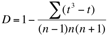
 

The function returns several results as a list:

  • uval – The calculated U value for the pairwise comparison (the larger of the two calculated values).
  • crit – The critical U value at 95%.
  • value – The exact probability for the pairwise comparison.

The function also displays the results to the console, even if you assign the result to a named object.

hog3
  Upper Mid Lower
1     3   4    11
2     4   3    12
3     5   7     9
4     9   9    10
5     8  11    11
6    10  NA    NA
7     9  NA    NA

KW.post(Upper, Lower, data = hog3)

Data:  hog3
Pairwize comparison of:  Upper  and  Lower
U-value:  32.5
U-crit (95%):  31.06011
Post-hoc p-value:  0.02641968

If your data are in scientific recording layout, that is you have a response variable and a predictor variable, then you need a slightly different approach. You’ll have to work out a U-test result first, then run the KWp.post() and/or KWu.post() commands (see below).

The KWp.post() function

KWp.post(Uval, grp, n1, n2)
Uval A calculated U-value for the pairwise comparison (the larger of the two calculated values).
grp The number of groups (samples) in the original Kruskal-Wallis test.
n1, n2 The sample sizes of the two groups being analysed.


This function returns an exact p-value for a post hoc analysis. The value is returned immediately.

KWp.post(18, grp = 3, 7, 5)
Post-hoc p-value: 0.9851855

You can carry out a wilcox.test() on two samples to obtain a U-value. You need to know samples sizes because you need the larger of the two U values.

The wilcox.test() only gives one value so you must work out if the value you got was the largest. It so happens that:

n1 * n2 = U1 + U2

This means that you can work out the alternative U-value easily if you know sample sizes.

If your data are in recording layout, with a predictor and response, you’ll need to use the subset parameter to carry out the pairwise test:

hog2
   count  site
1      3 Upper
2      4 Upper
3      5 Upper
4      9 Upper
5      8 Upper
6     10 Upper
7      9 Upper
8      4   Mid
9      3   Mid
10     7   Mid
11     9   Mid
12    11   Mid
13    11 Lower
14    12 Lower
15     9 Lower
16    10 Lower
17    11 Lower

wilcox.test(count ~ site, data = hog2, subset = site %in% c("Upper", "Lower"))

Wilcoxon rank sum test with continuity correction
data:  count by site
W = 32.5, p-value = 0.01732
alternative hypothesis: true location shift is not equal to 0

Check the sample sizes:

replications(count ~ site, data = hog2)

$site
site
Lower   Mid Upper
    5     5     7

Now you can see if the U-value you got was the largest:

5*7 – 32.5
[1] 2.5

Since it is the largest, you can use it in the KWp.post() function:

KWp.post(32.5, grp = 3, 5, 7)

Post-hoc p-value: 0.02641968

Generally speaking the wilcox.test() will return the largest U-value if you use the response ~ predictor format for the command. If you run the command on separate samples the returned U-value will depend on the order you specify the samples.

The KWu.post() function

KWu.post(CI = 0.95, grp, n1, n2)
CI = 0.95 The confidence interval, defaults to 0.95. This is essentially a significance level of p = 0.05.
grp The number of groups (samples) in the original Kruskal-Wallis test.
n1, n2 The sample sizes of the two groups being analysed.


This function returns a U-value for a given confidence level. You supply the number of groups (samples) in the original Kruskal-Wallis test and the sizes of the two samples being compared. The result is a critical value, which means you can carry out the wilcox.test() and compare the resulting U-value to this critical value.

KWu.post(CI = c(0.95, 0.99), grp = 3, n1 = 5, n2 = 5)
Post-hoc critical U value:    23.71961 26.44729

In the example you see that you can set multiple confidence intervals. Here the critical U values for p = 0.05 and p = 0.01 are returned.

Adjustment for tied ranks in the Kruskal-Wallis test

Exercise 10.2.b.

Statistics for Ecologists (Edition 2) Exercise 10.2.b

These notes are concerned with the Kruskal-Wallis test (Section 10.2). The notes show you how to adjust your test statistic when you have tied values, and so tied ranks.

Adjusting for tied ranks in the Kruskal-Wallis test

Introduction

The Kruskal-Wallis test is appropriate when you have non-parametric data and one predictor variable (Section 10.2). It is analogous to a one-way ANOVA but uses ranks of items in various groups to determine the likely significance.

When you have tied values, you will get tied ranks. In these circumstances you should apply a correction to your calculated test statistic. The notes show you how this can be done. The calculations are simple but in Excel it can be difficult to get the process “automated”. In R the kruskal.test() command computes the adjustment for you.

Calculating the adjustment factor

In order to correct for tied ranks you first need to know which values are tied. Then you need to know how many ties there are for each rank value. Finally, you’ll need to know how many replicates there are in the dataset.

Once you’ve ascertained these things you can use the following formula to work out a correction, or adjustment, factor:

In the formula t is the number of ties for each rank value. For each value of t, you evaluate the t-cubed minus t part. This is then summed for all the tied values (values without ties can also be evaluated but 13 – 1 = 0). Once you have the numerator you work out the denominator using n, the number of replicates in the original dataset.

The final value of D is then 1 – your fraction.

Adjusting the KW test statistic

Once you have the value of D, the correction factor, you can use it to adjust the original Kruakal-Wallis test statistic (H).

Formula for adjustment of the Kruskal-Wallis statistic in the case of tied ranks.

The correction is simple: H/D.

You then use the Hadj value in place of the original to determine the final test significance (using critical values tables – see exercise 10.2a).

Example data

Have a look at the correction in action using the following example:

Example data. Three non-parametric samples for use in Kruskal-Wallis test.

Upper Mid Lower
3 4 11
4 3 12
5 7 9
9 9 10
8 11 11
10
9


Here there are three samples and you can see that there are tied values, so you know there will be tied ranks.

Example ranks

The first step is to evaluate the ranks. Each value is replaced by its rank in the overall dataset.

Sample data shown as ranks instead of original values. Samples are combined for ranking.

Upper Mid Lower
1.5 3.5 15
3.5 1.5 17
5 6 9.5
9.5 9.5 12.5
7 15 15
12.5
9.5


The Kruskal-Wallis test looks at the sum of the ranks from each sample. If the ∑rank is different between samples there is a good chance that differences are statistically significant. If the ∑rank are close, then differences are less likely to be significant.
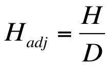
In this example the rank sums are:

Rank sums for three samples.

Upper Mid Lower
48.5 35.5 69


You can now calculate the Kruskal-Wallis test statistic, H.

Original H value

Once you have the rank sums you can compute the Kruskal-Wallis test statistic:

Formula for calculating the Kruskal-Wallis statistic for non-parametric samples.

The Kruskal–Wallis formula looks pretty horrendous but actually it is not that bad. The numbers 12 and 3 are constants. Uppercase N is the total number of observations. The R refers to the ranks of the observations in each sample and n is the number of observations per sample.

In the example the final value of the Kruskal-Wallis statistic works out to be H = 6.403.

Tied ranks

The formula for working out the correction factor was given earlier. You need to work out, for each rank value, the number of repeats.

It is not easy to do this “automatically” using Excel. There are ways you could make a template to evaluate the ties for you but it is complicated. Since you can do it using a bit of copy and paste, this is what you’ll see here.

Start by assembling the ranks into a single column. This means a bit of copy and paste but you’ll probably need to use Paste Special to place the Values only.

When you paste the ranks you only want the numbers and don’t want the formula (which would give an error).

Once you have the column of ranks you can simply re-arrange them in ascending order (use the Home > Sort & Filter button or the Data > Sort button). In the following table the second column shows the sorted ranks (you don’t need to make a second column, I have done this to show the effect).

Rearranging ranked data to make calculation of tied ranks easier.

Rnk Ord Ties T3-T
1.5 1.5
3.5 1.5 2 6
5 3.5
9.5 3.5 2 6
7 5
12.5 6
9.5 7
48.5 9.5
3.5 9.5
1.5 9.5
6 9.5 4 60
9.5 12.5
15 12.5 2 6
17 15
9.5 15
12.5 15 3 24
15 17
15 48.5


Once you have the ranks in order it is easy to work out the number of repeats by inspection. You can simply fill in the values as you work down the column. In the preceding table the 3rd column shows the tied rank repeats. So, for example the rank 1.5 is repeated 2 times. The rank 9.5 has 4 repeats.

The final column shows the T3 – T values. In other words, you take the number of repeats and cube it, then subtract the number of repeats.

Once you have these values you can sum them to get an overall value, in this case 102.

Final H adjustment

Once you have your final sum of T3 -3 values you can work out the value of D using the formula given earlier. You need to know the total number of replicates in the original dataset (in this case 17).

The final value of D works out at: 0.9792.

The adjusted H value is then H/D = 6.403 / 0.9792 = 6.540.

You can now use the adjusted H-value to compare to critical value tables (see exercise 10.2a) to see if your result is statistically significant.

(more…)