Graphs – Data Visualization Using R
- Bar Charts
- Histograms
- Stem-Leaf plots
- Box-Whisker plots
- Scatter plots
- Line plots
- Time Series
- Pie Charts
R has great graphical power but it is not a point and click interface. This means that you must use typed commands to get it to produce the graphs you desire. This can be a bit tedious at first but once you have the hang of it you can save a list of useful commands as text that you can copy and paste into the R command line.
Bar Charts
The bar chart (or column chart) is a familiar type of graph and a useful graphical tool that may be used in a variety of ways. In essence a bar chart shows the magnitude of items in categories, each bar being a single category (or item). The basic command is barplot() and there are many potential parameters that can be used with it, here are some of the most basic:
barplot(x, names.arg, beside, horiz, col, xlab, ylab, main, legend, ...)
Where:
- x – the data to plot; either a single vector or a matrix.
- arg – the names to appear under the bars, if the data has a names attribute this will be used by default.
- beside – used in multi-category plots. The default (FALSE) will create a bar for each group of categories as a stack. If you set beside = TRUE the bars will appear separately in blocks.
- horiz – the default is for vertical bars (columns), set horiz = TRUE to get horizontal bars. Note however that the bottom axis is always x and the vertical y when it comes to labelling.
- col – the colours to use for the bars.
- xlab – a text label for the x-axis (the bottom axis, even if horiz = TRUE).
- ylab – a text label for the y-axis (the left axis, even if horiz = TRUE).
- main – an overall plot title.
- legend – should the chart incorporate a legend (the default is FALSE). If you include a legend it defaults to the middle of the right axis.
- … – there are many other options!
It is easiest to get to grips with the various options by seeing some examples.
Single category bar charts
The simplest kind of bar chart is where you have a sample of values like so:
> VADmeans = colMeans(VADeaths)
> VADmeans
Rural Male Rural Female   Urban Male Urban Female
     32.74        25.18        40.48        25.28
The colMeans() command has produced a single sample of 4 values from the dataset VADeaths (these data are built-in to R). Each value has a name (taken from the columns of the original data). So, you have one row of data split into 4 categories, each will form a bar:
> barplot(VADmeans, main = "Road Deaths in Virginia", xlab = "Categories", ylab = "Mean Deaths")
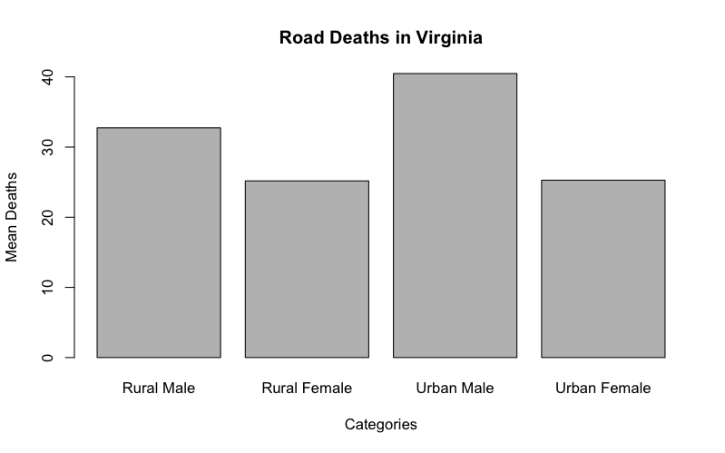
In this case the bars are labelled with the names from the data but if there were no names, or you wanted different ones, you would need to specify them explicitly:
barplot(VADmeans, names.arg = c("RM", "RF", "UM", "UF"))
Multiple category bar charts
The VADeaths dataset consists of a matrix of values with both column and row labels:
> VADeaths
      Rural Male Rural Female Urban Male Urban Female
50-54       11.7          8.7       15.4          8.4
55-59       18.1         11.7       24.3         13.6
60-64       26.9         20.3       37.0         19.3
65-69       41.0         30.9       54.6         35.1
70-74       66.0         54.3       71.1         50.0
The columns form one set of categories (the gender and location), the rows form another set (the age group). If you create a bar chart the default will be to group the data into columns, split by row (in other words a stacked bar chart).
There are various ways you can present these data.
Stacked bar charts
The default when you have a matrix of values is to present a stacked bar chart where the columns form the main set of bars:
> barplot(VADeaths, legend = TRUE)
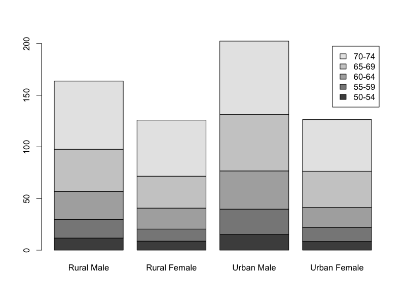
Here the legend parameter was added to give an indication of which part of each bar relates to which age group. There are many additional parameters that “tweak” the legend!
Grouped bar charts
If you want to present the categories entirely separately (i.e. grouped instead of stacked) then you use the beside = TRUE parameter.
> barplot(VADeaths, legend = TRUE, beside = TRUE)

This is fine but the colour scheme is kind of boring. Here is a new set of commands:
> barplot(VADeaths, beside = TRUE, col = c("lightblue", "mistyrose", "lightcyan","lavender", "cornsilk"), legend = TRUE, ylim = c(0, 100))
> title(main = "Death Rates in Virginia", font.main = 4)
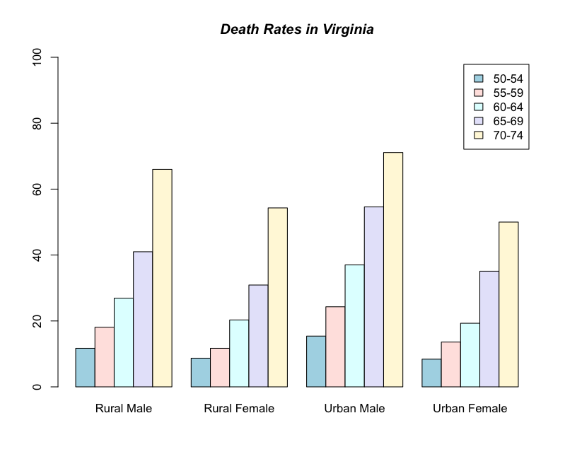
This is a bit better. We have specified a list of colours to use for the bars. Note how the list is in the form c(item1, item2, item3, item4). The command ylim sets the limits of the y-axis. In this case a lower limit of 0 and an upper of 100. The command is in the form ylim= c(lower, upper) and note again the use of the c(item1, item2) format. The legend takes the names from the row names of the datafile. The y-axis has been extended to accommodate the legend box.
It is possible to specify the title of the graph as a separate command, which is what was done above. The command title() achieves this but of course it only works when a graphics window is already open. The command font.main sets the typeface, 4 produces bold italic font.
Bar chart of transposed data
The default behavior in the barplot() command is to draw the bars based on the columns. If you wanted to draw the rows instead then you need to transpose the matrix. The t() command will do this. Try the following for yourself:
barplot(t(VADeaths), beside = TRUE, legend = TRUE, ylim = c(0, 100))
Frequency plots
Sometimes you will have a single column of data that you wish to summarize. A common use of a bar chart is to produce a frequency plot showing the number of items in various ranges. Here is a vector of numbers:
> carb
[1] 75 67 70 75 65 71 67 67 76 68
> barplot(carb)
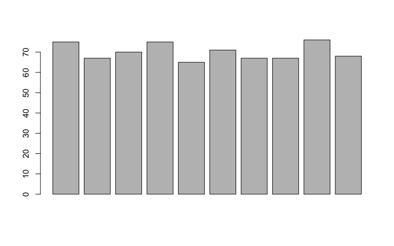
> barplot(table(carb))
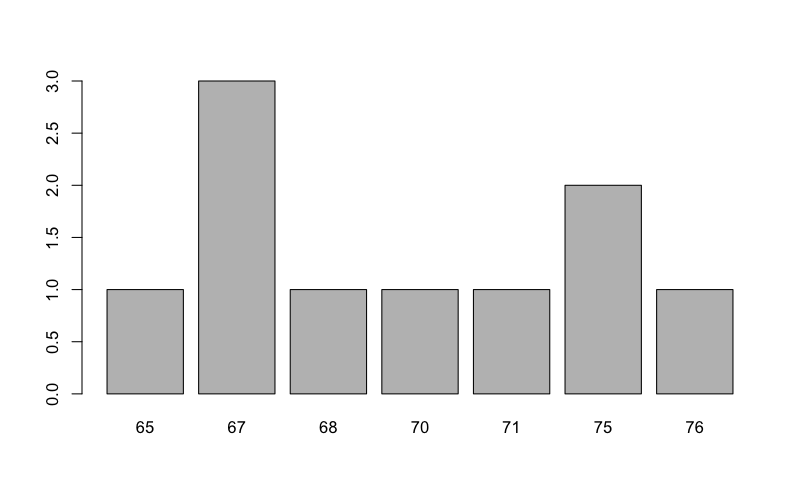
This is much better. Now you have the frequencies for the data arranged in several categories (sometimes called bins). As with other graphs you can add titles to axes and to the main graph.
You can look at the table() function directly to see what it produces.
> table(carb)
carb
65 67 68 70 71 75 76
 1  3  1  1  1  2  1
You can see that the function has summarized the data for us into various numerical categories. Note that is not a “proper” histogram (you’ll see these shortly), but it can be useful.
you may wish to show the frequencies as a proportion of the total rather than as raw data. To do this you simply divide each item by the total number of items in your dataset:
barplot(table(carb)/length(carb))
This shows exactly the same pattern but now the total of all the bars add up to one.
It is straightforward to rotate your plot so that the bars run horizontal rather than vertical (which is the default). To produce a horizontal plot you add horiz= TRUE to the command e.g.
> barplot(table(carb), horiz = TRUE, col = "lightgreen", xlab = "Frequency", ylab = "Range")
> title(main = "Horizontal Bar Plot", font.main = 4)
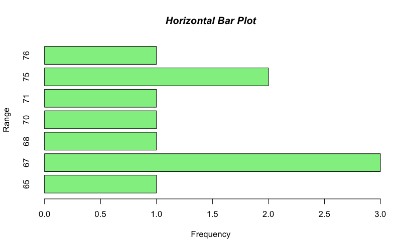
This time I used the title() command to add the main title separately. The value of 4 sets the font to bold italic (try other values).
Histograms
The barplot() function can be used to create a frequency plot of sorts but it does not produce a continuous distribution along the x-axis. A true frequency distribution should have the bar categories (i.e. the x-axis) as continuous items. The frequency plot produced previously had discontinuous categories.
To create a frequency distribution chart you need a histogram, which has a continuous range along the x-axis. The command in R is hist(), and it has various options:
hist(x, breaks, freq, col, ...)
Where:
- x – the data to describe, this is usually a single numerical sample (i.e. a vector).
- breaks – how to split the break-points. You can give the explicit values (on the x-axis) where the breaks will be, the number of break-points you want, or a character describing an algorithm: the options are “Sturges” (the default), “Scott”, or “FD” (or type “Freedman-Diaconis”).
- freq – if set to TRUE the bars show the frequencies. If set to FALSE the bars show density (in which case the total area under the bars sums to 1).
- col – the colour(s) for the bars.
- … – there are plenty of other options!
Here are some of the options in action:
> test.data
[1] 2.1 2.6 2.7 3.2 4.1 4.3 5.2 5.1 4.8 1.8 1.4 2.5 2.7 3.1 2.6 2.8

> hist(test.data)

To plot the probabilities (i.e. proportions) rather than the actual frequency you need to add the parameter, freq = FALSE like so:
hist(test.data, freq = FALSE)
You can also use probability = TRUE (instead of freq = FALSE) in the command.
This is useful but the plots are a bit basic and boring. You can change axis labels and the main title using the same commands as for the barplot() command. Here is a new plot with a few enhancements:
> hist(test.data, col = "cornsilk", xlab = "Data range", ylab = "Frequency of data", main = "Histogram", font.main = 4)
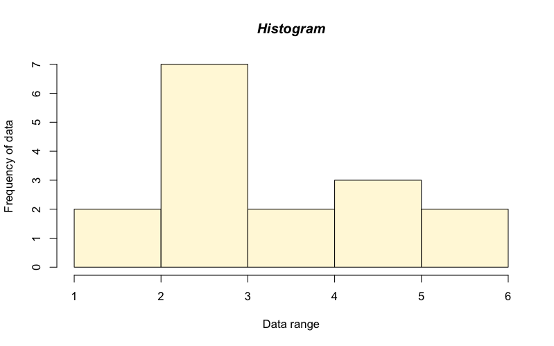
These commands are largely self-explanatory. The 4 in the font.main parameter sets the font to italic (try some other values).
By default R works out where to insert the breaks between the bars using the “Sturges” algorithm. You can try other methods:
> hist(test.data, breaks = 10)
> hist(test.data, breaks = c(1,2,3,max(test.data)))
Using explicit break-points can lead to some “odd” looking histograms, try the examples for yourself (you can copy the data and paste into R)!
Notice how the exact break points are specified in the c(x1, x2, x3) format. You can manipulate the axes by changing the limits e.g. make the x-axis start at zero and run to 6 by another simple command e.g.:
> hist(test.data, 10, xlim=c(0,6), ylim=c(0,10))

This sets 10 break-points and sets the y-axis from 0-10 and the x-axis from 0-6. Notice how the commands are in the format c(lower, upper). The xlim and ylim parameters are useful if you wish to prepare several histograms and want them all to have the same scale for comparison.
Stem-Leaf plots
A very basic yet useful plot is a stem and leaf plot. It is a quick way to represent the distribution of a single sample. The basic command is:
stem(x, scale = 1, ...)
Where:
- x – the data to be represented.
- scale – how to expand the number of bins presented (default, scale = 1).
The stem() command does not actually make a plot (in that is does not create a plot window) but rather represents the data in the main console.
> test.data
[1] 2.1 2.6 2.7 3.2 4.1 4.3 5.2 5.1 4.8 1.8 1.4 2.5 2.7 3.1 2.6 2.8
> stem(test.data)

The decimal point is at the |

1 | 48
2 | 1566778
3 | 12
4 | 138
5 | 12
The stem-leaf plot is a way of showing the rough frequency distribution of the data. In most cases a histogram would be a better option.
The scale parameter alters the number of rows; it can be helpful to set scale to a larger value than 1 in some cases.
Box-Whisker plots
A box and whisker graph allows you to convey a lot of information in one simple plot. Each sample produces a box-whisker combination where the box shows the extent of the inter-quartiles (that is the 1st and 3rd quartiles), and the whiskers show the max and min values. A stripe is added to the box to show the median. The basic command is boxplot() and it has a range of options:
boxplot(x, range, names, col, horizontal, ...)
Where:
- x – the data to plot. This can be a single vector or several (separated by commas). Alternatively you can give a formula of the form y ~ x where y is a response variable and x is a predictor (grouping) variable.
- range – the extent of the whiskers. By default values > 1.5 times the IQR from the median are shown as outliers (points). Set range = 0 to get whiskers to go to the full max-min.
- names – the names to be added as labels for the boxes on the x-axis.
- col – the colour(s) for the boxes.
- horizontal – if TRUE the bars are drawn horizontally (but the bottom axis is still considered as the x-axis). The default is FALSE.
- … – there are various other options.
The boxplot() command is very powerful and R is geared-up to present data in this form!
Single sample boxplot
You can create a plot of a single sample. If the data are part of a larger dataset then you need to specify which variable to draw:
> head(trees)
  Girth Height Volume
1   8.3     70   10.3
2   8.6     65   10.3
3   8.8     63   10.2
4  10.5     72   16.4
5  10.7     81   18.8
6  10.8     83   19.7

> boxplot(trees$Height, col = "lightgreen", ylab = "Value axis", xlab = "Single sample", main = "Single Box plot")

> boxplot(trees$Volume, col = "lightgreen", ylab = "Value axis", xlab = "Single sample", main = "Box plot with outlier")

Now you see an outlier outside the range of the whiskers. R doesn’t automatically show the full range of data (as I implied earlier). You can control the range shown using a simple parameter range= n. If you set n to 0 then the full range is shown. Otherwise the whiskers extend to n times the inter-quartile range. The default is set to n = 1.5.
> boxplot(trees$Volume, col = "lightgreen", range = 0, ylab = "Value axis", xlab = "Single sample", main = "Box plot with full range")

Plotting several samples
If your data contain multiple samples you can plot them in the same chart. The form of the command depends on the form of the data.
> flies
    C  F F.G  G  S
1  75 58  58 57 62
2  67 61  59 58 66
3  70 56  58 60 65
4  75 58  61 59 63
5  65 57  57 62 64
6  71 56  56 60 62
7  67 61  58 60 65
8  67 60  57 57 65
9  76 57  57 59 62
10 68 58  59 61 67

> boxplot(flies, col = "bisque")
> title(xlab = "Food type", ylab = "Size", main = "Fly growth and sugar diet")
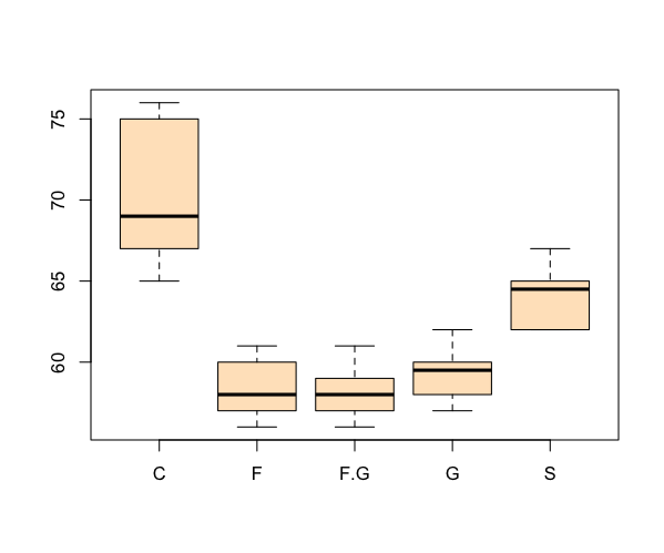
In this example the data were arranged in sample layout, so the command only needed to specify the “container”. If the data are set out with separate variables for response and predictor you need a different approach.
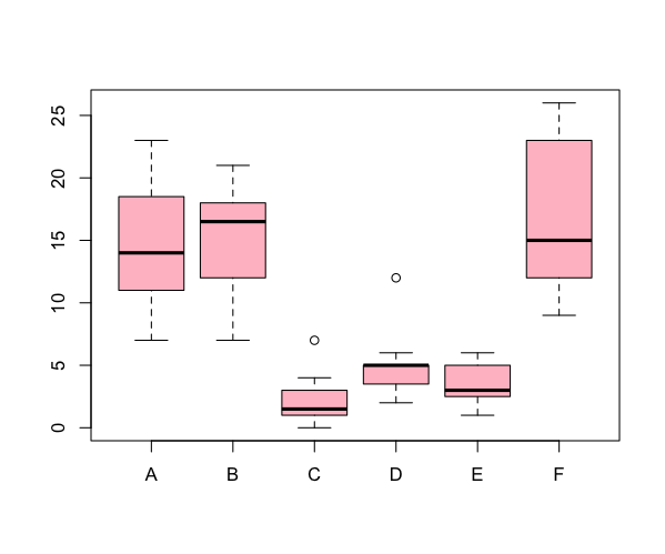
> head(InsectSprays)
  count spray
1    10     A
2     7     A
3    20     A
4    14     A
5    14     A
These data have a response variable (dependent variable), and a predictor variable (independent variable). You need to specify the data to plot in the form of a formula like so:
> boxplot(count ~ spray, data = InsectSprays, col = "pink")
The formula is in the form y ~ x, where y is your response variable and x is the predictor. You can specify multiple predictor variables in the formula, just separate then with + signs.
Horizontal box plots
It is straightforward to rotate your plot so that the bars run horizontal rather than vertical (which is the default). To produce a horizontal plot you add horizontal= TRUE to the command e.g.
> boxplot(flies, col = "mistyrose", horizontal = TRUE)
> title(xlab = "Growth", ylab = "Sugar type", main = "Horizontal box-plot")
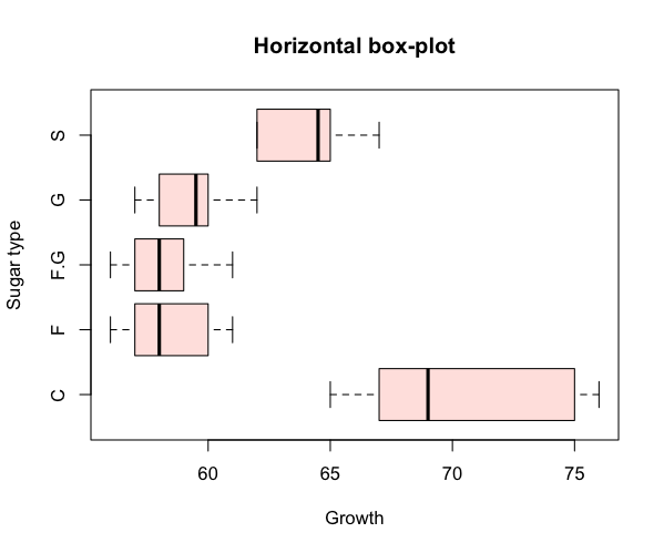
When you add the titles, either as part of the plotting command or separately via the title() function, you need to remember that ylab is always the vertical (left) axis and xlab refers to the bottom (horizontal) axis.
Scatter plots
A scatter plot is used when you have two variables to plot against one another. R has a basic command to perform this task. The command is plot(). As usual with R there are many additional parameters that you can add to customize your plots.
The basic command is:
plot(x, y, pch, xlab, xlim, col, bg, ...)
Where:
- x, y – the names of the variables (you can also use a formula of the form y ~ x to “tell” R how to present the data.
- pch – a number giving the plotting symbol to use. The default (1) produces an open circle (try values 0–25).
- xlab, ylab – character strings to use as axis labels.
- xlim, ylim – the limits of the axes in the form c(start, end).
- col – the colour for the plotting symbols.
- bg – if using open symbols you use bg to specify the fill (background) colour.
- … – there are many additional parameters that you might use.
Here is an example using one of the many datasets built into R:
> head(cars)
  speed dist
1     4    2
2     4   10
3     7    4
4     7   22
5     8   16
6     9   10

> plot(dist ~ speed, data = cars)

The default is to use open plotting symbols. You can alter this via the pch parameter. The names on the axes are taken from the columns of the data. If you type the variables as x and y the axis labels reflect what you typed in:
plot(cars$speed, cars$dist)
This command would produce the same pattern of points but the axis labels would be cars$speed and cars$dist. You can use other text as labels, but you need to specify xlab and ylab from the plot() command.
As usual with R there are a wealth of additional commands at your disposal to beef up the display. A useful additional command is to add a line of best-fit. This is a command that adds to the current plot (like the title() command). For the above example you would type:
abline(lm(dist ~ speed, data= cars))
The basic command uses abline(a, b), where a= slope and b= intercept. Here a linear model command was used to calculate the best-fit equation (try typing the lm() command separately, you get the intercept and slope).
If you combine this with a couple of extra lines you can produce a customized plot:
> plot(dist ~ speed, data= cars, xlab = "Speed", ylab = "Distance, col= "blue")
> title(main = "Scatter plot with best-fit line", font.main = 4)
> abline(lm(dist ~ speed, data= cars), col= "red")

You can alter the plotting symbol using the command pch= n, where n is a simple number. You can also alter the range of the x and y axes using xlim= c(lower, upper) and ylim= c(lower, upper). The size of the plotted points is manipulated using the cex= n parameter, where n = the ‘magnification’ factor. Here are some commands that illustrate these parameters:
> plot(dist ~ speed, data= cars, pch= 19, xlim= c(0,25), ylim= c(-20, 120), cex= 2)
> abline(lm(dist ~ speed, data= cars))
> title(main = "Scatter plot with altered y-axis")

Here the plotting symbol is set to 19 (a solid circle) and expanded by a factor of 2. Both x and y axes have been rescaled. The labels on the axes have been omitted and default to the name of the variable (which is taken from the data set).
If you produce a plot you generally get a series of points. The default symbol for the points is an open circle but you can alter it using the pch= n parameter (where n is a value 0–25). Actually the points are only one sort of plot type that you can achieve in R (the default). You can use the parameter type = “type” to create other plots.
- “p” – produces points (the default).
- “l” – lines only (straight lines connecting the data in the order they are in the dataset).
- “b” – points joined with segments of line between (i.e. there are gaps).
- “o” – overplot; that is lines with points overlaid (i.e. the line has no gaps).
- “n” – nothing is plotted!
So, if your data are “time sensitive” you can choose to display connecting lines and produce some kind of line plot.
Line plots
You generally use a line plot when you want to “follow” a data series from one interval to another. If your x-data are numeric you can achieve this easily:
> nile
   year flow
1  1871 1120
2  1872 1160
3  1873  963
4  1874 1210
5  1875 1160
6  1876 1160
7  1877  813
8  1878 1230
9  1879 1370
10 1880 1140
> plot(nile, type = “b”)
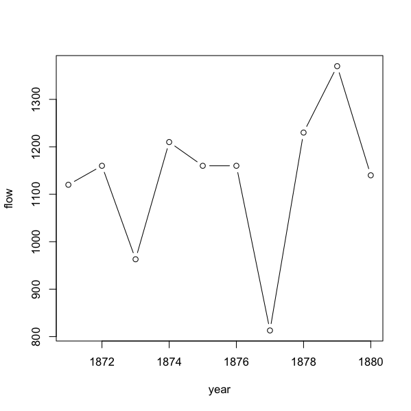
Here we use type = “b” and get points with segments of line between them. Note that the x-axis tick-marks line up with the data points. This is unlike an Excel line plot, where the points lie between tick-marks.
In R a line plot is more akin to a scatter plot. In Excel a line plot is more akin to a bar chart.
Custom Axes
If your x-axis data are numeric your line plots will look “normal”. However, if your data are characters (e.g. month names) then you get something different.
> vostok
   month  temp
1    Jan -32.0
2    Feb -47.3
3    Mar -57.2
4    Apr -62.9
5    May -61.0
6    Jun -70.6
7    Jul -65.5
8    Aug -68.2
9    Sep -63.2
10   Oct -58.0
11   Nov -42.0
12   Dec -30.4
These data show mean temperatures for a research station in the Antarctic. If you attempt to plot the whole variable e.g. plot(temp ~ month) you get a horrid mess (try it and see). This is because the month is a factor and cannot be represented on an x, y scatter plot.
However, if you plot the temperature alone you get the beginnings of something sensible:
> plot(vostok$temp)

So far so good. There appear to be a series of points and they are in the correct order. You can easily join the dots to make a line plot by adding (type= “b”) to the plot command. Notice that the axis label for the x-axis is “Index”, this is because you have no reference (you only plotted a single variable).
What you need to do next is to alter the x-axis to reflect your month variable. You’ll need to make a custom axis with the axis() command but first you need to re-draw the plot without any axes:
> plot(vostok$temp, axes = FALSE, ylab = "Temperature", type = "b", xlab = "Month")
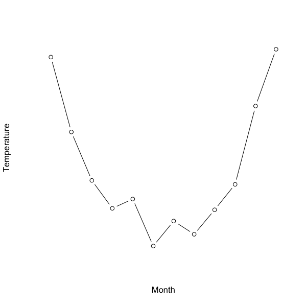
The bottom (x-axis) is the one that needs some work. There are 12 values so the at = parameter needs to reflect that. The labels are the month names, which are held in the month variable of the data.
> axis(1, at = 1:12, labels = vostok$month, cex.axis = 0.9)

So, the bottom axis ends up with 12 tick-marks and labels taken from the month variable in the original data. Note that here I had to tweak the size of the axis labels with the cex.axis parameter, which made the text a fraction smaller and fitted in the display.
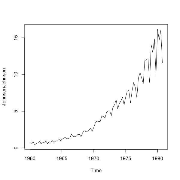
Some datasets are already in a special format called a time-series. R “knows” how the data are split time-wise. Here is an example that is built-in to R”
> JohnsonJohnson
      Qtr1  Qtr2  Qtr3  Qtr4
1960  0.71  0.63  0.85  0.44
1961  0.61  0.69  0.92  0.55
1962  0.72  0.77  0.92  0.60
1963  0.83  0.80  1.00  0.77
1964  0.92  1.00  1.24  1.00
1965  1.16  1.30  1.45  1.25
Time series objects have their own plotting routine and automatically plot as a line, with the labels of the x-axis reflecting the time intervals built into the data:
> plot(JohnsonJohnson)
A time-series plot is essentially plot(x, type = “l”) where R recognizes the x-axis and produces appropriate labels.
Pie Charts
Pie charts are not necessarily the most useful way of displaying data but they remain popular. You can produce pie charts easily in R using the basic command pie():
pie(x, labels, clockwise, init.angle, col, ...)
Where:
- x – the data to plot. This is a single sample (vector) of numbers.
- labels – a character string to use for labels (the default takes the names from the data if there are any).
- clockwise – the default is FALSE, producing slices of pie in a counterclockwise (anticlockwise) direction.
- angle – the starting point for the first slice of pie. The default is 90 (degrees) if plotting anticlockwise and 0 if clockwise.
- col – colours to use for the pie slices. If you specify too few colours they are recycled and if you specify too many some are not used. The default colours are pastel shades.
- … – there are several additional parameters you could use.
A basic pie chart could be made so:
> VADmeans = colMeans(VADeaths)
> VADmeans
Rural Male Rural Female   Urban Male Urban Female
     32.74        25.18        40.48        25.28
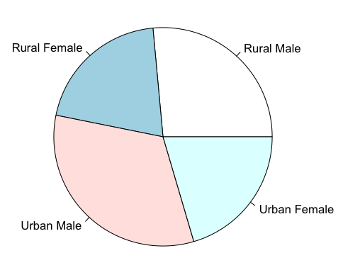
> pie(VADmeans)

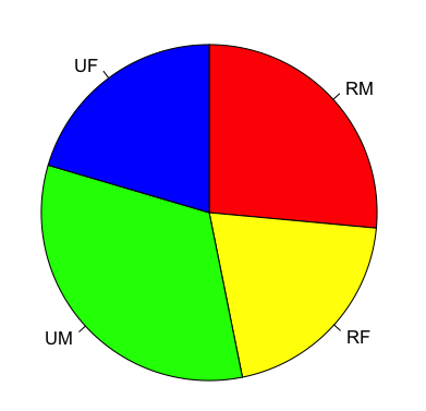
You can alter the labels used and the colours as well as the direction the pie is drawn:
> pie(VADmeans, labels = c("RM", "RF", "UM", "UF"), clockwise = TRUE, col = c("red", "yellow", "green", "blue"))
Setting the starting angle is slightly confusing (well, I am always confused). The init.angle parameter requires a value in degrees and 90 degrees is 12 o’clock (0 degrees is 3 0’clock).
Comments are closed.