Plot two (overlapping) histograms on one chart in R
I was preparing some teaching material recently and wanted to show how two samples distributions overlapped. This meant I needed to work out how to plot two histograms on one axis and also to make the colors transparent, so that they could both be discerned.
For my teaching example I wanted to make some normally distributed data and show how the overlap changes as the means and variance of the samples alters. However, being able to plot two sample distributions on a single chart is a generally useful thing so I wrote some code to take two samples and do just that.
Transparent colors
The first step is to make transparent colors; then any overlapping bars will remain visible. The key command is rgb() but you need to get R G and B values first.
Pick a color
Select a color that you want to make transparent. Then use the col2rgb() command to get the red, green and blue values you need for the rgb() command e.g.:
> col2rgb("lightblue")
      [,1]
red    173
green  216
blue   230
This gives you a matrix with three rows (red, blue, green). This means you can get values for several colors at once:
> col2rgb(c("lightblue", "lightgreen", "pink"))
      [,1] [,2] [,3]
red    173  144  255
green  216  238  192
blue   230  144  203
Make your chosen color transparent
The rgb() command defines a color: you define a new color using numerical values (0–255) for red, green and blue. In addition, you set an alpha value (also 0–255), which sets the transparency (0 being fully transparent and 255 being “solid”).
You also need to set the maximum color value, so that the command can relate your alpha value to a level of transparency. In practice setting max = 255 works well (since RGB colors are usually defined in the range 0–255).
The following example takes the standard blue and makes it transparent (~50%):
> mycol <- rgb(0, 0, 255, max = 255, alpha = 125, names = "blue50")
Note that the names parameter sets a name attribute for your color. You cannot use the name directly but it can be useful to see a name. You can call your colors anything of course, here they are simply named c1 and c2:
> c1 <- rgb(173,216,230,max = 255, alpha = 80, names = "lt.blue")
> c2 <- rgb(255,192,203, max = 255, alpha = 80, names = "lt.pink")
Make your histograms
The hist() command makes a histogram. Here is an example using some defaults.
> A # a numeric vector
[1] 17 26 28 27 29 28 25 26 34 32 23 29 24 21 26 31 31 22 26 19 36 23 21 16 30

> hist(A, col = "lightblue")
The defaults set the breakpoints and define the limits of the x-axis too. The histogram is plotted by default but you can alter this and save the histogram to a named object, which is going to be useful.

Histogram breakpoints
The breakpoints are set using the breaks parameter. There are 3 main options:
- A character string giving one of the in-built algorithms: “Sturges”, “Scott” or “FD” (“Freedman-Diaconis”).
- A number giving the desired number of breaks (you can also give a formula that produces a single number).
- A numerical vector giving the explicit breakpoints (or a formula that results in a numeric vector).
For example:
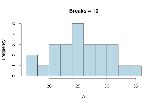
> hist(A, col = "lightblue", breaks = 10, main = "Breaks = 10")


The previous example used a set number of breakpoints. You can set explicit values too (which also means you can have unequal bar widths!):
> range(A)
[1] 16 36

> pretty(15:36, n = 12)
[1] 14 16 18 20 22 24 26 28 30 32 34 36

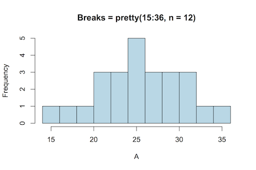
> hist(A, breaks = pretty(15:36, n = 12), col = "lightblue", main = "Breaks = pretty(15:36, n = 12)")
Note that the second breakpoint is the right edge of the first histogram bar. In the previous example the pretty() command was used to set the breaks. This command splits up a range of values into a tidy set of values, and is generally used internally by graphics commands to set axes.
Histogram x-axis width
The limits of the x-axis are set by the breakpoints but you can over-ride them as you need. There are two ways you can control the width, either way will permit you to make the space for two histograms on the one axis:
- Use the xlim parameter: you can set the axis width to cover the range of the combined samples.
- Use the breaks parameter: you can set the breaks to cover the range of the combined sample.
Using xlim to set axis limits
The xlim parameter allows you to specify the limits of the x-axis by giving a vector of two values, the start and end.
> A
[1] 17 26 28 27 29 28 25 26 34 32 23 29 24 21 26 31 31 22 26 19 36 23 21 16 30

> B
[1] 27 36 38 37 39 38 35 36 44 42 33 39 34 31 36 41 41 32 36 29 46 33 31 26 40

> range(c(A,B))
[1] 16 46
Unfortunately, simply using the range of the combined samples is not always sufficient!
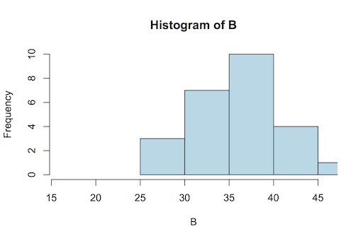
> hist(B, xlim = range(c(A,B)), col = "lightblue")

In the previous example you can see that the x-axis is not quite large enough to accommodate the entire range of the histogram. If you save the histogram to a named object you can see the data:
> hgB <- hist(B, plot = FALSE)

> hgB
$breaks
[1] 25 30 35 40 45 50

$counts
[1] 3 7 10 4 1

$density
[1] 0.024 0.056 0.080 0.032 0.008

$mids
[1] 27.5 32.5 37.5 42.5 47.5

$xname
[1] "B"

$equidist
[1] TRUE

attr(,"class")
[1] "histogram"
So, if you want to use xlim to set the axis limits you should use the histogram $breaks data, rather than the original sample data.
Using pretty() to set axis limits
The pretty() command is useful to set your x-axis limits because it moves the breakpoints about and makes tidy intervals. For example:
> range(c(A,B))
[1] 16 46

> pretty(16:46)
[1] 15 20 25 30 35 40 45 50
If you used this method your x-axis would encompass the entire histogram range.
You can set the “desired” number of breaks in the pretty() command:
> pretty(16:46)
[1] 15 20 25 30 35 40 45 50

> pretty(16:46, n = 10)
[1] 15 20 25 30 35 40 45 50

> pretty(16:46, n = 12)
[1] 16 18 20 22 24 26 28 30 32 34 36 38 40 42 44 46
You set n = your desired optimal number and the command does its best to create approximately that number of intervals.

If you subtract a tiny value from the minimum value you’ll be certain to encompass the entire dataset:
> b <- min(c(A,B)) – 0.001
> e <- max(c(A,B))

> b;e
[1] 15.999
[1] 46

> pretty(b:e, n = 12)
[1] 14 16 18 20 22 24 26 28 30 32 34 36 38 40 42 44 46
Don’t try to set the xlim parameter with the pretty() values, use them as explicit breakpoints:
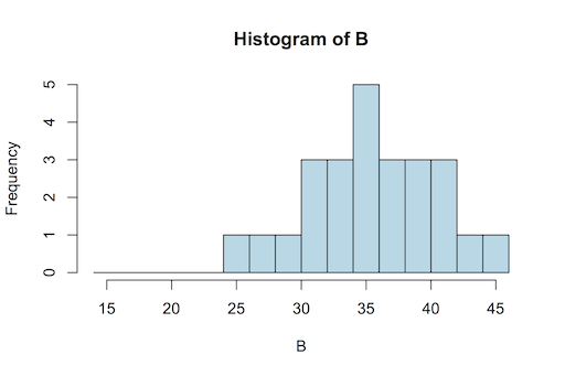
> hist(B, col = "lightblue", breaks = pretty(b:e, n = 12))
Using the pretty() command has an additional benefit: the interval will be the same for both histograms so that when plotted the bars will be the same width.
Histogram chart data
In order to plot two histograms on one plot you need a way to add the second sample to an existing plot. You cannot do this directly via the hist() command.
You need to save your histogram as a named object without plotting it. To do this you specify plot = FALSE as a parameter. If you save the histogram to a named object you can plot it later. Actually you can save the histogram data and plot it at the same time but you cannot add to an existing plot in this way.
> A
[1] 17 26 28 27 29 28 25 26 34 32 23 29 24 21 26 31 31 22 26 19 36 23 21 16 30

> hgA <- hist(A)
> hgA
$breaks
[1] 15 20 25 30 35 40

$counts
[1] 3 7 10 4 1

$density
[1] 0.024 0.056 0.080 0.032 0.008

$mids
[1] 17.5 22.5 27.5 32.5 37.5

$xname
[1] "A"

$equidist
[1] TRUE

attr(,"class")
[1] "histogram"
You can see that the data are stored in $ components and that you can access the frequency or density data. The breakpoints are set at this time and you cannot alter them unless you re-run the command and specify different values.
In order to plot a histogram object you simply use plot(). You can specify add = TRUE to plot a second histogram in the same plot window.
Plot two histograms
If you have a histogram object, all the data you need is contained in that object. Using plot() will simply plot the histogram as if you’d typed hist() from the start. However, you can now use add = TRUE as a parameter, which allows a second histogram to be plotted on the same chart/axis.
To make sure that both histograms fit on the same x-axis you’ll need to specify the appropriate xlim() command to set the x-axis limits. Alternatively, (and probably better) is to set the breakpoints for both histograms to cover the combined range of the samples.
Inevitably some bars will overlap, which is where the transparent colors come in useful. The following steps illustrate the process using the data examples you’ve already seen.
> A;B # The data
[1] 17 26 28 27 29 28 25 26 34 32 23 29 24 21 26 31 31 22 26 19 36 23 21 16 30
[1] 27 36 38 37 39 38 35 36 44 42 33 39 34 31 36 41 41 32 36 29 46 33 31 26 40

> b <- min(c(A,B)) – 0.001 # Set the minimum for the breakpoints
> e <- max(c(A,B)) # Set the maximum for the breakpoints
> ax <- pretty(b:e, n = 12) # Make a neat vector for the breakpoints
> ax
[1] 14 16 18 20 22 24 26 28 30 32 34 36 38 40 42 44 46

> hgA <- hist(A, breaks = ax, plot = FALSE) # Save first histogram data
> hgB <- hist(B, breaks = ax, plot = FALSE) # Save 2nd histogram data

> plot(hgA, col = c1) # Plot 1st histogram using a transparent color
> plot(hgB, col = c2, add = TRUE) # Add 2nd histogram using different color
The result looks something like the following:

In this example the y-axis is sufficient to cover both samples but if your data contain quite different frequencies you can use the ylim parameter to set the appropriate size for the y-axis.
If you want to plot the densities instead of the frequencies you can use freq = FALSE as you would when using the hist() command. This means you could also add the density lines to your plots as well as the histograms. Note that you cannot set the breaks in this manner.
Histograms with different breakpoints

If your histograms have different breakpoints, you’ll need to juggle the xlim parameter to get the right size for the x-axis. The ylim parameter may also need tweaking if frequencies are different.
> hgA <- hist(A, breaks = 12)
> hgB <- hist(B)

> range(c(hgA$breaks, hgB$breaks)) # Get range for x-axis
[1] 16 50

> max(c(hgA$count, hgB$count)) # Get range for y-axis
[1] 10

> plot(hgA, col = c1, xlim = c(16, 50), ylim = c(0,10))
> plot(hgB, add = TRUE, col = c2)
In the previous example both xlim and ylim parameters needed to be altered. Note that although the xlim parameter set the minimum to 16, the axis ended up with a minimum of 15. This is because the plot() command has used pretty() internally to “neaten” the axis intervals.
You only need to alter the xlim and ylim parameters for the first plot because the plot dimensions are already set by the time you add the second histogram.
Comments are closed.