Using Excel for Chi-squared goodness of fit tests
Exercise 9.4.
Statistics for Ecologists (Edition 2) Exercise 9.4
This exercise is concerned with association (Chapter 9), in particular chi squared goodness of fit testing using Excel (Section 9.4).
Using Excel for Chi squared goodness of fit tests
Introduction
Excel has several functions related to the Chi-squared statistic. This allows you to undertake chi-squared goodness of fit testing for example.
In goodness of fit tests, you have one set of frequency data in various categories. You also have a matching set of frequencies that you want to “compare”. The comparison set may be a theoretical set of values or perhaps a previous set of observations. The goodness of fit test is often used in genetic studies where you match up observed phenotypes against a theoretical ratio of expected phenotypes.
The following data will be used:
Data for use in goodness of fit test.
| Colour | Coat | Obs |
| Green | Smooth | 116 |
| Green | Wrinkled | 40 |
| Yellow | Smooth | 31 |
| Yellow | Wrinkled | 13 |
The data show the results of crossing two varieties of pea plants. The attributes of colour and coat type are of interest. There are green and yellow coloured varieties and two coat types: wrinkled and smooth. After crossing, the offspring were sorted into categories according to their colour and coat type. The Obs column shows how many offspring there were in each category (a frequency or count).
The theoretical ratio of phenotypes is 9:3:3:1.
The goodness of fit test can compare the observed frequencies to the theoretical ratios. Does the data match up with the genetic theory?
Get the example data: pea genetics.xlsx.
Calculate expected values
Open the spreadsheet pea genetics.xlsx. There are two worksheets, Data contains the basic data and Completed version has all the calculations (and a graph) completed for you.
First of all, you need to fill in the theoretical ratios and then calculate the expected frequencies based on those:
- In cell D1 type a label, Ratio, for the ratios. Now in the D column type the values 9, 3, 3, 1.
- In B6 type a label, Totals:, for some sum values.
- In C6 type a formula to sum the frequencies (the total number of observations): =SUM(C2:C5). You should get 200.
- Copy and paste the formula in C6 to D6 to give the sum of the ratios. Your result should be 16.
- In cell E1 type a label, Exp, for the expected values.
- In E2 type a formula to work out the expected value: =D2/D$6*C$6. You should get 112.5. Note the use of $ to “fix” some of the cell references.
- Copy and paste the cell E2 down the rest of the column to fill cells E2:E5 and so calculate all the expected frequencies. You can work out the sum if you like, which should be the same as the original, 200.
Your spreadsheet should now appear more or less like the following:
Expected values calculated as part of the goodness of fit test.
| Colour | Coat | Obs | Ratio | Exp |
| Green | Smooth | 116 | 9 | 112.5 |
| Green | Wrinkled | 40 | 3 | 37.5 |
| Yellow | Smooth | 31 | 3 | 37.5 |
| Yellow | Wrinkled | 13 | 1 | 12.5 |
| ∑ | 200 | 16 | 200 |
You are now ready to move on to calculating the chi-squared values and overall significance.
Calculate Chi-squared values
It is useful to see the individual chi-squared values:
- In cell F1 type a label, Chi-Sq, for the chi-squared values.
- In F2 type a formula to calculate the chi-squared value: =(C2-E2)^2/E2. You should get 0.11.
- Now copy and paste the cell F2 to the rest of the column to place the chi-squared values in cells F2:F5.
- Sum the individual chi-squared values to give a total in cell F6: =SUM(F2:F5). You should get 1.42.
You’ll need to compare your total chi-squared to a critical value but you may as well compute the Pearson residuals first.
Pearson residuals
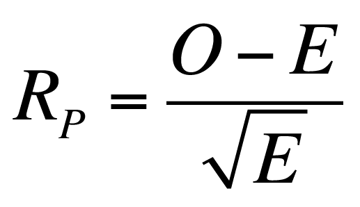
The Pearson residuals are more or less the square root of the chi-squared values.

The advantage is that the sign of the residual tells you about the direction of the difference between the oberved and expected values. Pearson residuals have a z-distribution so values of approximately 2 (1.96) are significant at p < 0.05. In a goodness of fit test small residuals indicate that there is little difference between the observed and expected values.
- In cell G1 type a label, Resid, for the residual values.
- In G2 type a formula to calculate the Pearson residual for the first category: =(C2-E2)/SQRT(E2). You should get 0.33.
- Copy and paste the cell G2 into the rest of the column to calculate residuals for all the categories, cells G2:G5.
You don’t really need a sum for the residuals but you could easily copy the adjacent sum of chi-squared values across.
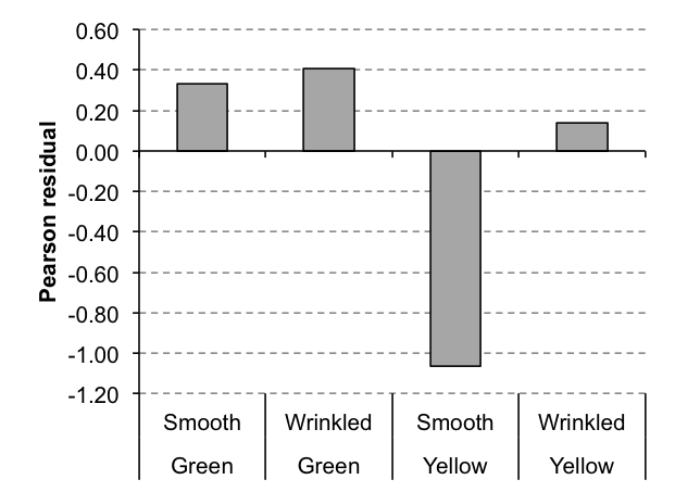
You can use the residuals in a column chart as a visualization of the results later.
Your spreadsheet should now look more or less like the following:
Chi squared and Pearson residuals computed as part of a goodness of fit test.
| Colour | Coat | Obs | Ratio | Exp | Chi-Sq | Resid |
| Green | Smooth | 116 | 9 | 112.5 | 0.11 | 0.33 |
| Green | Wrinkled | 40 | 3 | 37.5 | 0.17 | 0.41 |
| Yellow | Smooth | 31 | 3 | 37.5 | 1.13 | -1.06 |
| Yellow | Wrinkled | 13 | 1 | 12.5 | 0.02 | 0.14 |
| ∑ | 200 | 16 | 200 | 1.42 | -0.18 |
Now you can move on to look at the statistical significance of the results shortly but you can already see from the Pearson residuals than none are > 1.96 and so the result is likely to be not significant.
Critical values and significance
You can check to see if your result is a statistically significant one in several ways. Since you have a total chi-squared value you can compare that to a critical value. You can look up a critical value or use the CHIINV function. You can determine the exact p-value for your total chi-squared value using the CHIDIST function. In either case you’ll need the degrees of freedom (df), which is the number of categories (rows) minus 1. In this case 4-1 = 3.
You can also use the CHITEST function to get an exact p-value from the observed and expected values.
- In cell E7 type a label, df, for the degrees of freedom.
- In F7 type a function to calculate degrees of freedom: =COUNT(C2:C5)-1. The result is 3.
- In E8 type a label, p-val, for the exact p-value.
- In F8 type a function to compute the exact p-value using observed and expected values: =CHITEST(C2:C5,E2:E5). You should get 0.7.
- In E9 type a label, X-sq, for the chi-squared value based on the probability in step 4.
- In F9 type a formula to calculate the chi-squared value based on the p-value from step 4: =CHIINV(F8,F7). You should get the same result as the “long” calculation, 1.422.
- In E10 type a label, X-crit, for the critical chi-squared value at p = 0.05.
- In F10 type a formula to work out the critical value at 5%: =CHIINV(0.05,F7). You should get 7.815 (for df = 3).
- In E11 type another label, p-val, for the exact p-value based on your chi-squared result computed the “long” way.
- In F11 type a formula to calculate the exact p-value for your calculated chi-squared result: =CHIDIST(F6,F7). You should get 0.7 as before.
Now you have all the appropriate statistics, some of them computed in alternative ways. In this case the result is not significant. The calculated chi-squared result is smaller than the critical value. Also, the p-value is > 0.05.
You have determined that there is no significant departure between the observed and expected frequencies. In other words, the ratio of pea phenotypes you observed does not depart significantly from the theoretical ratio (9:3:3:1).
Visualize the results
There are many ways to visualize chi-squared results. One option is to plot the Pearson residuals, as this shows the departures from the “goodness” of the fit between Obs and Exp values and shows the significance.
- Use the mouse to highlight the cells containing the category names (and the headers), that is cells A1:B5.
- Now hold down the Control key and use the mouse to select the Pearson residual values and the header, cells G1:G5.
- You should now have two blocks of cells selected. Click the Insert > Column Chart button and choose the 2D Clustered Column chart option. The chart is created immediately.
- Click once on the chart to ensure the Chart Tools menus are active.
- Click the Format menu and in the Current Selection section use the drop-down to select Horizontal (Category) Axis. Then click the Format Selection You can also double click (or right-click) the axis on the chart itself. This opens the Format Axis dialogue.
- Find the Labels Then choose Low from the Label Position drop-down. This puts the category labels away from the axis (useful when you have bars hanging downwards).
With a bit of formatting and general juggling you can get a plot that resembles the one below.

You could also plot the Obs and Exp values as a column chart, try it by highlighting the cells A1:C5 then with the control key E1:E5.
Comments are closed.