Graphing multiple regression
Exercise 11.1.
Statistics for Ecologists (Edition 2) Exercise 11.1
This exercise is concerned with how to produce and chart some diagnostics for regression models (Sections 11.1 and 11.2). The dataset used to illustrate these notes is available as a file: regression diagnostic.csv.
Graphing multiple regression/linear models
Introduction
When you only have two variables (a predictor and a single response) you can use a regular scatter plot to show the relationship. Even if the relationship is logarithmic or polynomial you can represent the situation, as long as there is only one predictor variable.
When you have two or more predictor variables it becomes hard to represent the situation graphically. You can try a 3D plot but they are rarely successful. Generally, you’ll stick to plotting the “most important” predictor variable and display the model as a standard regression table.
However, it can be helpful show some diagnostics from your regression model as graphics. These notes show you how you can produce some simple regression diagnostics and present them graphically.
The data used for these notes can be downloaded as a CSV file: regression diagnostic.csv. The data are the same as shown in the book (mayfly regression) but reproduced here to make it easier to follow the notes.
Fitted values
When you make a regression model you are trying to find the “best” mathematical fit between the variables. In a simple form the relationship will be:
y = mx + c
In this case there is a single predictor variable, x. The m is the slope and c is the intercept. Both m and c are known as coefficients. You might have a logarithmic or polynomial relationship but essentially the form of the relationship is the same:
y = m.log(x) + c
y = ax + bx^2 + c
In multiple regression you have more than one predictor and each predictor has a coefficient (like a slope), but the general form is the same:
y = ax + bz + c
Where a and b are coefficients, x and z are predictor variables and c is an intercept. You can add more and more variables:
y = m1.x1 + m2.x2 + m3.x3 + ... + c
Note that each predictor variable has a unique coefficient.
Once you have your “equation” you can use the observed values of the predictors and of the coefficients in your equation to produce new y-values. These values are “fitted” to the regression model. Think of them as being idealised values or “expected” values.
Note that you should not call these fitted values “predicted” values because they are based on your observed predictor variable values. If you insert predictor values that you did not observe into the equation, then you can call the resulting y-values predicted y-values. The values you insert to the equation could lie within the max-min range of observed predictor (interpolation) or be outside (extrapolation). In general, it is “safer” to go with interpolation than with extrapolation.
Calculate Fitted values using R
Fitted values are easy to compute in R. You can get them from the result of a lm() command in two ways:
model$fitted.values
fitted(model)
In both cases model is the result of a lm() command.
names(mf)
[1] "Length" "Speed" "Algae" "NO3" "BOD"
mf.lm = lm(Length ~ BOD + Algae, data = mf)
Then you can get the fitted values:
fitted(mf.lm)
1        2        3        4        5        6        7        8
16.71301 17.70924 19.40969 21.65981 21.79722 20.93840 21.88309 19.12458
9       10       11       12       13       14       15       16
17.22829 16.42101 19.50246 20.23417 21.14452 20.23417 17.79511 16.72331
17       18       19       20       21       22       23       24
17.57183 19.29977 22.31250 14.66902 16.47254 24.35649 22.90681 22.52893
25
22.36403
Once you have the values you can use them like any other numeric variable (the vector has a names attribute).
Calculate Fitted values using Excel
To get fitted values in Excel you’ll need to calculate the coefficients and plug the values into the spreadsheet to generate them:
- Arrange your data so that the predictor values are next to one another.
- Use the LINEST function to determine the coefficients:
- Highlight one block of cells in a row, you need one cell per coefficient.
- Type =LINEST and start the formula, inside the () you need
- The y-values, the x-values, 1, 0. Note that the final 0 suppresses additional regression stats, you only get the coefficients.
- Enter the formula as an array using Control+Enter
- The results of LINEST show the coefficients backwards! The intercept is last. The first coefficient shows the last of the predictor variables.
- Use the coefficient values and the observed predictors to make your predicted values.
Once you have the coefficients it is fairly easy to create the fitted values but you will need to “fix” the references to the coefficients using $ in the cell reference(s). Then you can copy/paste the formula down the column to fill in the fitted values for all the rows of data.
Use the Analysis ToolPak
If you have the Analysis ToolPak add-in you can use this to generate the regression statistics. The Regression routine will produce the coefficients as well as the fitted values.
- Arrange your data so that the predictor values are next to one another.
- Click the Data > Data Analysis
- Select the Regression option.
- Use the mouse to select the appropriate data (you can include the label headings).
- Choose the location for the results, which can be in the current worksheet or in another.
- Tick the box labelled, Residuals.
- Click OK to finish.

Residuals
Residual values are the difference between the fitted values and the actually observed values for your response variable. Think of the fitted values as being the “ideal” or “expected” values based on your regression equation. The residual values are (usually) not ideal and differ from the “perfect fit”.
So, the residuals are a way to see how bad the fit is between the ideal values based on your regression model and the real situation. In general, you want to see that the residuals are normally distributed, at least this is what you want when doing regular linear regression (and curvilinear). In diagnostic terms it is the normal distribution of the residuals that is the really important thing, not the distribution of the original data (although usually you do not get the former without the latter).
Calculate residuals using R
Residual values are easy to compute using R; you get them from the result of a lm() command:
model$residuals
resid(model)
Simply make your regression model result then away you go:
mf.lm = lm(Length ~ BOD + Algae, data = mf)

fitted(mf.lm)
1        2        3        4        5        6        7        8
16.71301 17.70924 19.40969 21.65981 21.79722 20.93840 21.88309 19.12458
9       10       11       12       13       14       15       16
17.22829 16.42101 19.50246 20.23417 21.14452 20.23417 17.79511 16.72331
17       18       19       20       21       22       23       24
17.57183 19.29977 22.31250 14.66902 16.47254 24.35649 22.90681 22.52893
25
22.36403
The result of resid() is a numerical vector (with a names attribute), which you can use in various ways (as you will see later).
Calculate residuals using Excel
Residuals are simply the difference between the observed and expected values of your response variable. You can use the regression equation for your model to generate the fitted values. Once you have those you simply subtract the fitted value from the observed:
Observed – Fitted = Residual
Note that you always carry out the calculation this way around by convention.
Use the Analysis ToolPak
The Analysis ToolPak can compute the residuals for you easily. You simply tick the box labelled Residuals in the Regression dialogue box. The process is exactly the same as when calculating the fitted values.
The residuals are placed alongside the fitted values (which are labelled Predicted), and are labelled Residuals.
Standardized residuals
Standardized residuals are residuals that have been rescaled. The way they are scaled is such that each residual value has unit standard deviation. The standardization process takes into account how much “influence” a datum might have on the regression (something called leverage).
It is generally preferable to use the standardized residuals.
Standardized residuals in R
You can compute the standardized residuals using the rstandard() command:
rstandard(mf.lm)
1           2           3           4           5           6
1.89433577  1.85925744  1.53830120  0.77572446 -0.45212719 -0.52806189
7           8           9          10          11          12
-1.70410540 -1.82866111 -1.29005538 -1.41946426  0.85656348  0.43789841
13          14          15          16          17          18
-0.09180616 -0.13389770  0.71314102  0.75324789 -0.32958291 -0.16844397
19          20          21          22          23          24
-0.76996058 -1.02235369 -0.27307270  0.39957434  0.63390452  0.27061395
25
-0.20911178
The result is a numeric vector (with a names attribute).
Standardized residuals in Excel
You cannot calculate the standardized residuals in Excel without some tedious computations! The Analysis ToolPak claims to calculate standardized residuals but what you end up with is the residuals divided by the standard deviation of the residuals. This is only an approximation to the “proper” standardization.
Diagnostic plots
There are several type of plot you might use as diagnostic tools. The ones I’ll show here are:
- Residuals vs. Fitted values.
- Normal distribution plot of standardized residuals.
You can make these plots easily using R. In Excel you can make some worthwhile attempts but you can only use approximately standardized residuals.
Residuals vs. Fitted values
You can calculate the fitted and residuals easily in R or Excel. A plot of the residuals against the fitted values is a simple way to produce a useful diagnostic tool.
Plot using R
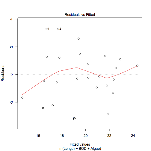
The simplest way to produce a residual plot is to use the plot() command on a regression model result (which actually runs the plot.lm() command). The plot.lm() command produces up to six diagnostic plots, which you can choose using the which = parameter. The plot of residuals vs. fitted values is obtained via:
plot(model, which = 1)
This produces a scatter plot of the regular residuals against the fitted values. The command also produces a locally weighted polynomial smooth fit line and identifies and data points that might have undue influence on the model fit.
plot(mf.lm, which = 1)

Ideally you would like not to see any kind of pattern. In the example there are some points identified as possibly having undue influence but the lowess line runs aimlessly along the middle.
You can produce a similar plot using standardized residuals and regular plot commands:
plot(fitted(mf.lm), rstandard(mf.lm))
abline(h = 0, lty = 3)
lines(lowess(fitted(mf.lm), rstandard(mf.lm)), col = "red")
Plot using Excel
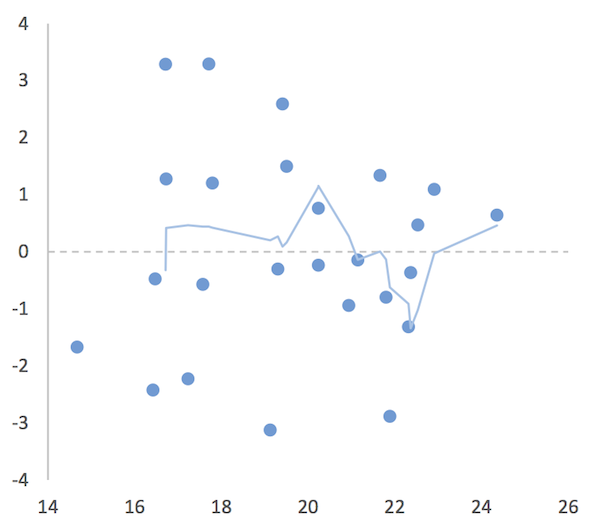
It is fairly easy to plot the regular residuals against the fitted values using Excel. Once you have calculated the values you can simply make a scatter plot. However, it is not so easy to add a locally weighted polynomial. There are add-ins you might try but a simple workaround is to use a moving average trendline. To incorporate this, you need to sort the fitted values in ascending numerical order.
- First of all, you need to calculate the fitted values and the residuals. You can do this using the Analysis ToolPak.
- If you used regular commands to compute the values, then:
- Copy them to the clipboard.
- Paste Special the values only to a new location.
- If you used the Analysis ToolPak you do not need to do anything.
- Highlight the values (include their headings) and sort them:
- Click the Home > Sort & Filter button.
- Click Custom Sort.
- Use the dropdown on the left to sort by the Fitted values.
- Make sure you use Smallest to Largest.
- Click OK to apply the sort.
- Now you have the fitted values sorted in ascending numerical order.
Make a scatter plot by highlighting the fitted and residual values data (and the column headings). You want to ensure that the fitted values are in the first column (Excel will expect this).

Add a moving average trendline.
- In Excel 2013 click the chart then use the Design > Add Chart Element
- In Excel 2010 click the chart then use the Layout > Trendline
You want to select the Moving Average option. The default is for a two-point moving average. This is okay for some cases and not for others so format the trendline and alter the options until you get something that looks sensible. In the following chart a 4-point moving average was used.
A residual vs. fitted values plot in Excel. Use a moving point average trendline to get an impression of the fit (or lack of).
The moving average trendline is not a perfect solution but it will give you an idea.
Distribution plot of residuals
Ideally you want the residuals (standardized) to be normally distributed. In R you can calculate the standardized residuals and plot a histogram or QQ plot to show the distribution. In Excel you can only approximate the standardized residuals, which you can plot as a histogram or a QQ plot (with a bit of work).
Plot using R
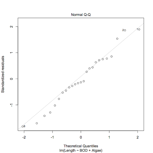
The simplest solution is to use plot() on the result of a regression model. If you use the parameter, which = 2, you’ll get a QQ plot of the standardized residuals.
plot(mf.lm, which = 2)
A normal QQ plot of the standardized residuals of a regression model.
You can see that the plot() command has highlighted those data points that have some influence over the model fit. You can produce a similar plot using regular commands:
qqnorm(rstandard(mf.lm))
qqline(rstandard(mf.lm), lty = 3)
However, this would not identify any “odd points”.

Plot using Excel
Once you have the residuals in Excel (either by direct calculation or via the Analysis ToolPak) you are well on your way to making a normal distribution plot. If you want the standardized residuals you will have to put up with Excel’s approximation. You can work out the approximate values using:
Approx Std.Resid = Residual / Stdev(Residual)
Or let the Analysis ToolPak calculate this for you.
You can then make a histogram of the values. You’ll have to select appropriate bins and use the FREQUENCY function to work out the frequencies. Alternatively, you can let the Analysis ToolPak work out frequencies for you via the Histogram routine (which will make the chart too).
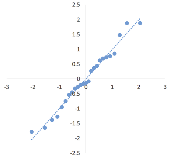
It is possible to produce a QQ plot, which requires a few steps:
- Make a column of “ranks”, which is a simple list of “observation number”, values from 1 to the number of replicates (rows) in your dataset.
- Now determine the cumulative proportion for the rank values. You need a formula resembling: =(rank-0.5)/count(rank1:rankn) where rank1:rankn is your column of rank values and rank is the rank you are working out the proportion of. You will need to “fix” the cell references for rank1:rankn using $.
- Copy and paste the formula down the column. You should see ascending values rising towards a value of 1 (you’ll probably end up with 0.98).
- In the next column you need to calculate a z-score. Use NORMSINV to work this out using the proportions you just calculated. You should end up with a series of values starting at about -2 and rising through 0 to around +2.
- In the next column copy your standardized residual values.
- Sort the residuals from smallest to largest.
- Highlight the z-score and sorted residuals data.
- Insert a Scatter plot.

You can add a linear trendline and with a bit of formatting can end up with a half decent QQ plot.
A QQ plot of residuals from a regression model.
The QQ plot is a bit more useful than a histogram and does not take a lot of extra work. However, it can be a bit tedious if you have many rows of data.
Comments are closed.