Gridlines in graphs and charts
Exercise 6.3.1b.
Statistics for Ecologists (Edition 2) Exercise 6.3.1b
Here are some notes regarding the use of gridlines in graphs and charts, to supplement Chapter 6.
Gridlines in graphs and charts
Introduction
Gridlines are potentially useful items you might want to incorporate in your charts. Gridlines can help the reader to gauge the height of bars in a column chart more easily for example, and so the readability is improved.
On the other hand, gridlines can “get in the way” and hinder readability by making your chart cluttered. In scatter plots you may require both horizontal and vertical gridlines, having gridlines on one axis only can “lead the eye”. Knowing when to apply gridlines or not is part of the skill of presentation.
Gridlines are added and edited easily in Excel. In R you can add gridlines using the abline() command.
Gridlines in Excel charts
You can easily add gridlines using Excel. Many chart templates incorporate them (sometimes when you do not require) and once you have a chart you can easily add them via the Chart Tools menus. In Excel 2013 there is an Add Chart Element button (you can also use the + button that appears beside a chart you have clicked on).


In previous versions of Excel (e.g. 2010) you can find the Gridlines button on the Layout menu of the Chart Tools.
Editing Excel gridlines
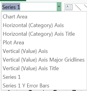
Once you have added your Excel gridlines you can choose to alter their appearance. You can double-click or right-click on the gridlines directly or you can use the Current Selection section of the Chart Tools > Format menu, which allows you to select, then format chart elements.
Once you have chosen to format the gridlines you will be presented with a range of formatting options, allowing you to choose the colour, width and style for example. You may not want the gridlines to be too bold so a mid-gray and dashed line might be more appropriate than a solid black line.

Altering Excel gridline visibility

By default, your chart colours will be solid. This means that on a column chart the gridlines will disappear behind the bars and only be visible between them.
In most cases this is exactly what you want but there may be occasions when you want to see the gridlines through the bars. You can edit the data series and choose to alter the transparency of the bars (on a column chart).
You can easily change the level of transparency to get the effect you want.
Of course generally you won’t want to allow the gridlines to be visible through the bars but it is a handy trick to have up your sleeve.

Gridlines in R plots
Use the abline() command to add gridlines to R plots. The command adds straight lines to existing plots. You can use the command to add a line of best-fit by specifying intercept and slope (indeed the command can read the results of other commands that produce coefficients), but for gridlines you can use one of the following:
- abline(h = x, …) For horizontal lines.
- abline(v = x, …) For vertical lines.
You specify x, which is the position of the line(s). You can use various methods to produce a set of values that define the position of the lines:
| Command | Detail |
| c(…) | Give the values explicitly, separated by commas. |
| start:end | Give the start and end points, this will produce a primitive sequence with an interval of 1. |
| seq(from = , to = , by = ) | Make a sequence, you specify start and end points and the interval. |
| pretty(start:end, n) | Makes a sequence from a simple range (start:end) that is split into “pretty” intervals. You also give n, which is an idealized number of intervals. The command does its best to produce n items. |
The seq() command is probably the easiest to use as the results are completely defined by the user. The pretty() command is generally used internally to make the plot axes intervals so using it would likely match the axis. However, you may not want gridlines at exactly the same intervals so it’s probably best to stick to seq().
You can use various additional parameters to alter the appearance of the lines for example:
| Parameter | Detail |
| col | The colour of the line(s). Usually as a “name” but you can specify an integer, which will use a colour from the current colour palette. |
| lwd | The width of the line. Think of it as an expansion factor. Values >1 make the line wider, whilst values <1 make it thinner. |
| lty | The line type, 0 = none, 1 = solid, 2 = dashed, 3 = dotted, 4 = dotdash, 5 = longdash, 6 = twodash. You can also specify the type as a “string” that matches the names given here. |
The abline() command thus gives you good control over the position and format of gridlines.
Place gridlines behind other R plot elements

When you add gridlines to an R plot your lines will usually over-top any points or bars that were present.
It may be that this is what you want, but generally it is desirable to have the gridlines disappear behind the bars. If you are drawing gridlines to a barplot() or a boxplot() then you can easily achieve this by re-plotting and adding add = TRUE in the plotting command.

If you are using a scatter plot and the regular plot() command you take a different approach.
- Use the plot() command but set type = “n” to create the plot but not any points.
- Add the gridlines using abline()
- Add the data points using the points()
These simple “tricks” should ensure that your gridlines end up where you want them.
Example code
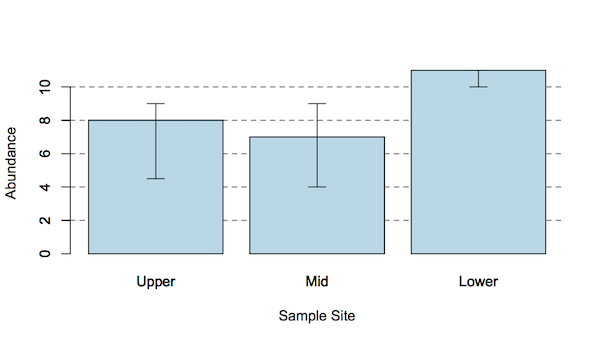
The bar chart with error bars shown earlier was drawn using the following code:
hog3 # The data
  Upper Mid Lower
1     3   4    11
2     4   3    12
3     5   7     9
4     9   9    10
5     8  11    11
6    10  NA    NA
7     9  NA    NA
Get median values for each column
med <- apply(hog3, MARGIN = 2, median, na.rm = TRUE)
Get the upper and lower quartiles, which will form the error bars
up <- apply(hog3, MARGIN = 2, quantile, na.rm = TRUE, prob = 0.75)
dn <- apply(hog3, MARGIN = 2, quantile, na.rm = TRUE, prob = 0.25)
dat <- rbind(med, up, dn) # Make a matrix of the data and error bars
dat
    Upper Mid Lower
med   8.0   7    11
up    9.0   9    11
dn    4.5   4    10
Draw the bar chart
barplot(dat["med",], col = "lightblue")
Add the gridlines
abline(h = seq(2,10,2), lty = "dashed", col = "gray30")
Add axis titles
title(xlab = "Sample Site", ylab = "Abundance")
Re-plot bars over gridlines
Note that the plot is given a name, which allows the x-values for the error bars to be calculated. Use add = TRUE to allow the bars to be plotted over the existing ones, thus ending up “on top” of the gridlines.
bp <- barplot(dat["med",], col = "lightblue", add = TRUE)
Draw the error bars using the inter-quartile values
arrows(bp,dat["up",], bp,dat["dn",], length = 0.1, angle = 90, code = 3)
Comments are closed.