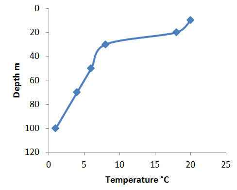
Reversing the axis of an Excel chart
Sometimes you want to make a plot that reflects the “real” situation rather than a plain “mathematical” one. An example might be temperature and depth of the ocean. You ought to plot the temperature on the y-axis and the depth on the x-axis but it would be nice to visualize the change in temperature with depth as if you were looking down a profile of the ocean. Your first attempt makes a scatter plot but the vertical is upside down with the deeper values at the top.

I am text block. Click edit button to change this text. Lorem ipsum dolor sit amet, consectetur adipiscing elit. Ut elit tellus, luctus nec ullamcorper mattis, pulvinar dapibus leo.

If you select the box that says Values in reverse order the values will… reverse. The x-axis will still be at the top so you might want to alter it using the Horizontal axis crosses: section. Set the x-axis to cross at the Maximum axis valueand it will move to the bottom (the values are in reverse order now so the max. value is at the bottom of the y-axis).

Now your chart is the way up you intended. Here I added smoothed joining lines to help visualize the pattern of temperature with depth. Right-click on a data point and select Format Data Series… to bring up the options.
Comments are closed.