Association Plots in R

Association Plots

Association plots in R. An association plot draws the results of an association test by charting the Pearson Residuals.

Association plots in R are drawn using assocplot()

assocplot(x, col = c("black", "red"), space = 0.3,
          main = NULL, xlab = NULL, ylab = NULL)
Parameter Explanation
x the data, usually a numeric matrix.
col colors for positive and negative associations.
space amount of space between the bars, as a fraction of average bar height and width (default = 0.3).
main, xlab, ylab title annotations.


Essentially you need a 2-dimensional matrix to use assocplot():

VADeaths
      Rural Male Rural Female Urban Male Urban Female
50-54       11.7          8.7       15.4          8.4
55-59       18.1         11.7       24.3         13.6
60-64       26.9         20.3       37.0         19.3
65-69       41.0         30.9       54.6         35.1
70-74       66.0         54.3       71.1         50.0

Apart from the titles, the only graphical parameter you can alter directly is col, to alter the positive and negative bar colors:

assocplot(VADeaths, col = c("lightblue", "pink"),
	  xlab = "Age class", ylab = "Driver actegory")

Basic association plot using custom color for positive and negative bars

Graphical parameters

If you want to alter the general appearance of your association plot you’ll need to set the appropriate graphical parameters using par() before using assocplot():

opar <- par(las = 1, cex = 0.8, mar = c(5,7,2,1))

assocplot(VADeaths, col = c("blue", "tomato"),
          space = 0.05, xlab = "Age class")
title(ylab = "Driver category", line = 6)

par(opar)
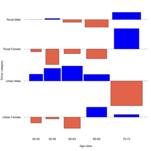
Custom graphical parameters have to be applied using par() before using assocplot()

In the preceding example the margins were widened to allow the labels to “fit”. Note also how title() was used to place the y-axis annotation on an outer line.

Data layout

Essentially you need a 2D matrix for assocplot() to make an association plot in R. If you have something else you need to coerce it to the correct form.

Here are some options:

  • data.frame use as.matrix() to alter the form.
  • table use x[r, c, n, ...] to “pick out” the appropriate 2D sub-table or..
  • table use margin.table to “collapse” a table and combine across the margins you want.
# 3D table
HairEyeColor
, , Sex = Male

       Eye
Hair    Brown Blue Hazel Green
  Black    32   11    10     3
  Brown    53   50    25    15
  Red      10   10     7     7
  Blond     3   30     5     8

, , Sex = Female

       Eye
Hair    Brown Blue Hazel Green
  Black    36    9     5     2
  Brown    66   34    29    14
  Red      16    7     7     7
  Blond     4   64     5     8
# Choose "Male"
HairEyeColor[,,1]
       Eye
Hair    Brown Blue Hazel Green
  Black    32   11    10     3
  Brown    53   50    25    15
  Red      10   10     7     7
  Blond     3   30     5     8
# Combine "Male" and "Female"
margin.table(HairEyeColor, margin = c(1,2))
       Eye
Hair    Brown Blue Hazel Green
  Black    68   20    15     5
  Brown   119   84    54    29
  Red      26   17    14    14
  Blond     7   94    10    16
# Combine "Eye"
margin.table(HairEyeColor, margin = c(1,3))
       Sex
Hair    Male Female
  Black   56     52
  Brown  143    143
  Red     34     37
  Blond   46     81

Alternatives to assocplot()

The assocplot() function is not the only was to draw an association plot using R. You could run a chisq.test() and extract the Pearson residuals $residuals, which you then plot using barplot().

X <- chisq.test(VADeaths)
X$residuals
         Rural Male Rural Female Urban Male Urban Female
50-54 -0.0001229145  -0.09956533  0.2454344  -0.21106734
55-59  0.0422284686  -0.56107962  0.4550546  -0.06391943
60-64 -0.0951496863  -0.16808112  0.5368919  -0.40335827
65-69 -0.2718462679  -0.34870589  0.2349807   0.36003546
70-74  0.2624133483   0.73510055 -0.8898149   0.09370444
barplot(X$residuals, beside = TRUE, col = cm.colors(5),
        ylim = c(-1,1), legend = TRUE,
	args.legend = list(x = "top", bty = "n", ncol = 5))
title(ylab = "Pearson residuals", xlab = "Category")
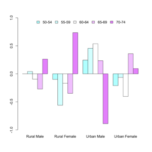
Alternative to assocplot() is to use barplot() on the Pearson residuals

To get multiple rows, with a separate mini-plot for each row you would need to set-up par(mfrow = c(rows, cols)).

There are potential advantages to this method, for example you can add horizontal lines at +/- 2 to show the “significance band”. However, it is also somewhat more involved!


This article is partly in support of my book An Introduction to R see the publications page for more information.

Conditional density plots in R

Conditional density plots

Conditional density plots in R — how to draw a conditional density plot using R. A conditional density plot shows the density of a sample split into groups.

Use cdplot() to draw a conditional density plot using R.

cdplot(x, y,
       plot = TRUE, tol.ylab = 0.05, ylevels = NULL,
       bw = "nrd0", n = 512, from = NULL, to = NULL,
       col = NULL, border = 1, main = "", xlab = NULL, ylab = NULL,
       yaxlabels = NULL, xlim = NULL, ylim = c(0, 1), ...)

There are many potential parameters for cdplot() but the most helpful are:

Parameter Explanation
x, y the data, specify x and y or use a formula. In any event y should be a factor and x a numeric
ylevels the order of the variables to be plotted
yaxlabels labels for axis annotation
bw, n, from, to, ... arguments to pass to density

There are several arguments related to the density() function, which in most cases you’ll never need to alter.

A basic plot requires a factor variable and a numeric:

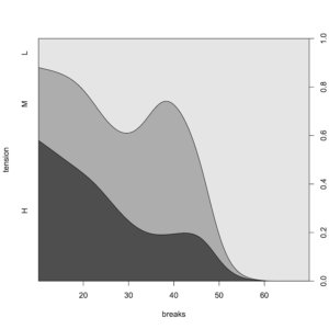
cdplot(tension ~ breaks, data = warpbreaks)

A conditional density plot

You can use the ylevels argument to alter the order of the plotting of a cdplot():

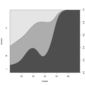
cdplot(tension ~ breaks, data = warpbreaks, ylevels = 3:1)

Use the ylevels argument to change the order of a conditional density plot

Give customized names to the factor levels via the yaxlabels argument:

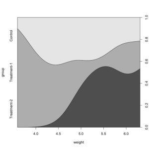
cdplot(group ~ weight, data = PlantGrowth,
       yaxlabels = c("Control", "Treatment-1", "Treatment-2"))

Custom factor labels via yaxlabels argument in cdplot

Altering graphical appearance

Only some of the general graphical parameters can be changed in cdplot(), as in the following example.

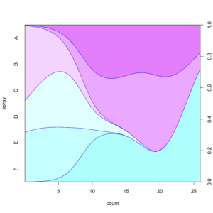
Use graphical parameters col and border to alter the appearance:

cdplot(spray ~ count, data = InsectSprays,
       col = cm.colors(6), border = "blue")

Basic graphical parameters col and border used to alter a cdplot

If you want to change any other graphical parameters you’ll need to call par() first:

opar <- par(las = 1, cex = 0.8, mar = c(5,7,2,3))

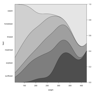
cdplot(feed ~ weight, data = chickwts, ylab = "")
title(ylab = "feed", line = 5)

par(opar)

Use par() to set graphical parameters (other than col, border) in a cdplot

In the preceding example the margins were altered to allow the annotations to “fit”. In the title the annotation was shifted outwards.

This article is partly in support of my book An Introduction to R see the publications page for more information.

Spine plots using R

Spine Plots using R

A spine plot is similar to a mosaic plot and stacked bar chart. Use spineplot()  function to draw spine plots using R. There are quite a number of potential arguments you can use:

spineplot(x, y = NULL,
          breaks = NULL, tol.ylab = 0.05, off = NULL,
          ylevels = NULL, col = NULL,
          main = "", xlab = NULL, ylab = NULL,
          xaxlabels = NULL, yaxlabels = NULL,
          xlim = NULL, ylim = c(0, 1), axes = TRUE, ...)

The major parameters are:

Parameter Result
x data (x,y) or formula y~x
breaks passed to hist()
off space between bars
ylevels order of levels in x
col colors
xaxlabels labels for x-axis

Your data might be in one of two forms, which affects the kind of plot you get:

  • category ~ category results in a spine plot (like a 100% stacked bar chart).
  • factor ~ numeric results in a spinogram (like a histogram).

Spine plots

If your data are category ~ category your spineplot results in a kind of stacked bar chart.

Look at the VADeaths dataset (a matrix) as an example:

VADeaths
      Rural Male Rural Female Urban Male Urban Female
50-54       11.7          8.7       15.4          8.4
55-59       18.1         11.7       24.3         13.6
60-64       26.9         20.3       37.0         19.3
65-69       41.0         30.9       54.6         35.1
70-74       66.0         54.3       71.1         50.0
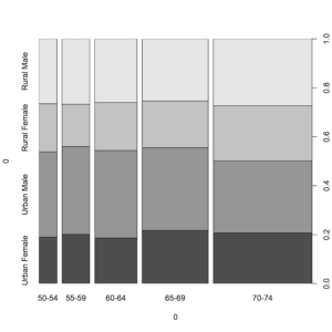
spineplot(VADeaths)

A simple spine plot from a categorical matrix

You can tinker with the graphical parameters to make the chart look “nicer”:

# Custom colours, bar space, and axis labels
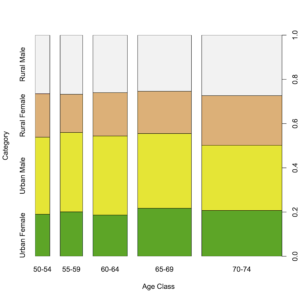
spineplot(VADeaths, col = terrain.colors(4),
          off = 5,
          xlab = "Age Class",
          ylab = "Category")

Graphical parameters used to prettify a spine plot

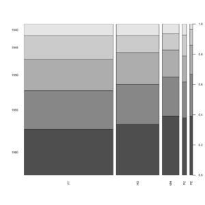
It is hard to resize name labels, as cex, las and so on do not work! The solution is to set these parameters globally using par() and reset them after drawing your plot.

In the following example custom names are also used to help “fit” labels in the plot:

opar <- par(cex.axis = 0.6, las = 2)
spineplot(USPersonalExpenditure,
          xlab = "", ylab = "",
          xaxlabels = c("FT", "HO", "MH", "PC", "PE"))
par(opar)

Axis labels are set using par() before drawing a spineplot

Multi-dimensional tables

The spineplot() function can only deal with 2-dimensional objects. If you have a multi-dimensional table you need to collapse the table to 2D.

spineplot(HairEyeColor)
Error in spineplot.default(HairEyeColor) :
  a 2-way table has to be specified
x <- margin.table(HairEyeColor, margin = c(1,2))
x
       Eye
Hair    Brown Blue Hazel Green
  Black    68   20    15     5
  Brown   119   84    54    29
  Red      26   17    14    14
  Blond     7   94    10    16
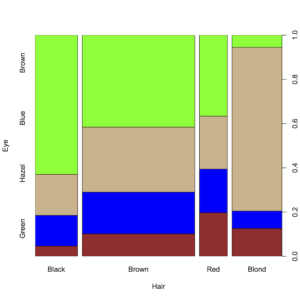
spineplot(x, col = c("brown", "blue", "tan", "green"))

A multi-dimensional table needs to be collapsed to 2D for plotting

Spinograms

A spinogram is a spineplot where the data is in the form factor ~ numeric. A spinogram is analogous to a histogram.

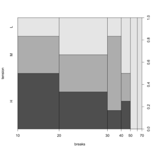
spineplot(tension ~ breaks, data = warpbreaks)

A spinogram is a form of histogram

If you have numeric data you can use factor() to convert the data:

# Use factor(x) to "convert" numeric
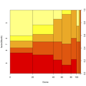
spineplot(factor(Month) ~ Ozone,
          data = airquality,
          col = heat.colors(5))

A spinogram where numeric data are converted to a factor before plotting

caption: : A spinogram where numeric data are converted to a factor before plotting

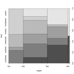
Use the breaks argument as you would for hist() to change the breakpoints (you can enter a single integer or a numeric vector).

spineplot(feed ~ weight, data = chickwts, breaks = 4)

Using the breaks argument to alter the breakpoints in a spinogram

It can be tricky to read a spinogram and it is not trivial to add a legend for the colors. See Tips and Tricks article about legends here.


This article is partly in support of my book An Introduction to R see the publications page for more information.

Drawing mathematical curves

Drawing mathematical curves using R is fairly easy. Here’s how to plot mathematical functions using R functions curve and plot.

The main functions are curve() and plot.function() but you can simply use plot().

curve(expr, from = NULL, to = NULL, n = 101, add = FALSE,
     type = "l", xname = "x", xlab = xname, ylab = NULL,
     log = NULL, xlim = NULL, ...)

plot(x, y = 0, to = 1, from = y, xlim = NULL, ylab = NULL, ...)

Essentially you use (or make) a function that takes values of x and returns a single value. The arguments are largely self-explanatory but:

  • expr, x — an expression or function that returns a single result.
  • from, to — the limits of the input (default 01).
  • n — the number of “points” to draw (these will be evenly spaced between from and to).
  • ... — regular graphical arguments can be used.

Simple Math and Trigonometry

You can visualize built-in functions. Note that you can use regular graphics arguments to augment the basic plot.

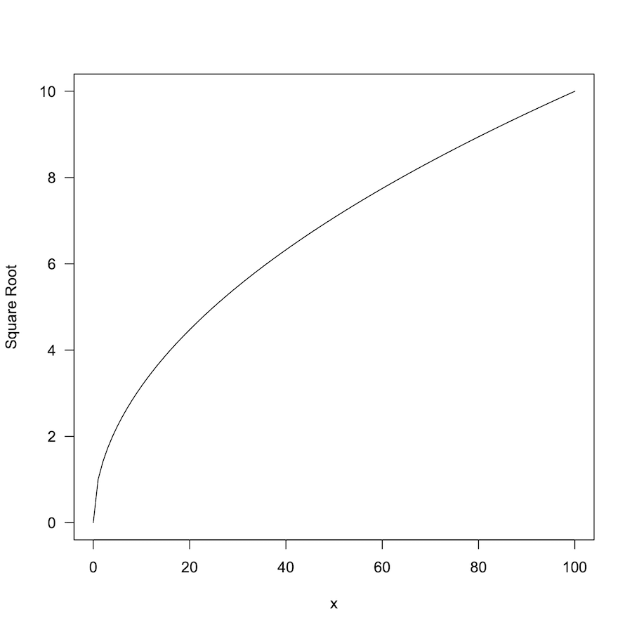
Here is a plot of the sqrt function:

curve(sqrt, from = 0, to = 100, ylab = "Square Root", las = 1)

Plot of the square root function sqrt()

Here is a simple log plot:

curve(log, from = 0, to = 100, las = 1, lwd = 2, col = "blue")

Plot of log function using curve()

Adding to plots

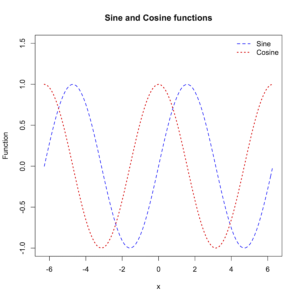
Use the add = TRUE argument to add a curve() to an existing plot.

curve(sin, -pi*2, pi*2, lty = 2, lwd = 1.5, col = "blue",
      ylab = "Function", ylim = c(-1,1.5))

curve(cos, -pi*2, pi*2, lty = 3, col = "red", lwd = 2, add = TRUE)

# Add legend and title
legend(x = "topright", legend = c("Sine", "Cosine"),
      lty = c(2, 3), lwd = c(1.5, 2),
      col = c("blue", "red"), bty = "n")

title(main = "Sine and Cosine functions")

Plot of functions sin and cos using curve()

Custom functions

You can define your own function to plot. Remember that the result should be a single value. In this example we define two functions to convert between Celsius and Fahrenheit:

# Conversion of temperature
cels <- function(x) (x-32) * 5/9
fahr <- function(x) x*9/5 + 32

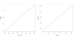
Now you can use from and to arguments to set the limits for the input (the default is 01).

curve(cels, from = 32, to = 100, xname = "Farenheit",
      ylab = "Celsius", las = 1)

curve(fahr, from = 0, to = 50, xname = "Celsius",
      ylab = "Fahrenheit", las = 1)

Plots using custom function, temperature conversion

Function arguments

If your function requires additional arguments you need to do something different. In this example you can see the Manning equation, which is used to estimate speed of fluids in pipes/tubes:

manning <- function(r, g, c = 0.1) (r^(2/3) * g^0.5/c)

curve(manning) # fails
Error in manning(x) : argument "g" is missing, with no default

The plotting fails. You need to pre-define all arguments as you cannot “pass-through” additional arguments to your function:

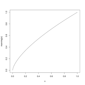
manning <- function(r, g = 0.01, c = 0.1) (r^(2/3) * g^0.5/c)

curve(manning) # works

Plot of a custom function with parameters

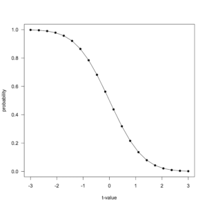
In the following example you see a built-in function pt() used to visualize the Student’s t distribution.

# pt needs df and lower.tail arguments
PT <- function(x) pt(q = x, df = 100, lower.tail = FALSE)

curve(PT, from = -3, to = 3, las = 1, xname = "t-value",
     n = 20, type = "o", pch = 16, ylab = "probability")

Plot of Student’s t distribution using a function “wrapper”

The workaround is to create a “wrapper” function that calls the actual function you want with the appropriate arguments. Note that in this example the n argument was used to plot 20 points, along with type and pch to create a line with over-plotted points.

This post is part of the support for the new book An Introduction to R. See Publications home page for more details.