Conditional density plots
Conditional density plots in R — how to draw a conditional density plot using R. A conditional density plot shows the density of a sample split into groups.
Use cdplot() to draw a conditional density plot using R.
cdplot(x, y,
       plot = TRUE, tol.ylab = 0.05, ylevels = NULL,
       bw = "nrd0", n = 512, from = NULL, to = NULL,
       col = NULL, border = 1, main = "", xlab = NULL, ylab = NULL,
       yaxlabels = NULL, xlim = NULL, ylim = c(0, 1), ...)
There are many potential parameters for cdplot() but the most helpful are:
| Parameter | Explanation |
|---|---|
x, y |
the data, specify x and y or use a formula. In any event y should be a factor and x a numeric |
ylevels |
the order of the variables to be plotted |
yaxlabels |
labels for axis annotation |
bw, n, from, to, ... |
arguments to pass to density |
There are several arguments related to the density() function, which in most cases you’ll never need to alter.
A basic plot requires a factor variable and a numeric:
cdplot(tension ~ breaks, data = warpbreaks)
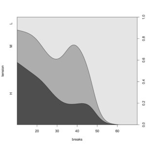
A conditional density plot
You can use the ylevels argument to alter the order of the plotting of a cdplot():
cdplot(tension ~ breaks, data = warpbreaks, ylevels = 3:1)
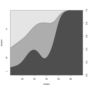
Use the ylevels argument to change the order of a conditional density plot
Give customized names to the factor levels via the yaxlabels argument:
cdplot(group ~ weight, data = PlantGrowth,
       yaxlabels = c("Control", "Treatment-1", "Treatment-2"))
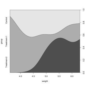
Custom factor labels via yaxlabels argument in cdplot
Altering graphical appearance
Only some of the general graphical parameters can be changed in cdplot(), as in the following example.
Use graphical parameters col and border to alter the appearance:
cdplot(spray ~ count, data = InsectSprays,
       col = cm.colors(6), border = "blue")
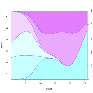
Basic graphical parameters col and border used to alter a cdplot
If you want to change any other graphical parameters you’ll need to call par() first:
opar <- par(las = 1, cex = 0.8, mar = c(5,7,2,3))

cdplot(feed ~ weight, data = chickwts, ylab = "")
title(ylab = "feed", line = 5)

par(opar)
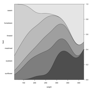
Use par() to set graphical parameters (other than col, border) in a cdplot
In the preceding example the margins were altered to allow the annotations to “fit”. In the title the annotation was shifted outwards.
This article is partly in support of my book An Introduction to R see the publications page for more information.
- For more articles look at the Tips and Tricks page and look for the various categories or use the search box.
- See also the Knowledge Base where there are other topics related to R and data science.
- An Introduction to R will be published by Pelagic Publishing. See all my books at Pelagic Publishing.
- Visit our other site at GardenersOwn for a more ecological matters.


