Statistics for Ecologists (Edition 2) Exercise 6.2.1
Some notes on data visualisation to supplement Chapter 6.
Tally plots for data visualisation in Excel
Introduction
Data distribution is important. You need to know the shape of your data so that you can determine the best:
- Summary statistics
- Analytical routines
Some statistical tests use the properties of the normal (Gaussian) distribution, whilst others use data ranks. So, it’s important to know if your data are normally distributed or otherwise.
The classic way to look at the shape of your data is with a histogram, showing the frequency of observations that fall into certain size classes (called bins). However, you can make a “quick and dirty” histogram using pencil and paper, a tally plot. The tally plot is useful as it is something you can do in a notebook in the field as you collect data.
The classic histogram
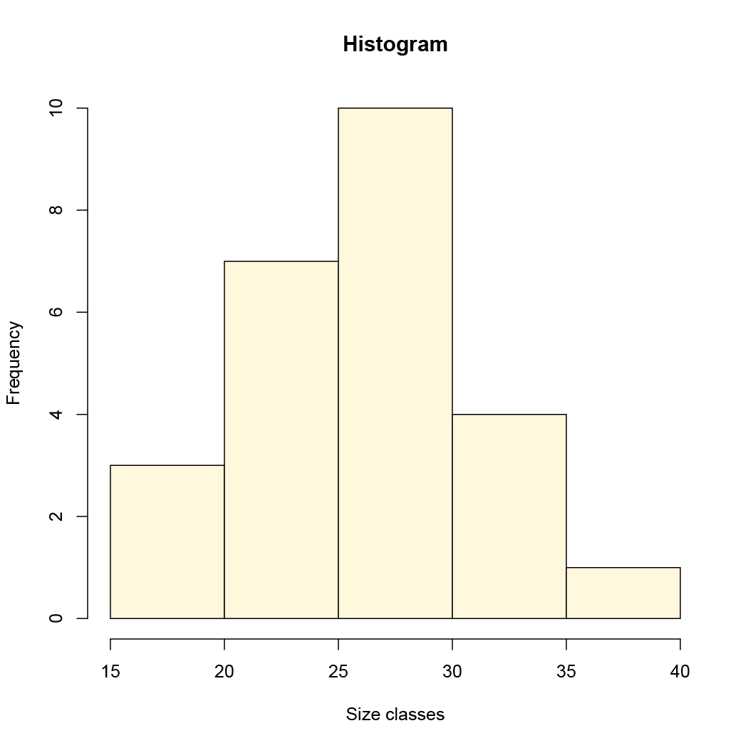
A classic histogram uses an x-axis that is a continuous variable, like the following example drawn using R:
A classic histogram has a continuous x-axis (this drawn using R).
The x-axis is split according to the bin boundaries and the bars show the frequency of observations that fall between two bin boundaries. This classic histogram is easy to draw using R with the hist() command. The command works out the axis breakpoints and calculates the frequencies for you.


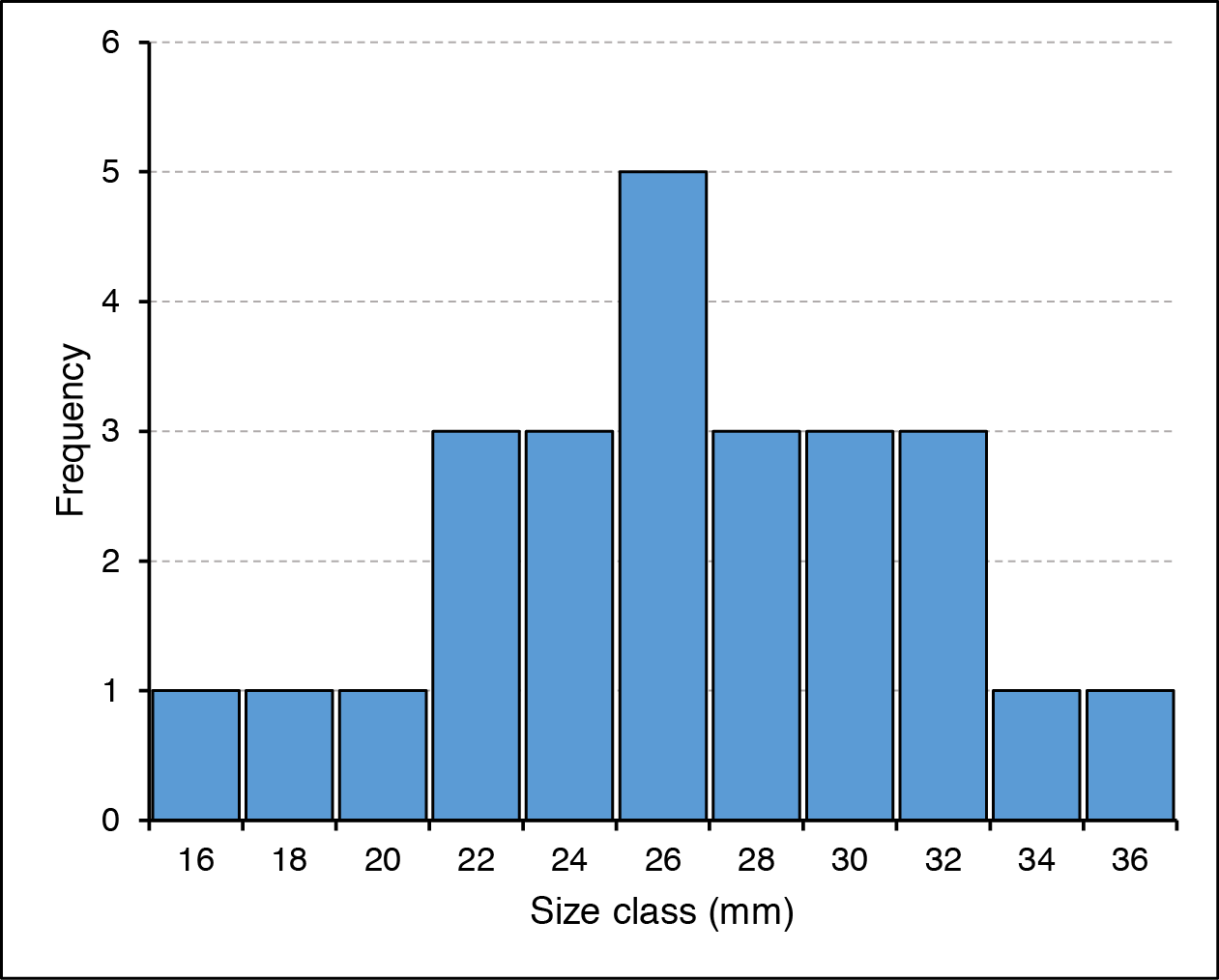
Excel cannot draw a “proper” histogram; the nearest it can get is a column chart with separate categories representing the bin classes:
In Excel the column chart is used in lieu of a true histogram. The x-axis is split into categories representing the bin sizes.
This is not so terrible, but it is not quite the same as a true histogram. In the preceding example the bars have been widened to reduce the gap width, which makes the chart appear more like a real histogram.
Using Excel to calculate data frequency
You can draw the histogram (column chart) in Excel easily enough but need to compute the frequency of observations for each bin class. To do this you need the FREQUENCY function.
FREQUENCY(data_array, bins_array)
To use the function, follow these steps:
- Make sure you have your data!
- Work out the minimum value you’ll need (the MIN function is helpful).
- Work out the maximum (use the MAX function).
- Determine the interval you need to give you the number of bins you want.
- Type in the values for the bins somewhere in your worksheet.
- Highlight the cells adjacent to the bins you just made, these will hold the frequencies.
- Type the formula for FREQUENCY, highlighting the appropriate cells (or type their cell range) for the data and bins.
- Do NOT press Enter since FREQUENCY is an array function. Instead press Ctrl+Shift+Enter (on a Mac Cmd+Shift+Enter), which will complete the function and place the result into all the cells you highlighted.

Figure 11. Frequency-array.png
The FREQUENCY function places a result into an array of cells.
Now you have the bins and the frequency so you can build your histogram (column chart), using the Insert > Column Chart button.
Frequency calculation via Analysis ToolPak
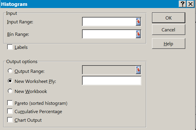
You could skip the frequency calculation stage altogether and use the Analysis ToolPak (Insert > Data Analysis), which will also draw a column chart (histogram) for you if you like.
If you cannot see the Data > Data Analysis button you may not have the ToolPak installed. Go to the Excel options and the Add-Ins section, where you can enable it.
The Histogram section of the Analysis ToolPak requires you to have some data and a range of bins. So:
- Make sure you have your data!
- Work out the minimum value you’ll need (the MIN function is helpful).
- Work out the maximum (use the MAX function).
- Determine the interval you need to give you the number of bins you want.
- Type in the values for the bins somewhere in your worksheet.
- Click the Data > Data Analysis button.
- Scroll down and choose the Histogram option.
- Fill in the boxes for the data range and the bins ranges.
- Click OK and the Analysis ToolPak will compute the frequencies for you.

Once you’ve clicked OK you should see the results, the bins will be repeated alongside the appropriate frequencies. If you selected to have a chart output, then you’ll see a column chart too.
If you do not have Windows or indeed Excel, then you can’t use the Analysis ToolPak but you can still use the FREQUENCY function. Both FREQUENCY and REPT are part of the armoury of OpenOffice and LibreOffice (and probably others).
Making a Tally plot
You may not want a graphic and require only a simple tally plot. It is easy to do this in Excel using the FREQUENCY and REPT functions. You use the FREQUENCY function as described before to determine the frequency of observation in various bins. Once you have the frequencies you use the REPT function to repeat some text a number of times (corresponding to the frequency).
The REPT function repeats some text a number of times. Use with FREQUENCY to make a tally plot.
In the example I have set the character text I want to use in cell D6. The frequencies are in E2:E12. The REPT function takes the text I want to display as a tally mark and repeats it by the number on the frequency column. Note the cell reference D$6, which “fixes” the row so that the formula stays correct as it it copied down (from G2 to G12).
You could use the text directly in the REPT formula e.g. =REPT(“X”, E2) but then if you wanted to alter the tally plot you’d need to alter all the cells. If you point to a single cell you can alter the tally plot simply by typing a new tally character into that one cell.
The tally plot doesn’t really replace the histogram but it can be useful to have a plain text representation of your data rather than a graphic. You can copy the spreadsheet cells into various programs.
Bins
16 X
18 X
20 X
22 XXX
24 XXX
26 XXXXX
28 XXX
30 XXX
32 XXX
34 X
36 X

If it not too hard to get the tally plot oriented with the tallies vertical. You’ll need to format the tally cells so that they are oriented at 90˚ but otherwise this is straightforward. However, in the “vertical” orientation the cells do not copy/paste so nicely!
Comments are closed.