Tally plots in R
Exercise 6.2.2.
Statistics for Ecologists (Edition 2) Exercise 6.2.2
Recently I saw a message in a forum asking about the difference between dot plots and histograms. This got me thinking and so I decided to work out how to make R produce a dot plot from scratch. These notes also supplement Chapter 6 (Graphics).
Tally plots in R
Dot charts as an alternative to the histogram
A histogram is a way of showing the frequency of your numeric data in a visual manner. The histogram looks more or less like a bar chart except that the bars are touching – the x-axis is a continuous scale rather than being discrete categories. Look at the following data:
> mydata = c(6, 7, 8, 7, 6, 3, 8, 9, 10, 7, 6, 9)
Stem-leaf plot
You can visualise the distribution using a stem-leaf plot:
> stem(mydata)
The decimal point is at the |
 2 | 0
 4 |
 6 | 000000
 8 | 0000
10 | 0
The stem() command does not give much flexibility when it comes to the bins separating the data categories but you can use the scale = n instruction. The default is 1 so making the value larger will increase the number of bin categories:
> stem(mydata, scale = 2)
The decimal point is at the |
 3 | 0
 4 |
 5 |
 6 | 000
 7 | 000
 8 | 00
 9 | 00
10 | 0
Making the scale smaller gives a different impression:
> stem(mydata, scale = 0.5)
The decimal point is 1 digit(s) to the right of the |
0 | 3
0 | 6667778899
1 | 0
The stem() command can be useful but it does not really match the histogram.
Make a frequency table with the table() command
Another method of looking at the data is to make a frequency table:
> table(mydata)
mydata
3  6  7  8  9 10
1  3  3  2  2  1
Not very visual but it does a job. It splits the data into chunks and shows the frequency for each. The table() command really only works sensibly on integer values (otherwise you end up with loads of “bins”).
Visualize frequency with a bar chart
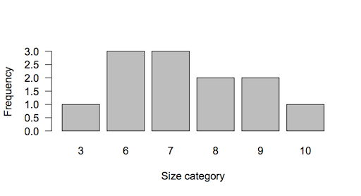
The resulting table can be turned into a visual representation of the data if you make a bar chart:
> barplot(table(mydata))
The resulting bar chart gives you an impression of the frequency distribution:

The barplot is useful but can be misleading. The bars are discrete categories (bins or size classes) and are discontinuous. In the preceding barplot you can see that there is a jump from the 3-bin to the 6-bin. The barplot() command is very flexible and you can customize your plot in many ways but you cannot get around this problem.
A true histogram

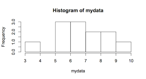
A true histogram has a continuous x-axis and you can make one using the hist() command:
> hist(mydata)
The histogram can be jazzed up and customized in various ways, which I won’t delve into at this point. However, one important aspect is the control of the x-axis. The x-axis is a continuous scale and you can see the difference between this and the earlier barplot by looking at the position of the axis labels. In the barplot they are in the middle of each bar but in the histogram they are placed at the edges of the bars.
You can control the breakpoints using the breaks instruction. The default is breaks = “sturges”, which uses an algorithm to determine the breakpoints. You can also specify the number of breakpoints you want or even specify the “exact” position of the breakpoints by giving the values explicitly.
Developing a script to draw a tally plot or dot histogram
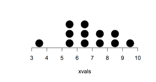
What I wanted was to make a chart that replaced the bars with dots, the number of dots in each column being equal to the frequency. One feature of the hist() command is that you can make a histogram without actually making the final plot. In other words you can calculate all the required statistics. I started by making a result object of the histogram data like so:
> hg = hist(mydata, plot = FALSE)
The result contains several elements in a list; useful elements are the mid-points of the columns and the counts (frequency):
> hg$mids
[1] 3.5 4.5 5.5 6.5 7.5 8.5 9.5

> hg$counts
[1] 1 0 3 3 2 2 1
I reasoned that I could use the $mids as the x-values in a regular plot. The y-values would come from the $counts data. A frequency of 3 would get plotted three times, at y = 1, y = 2 and y = 3. This meant I had to replicate the count data to make a sequence, which would have to be matched up to the x-data.
A loop of some sort seemed unavoidable and the number of times the loop would need to run would be equal to the number of bins, that is the number of bars. Put another way, it is the number of breaks-1. It is simplest to count the number of items in the $counts:
> bins = length(hg$counts)
To make the y-values I needed to make each frequency into a series, so a value of 3 would become 1, 2, 3. I also needed to take care of 0 values so I decided to make each frequency a series 0:frequency. Actually it was logical to do this the other way around freqency:0 so the loop becomes:
> yvals = numeric(0)
>  for(i in 1:bins) {
     yvals = c(yvals, hg$counts[i]:0)
  }
The first line simply creates a blank numeric vector. The loop creates the appropriate values and appends them to the vector. For the data under consideration this produces:
> yvals
[1] 1 0 0 3 2 1 0 3 2 1 0 2 1 0 2 1 0 1 0
Each count value is a sequence ending in zero, the count that was a zero remains so.
The x-values are derived from the $mids result, since I added an extra 0 to each y-value each item needed to be repeated a number of times equivalent to the count +1. This has the bonus of dealing with the 0 count, as a repeat of 0 would be “difficult”. A loop is needed again and it will run for as many times as there are bin categories.
> xvals = numeric(0)
>  for(i in 1:bins) {
     xvals = c(xvals, rep(hg$mids[i], hg$counts[i]+1))
  }
> xvals
[1] 3.5 3.5 4.5 5.5 5.5 5.5 5.5 6.5 6.5 6.5 6.5 7.5 7.5 7.5 8.5 8.5 8.5 9.5 9.5
The xvals and yvals cannot be used directly because there are zero items and we don’t want points plotted at 0. The simplest way to deal with this is to join up the values in a data.frame and then remove rows where y = 0.
> dat = data.frame(xvals, yvals)
> dat = dat[yvals > 0, ]
Now the data are ready to make into a plot. A regular scatter plot will do the job via the plot() command:
> plot(yvals ~ xvals, data = dat)
However, the points are too small and the plot does not look “tidy”.

The trick is to remove the axes, allow the points to spill over the plot area a little and to make the points larger. In addition, it is helpful to plot each point a little bit higher on the y-axis so that the bottom row do not overlap the axis too much. A few extra tweaks are also necessary to get the axis scales to come out right. After a bit of tweaking I get the final plot to appear thus:
The command uses the default breaks = “sturges” to work out the breakpoints, you can specify other breakpoints in exactly the same way as for the hist() command. The plotting symbols are set to pch = 19 (a solid circle) and enlarged somewhat with cex = 3. You can specify other values. The offset = 0.4 parameter plots each point slightly “upwards”. You can alter this offset and with the cex and pch parameters can get the appearance you want.
The biggest alteration you can make is with the graphics window. It seemed a lot of hassle to attempt to match the plot window size to the other parameters. It is easiest to simply use the mouse to resize the plot window to give the appearance you like. You can easily save the plot to a file once it is completed.
The hg_dot() command
When made up into a function the command lines look like the following:
## Dotplot histogram
## Mark Gardener 2013
## www.dataanalytics.org.uk
hg_dot <- function(x, breaks = "sturges",
                      offset = 0.4,
                      cex = 3,
                      pch = 19, ...) {

#   x = data vector
# ... = other instructions for plot

hg <- hist(x, breaks = breaks, plot = FALSE) # Make histogram data but do not plot
bins <- length(hg$count                      # How many bins are needed?
yvals <- numeric(0)                 # A blank variable to fill in

for(i in 1:bins) {                  # Start a loop
yvals <- c(yvals, hg$counts[i]:0)  # Work out the y-values
}                                  # End the loop

xvals <- numeric(0)                                 # A blank variable

for(i in 1:bins) {                                  # Start a loop
xvals <- c(xvals, rep(hg$mids[i], hg$counts[i]+1))  # Work out x-values
}                                                   # End the loop

dat <- data.frame(xvals, yvals)  # Make data frame of x, y variables
dat <- dat[yvals > 0, ]          # Knock out any zero y-values
 minx <- min(hg$breaks)  # Min value for x-axis
 maxx <- max(hg$breaks)  # Max value x-axis
  miny <- min(dat$yvals)  # Min value for y-axis
  maxy <- max(dat$yvals)  # Max value for y-axis

# Make the plot, without axes, allow points to overspill plot region
plot(yvals + offset ~ xvals, data = dat,
        xlim = c(minx, maxx), ylim = c(miny, maxy),
        axes = FALSE, ylab = "", xpd = NA,
        cex = cex, pch = pch, ...)
axis(1)   # Add in the x-axis

# Make results of original data, histogram and plot data
result <- list(hist = hg, original = x, plot.data = dat)
invisible(result)  # Save all the results invisibly
  } # end
## END
Once you run the command your chart will be created in whatever size your default graphics window is set to. Simply drag the window to a new size as appropriate.
The command produces a list result that contains the following:
- the original data $original
- the histogram statistics $hist
- the values plotted $plot.data
If you assign a named object to the command you can access these results afterwards.
> hg = hg_dot(mydata)

> names(hg)
[1] "hist"      "original"  "plot.data"
You can get the R script here: Dot Histogram Script.
Comments are closed.