Visualizing similarity
Exercise 12.2.1.
Statistics for Ecologists (Edition 2) Exercise 12.2.1
This exercise is concerned with looking at similarity between ecological communities (Section 12.2). This exercise shows you how to visualize the similarity between several communities using a dendrogram drawn using Excel.
Visualizing similarity. Using Excel to build a (dis)similarity dendrogram
- Introduction
- The raw data
- Rearranging data into samples
- Similarity calculations
- Excel drawing tools
- Drawing the dendrogram
- Joining the first two samples
- Second connection
- Existing pairings
- A third connection
- Making room
- The fourth connection
- More connections
- Final touches
- Rearranging branches
Introduction
When you have two or more ecological communities you can use the presence-absence of species (or abundance information, if you have it) to determine measures of similarity (or the corollary, dissimilarity). In the case of presence-absence data you use the species richness of each sample and the number of shared species to calculate an index of (dis)similarity. Once you have a matrix of (dis)similarity you can visualize the relationship between the community samples using a dendrogram. Think of it as being like a family tree, with communities most similar being “near” one another in the diagram.
You can carry out calculations for (dis)similarity using Excel, although things can get rather tedious when you have more than a few samples. There is no built-in chart type that will create a dendrogram in Excel so you must use other drawing tools. R is able to carry out the calculations and dendrogram rather easily but it is a worthwhile exercise to use Excel as it helps you understand how the (dis)similarity is “converted” to a dendrogram and therefore helps you to understand more clearly what you are looking at.
You can get the sample data here: Dendrogram Exercise.xlsx. There are three worksheets:
- Raw Data – the raw data as a list of plant species for several sites.
- Pivot and Similarity – contains a Pivot Table showing the presence-absence of species in each sample as well as the species richness and the Jaccard similarity calculations, with results as a similarity matrix. There is also a dissimilarity matrix (1-Jaccard), which will be used to draw the dendrogram.
- Dissimilarity – the dissimilarity matrix by itself, you will use this as the basis for the construction of the dendrogram.
Although this exercise focusses on the Jaccard dissimilarity (presence-absence data) the principles apply to any matrix of (dis)similarity.
The raw data
The raw data (Dendrogram Exercise.xlsx) are arranged simply in biological recording layout, with a column for the sample/site name and a column for the species name.
Raw data for the dendrogram exercise.
| Site | Species |
| ML1 | Achillea millefolium |
| ML1 | Centaurea nigra |
| ML1 | Lathyrus pratensis |
| ML1 | Leucanthemum vulgare |
| ML1 | Lotus corniculatus |
| ML1 | Plantago lanceolata |
| ML1 | Prunella vulgaris |
| ML1 | Ranunculus acris |
| ML1 | Trifolium repens |
In this example the data are simply lists of species, that is presence-absence. If you had abundance information this would be in a separate column.
Rearrange data into samples
Using Excel, the Pivot Table tool is an easy way to rearrange your data. In the example spreadsheet the Pivot Table has already been created for you (the Pivot and Similarity worksheet). If you want to have a go for yourself then:
- Click once in the block of data, there is no need to highlight/select any data, just click once.
- Click the Insert > Pivot Table
- Choose to place the Pivot Table in a new worksheet and click OK. This opens the Pivot Table Fields dialogue window/box.
- Drag the fields from the list at the top to the appropriate sections at the bottom to create the table.
The table in the example requires the fields to be arranged like so:
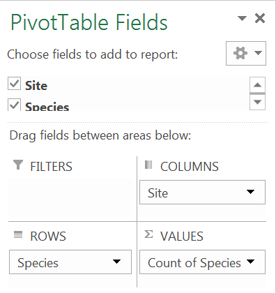

This will produce a table with a list of species (the Rows) down the left. Each column will be a separate sample/site (the Columns). If you had abundance data you’d use this in the Values section, but you don’t so place the Species field again to get a count (frequency), which essentially places a 1 if the species is present and blank if it is absent.
You can use the Pivot Table Tools menus to help reformat and present the Pivot Table. Column totals give the species richness for each sample.
In the example shown here some of the rows have been hidden so you can see the table structure. The totals for the columns give species richness. The row totals are less useful, essentially you get the frequency of occurrence for each species (so the first species occurs in 50% of the samples: 5/10). Where a species is present you see a 1. If a species is absent you see a blank (but you can alter the settings/options to display 0 if you prefer).
Similarity calculations
Now you have the data rearranged by sample you can calculate the similarity (and/or dissimilarity) for each pair of samples. This can get a bit tedious in Excel because you cannot simply drag a formula across rows or columns (you need both). However, it is possible and the example spreadsheet shows the results. Have a look at the example and see how the calculations were performed.
It is easiest to make a matrix (table) of the shared species first, then a second matrix of similarity values from that: recall that the Jaccard index is J/(A+B-J), where J = shared species and A, B are the species richness of the two samples being compared.
It is best to end up with a matrix of dissimilarity (1-similairty) as this will be the y-axis of the dendrogram.
A dissimilarity matrix (Jaccard).
The final dissimilarity matrix is what you’ll use to construct the dendrogram. In the example spreadsheet there is a copy in the Dissimilarity worksheet.

Excel tools for drawing
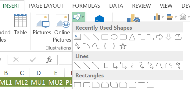
There are no built-in charts that you can coerce Excel to use for your dendrogram. You must use the matrix of (dis)similarity and the drawing tools. This is somewhat tedious but the results can be very good. The exercise also gives you a good insight into what the relationships between samples are.
The tools you need are in the Shapes button of the Insert menu (Excel 2013 and 2010).
The Insert > Shapes button provides the tools you need to construct a dendrogram in Excel.
You are going to need some kind of text box or shape (that you can enter the sample name into) to display the sample names and elbow connectors to join them together. Because of the way the elbow connectors work you’ll also have to use a small shape as a “node”; a kind of joining block if you like.
The dendrogram
Now you are ready to start constructing the Dendrogram.
Joining the first two samples
You’ll need to identify the first pair of samples to join together. These will be the pair that have the smallest (dis)similarity. In our current example this is 0.42, which represents the Jaccard dissimilarity between ML2 & MU2.
- Make a text box or shape for the ML2 sample and place it somewhere near the middle/bottom of the screen. If you choose a plain text box you can display the sample name only, otherwise you can have a shape with the name inside.
- Click on the box you created to activate the Drawing Tools You can then format the object as you like.
- Once you are happy you can copy to the clipboard and paste, to make a duplicate.
- Edit the name of the sample to MU2 (click in the shape or right-click and select Edit Text).
Now you need to make a small shape to use as a node. A diamond works well.
- Use the Insert > Shapes button to make a small shape.
- Use the Drawing Tools menu to format the shape how you want.
- Drag the node shape to a spot between the first two boxes and a little above them.
Now you need to join the node and the two sample boxes.
- Use the Insert > Shapes button and select a plain elbow connector.
- Hover over the ML2 shape and you’ll see “edge markers”, click the top one and hold down the mouse button.
- Drag the mouse to the node shape, when you “arrive” you’ll see the edge markers for the node. You can then release the mouse button to “fix” the connector.
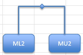
The elbow connector should automatically take the shape you want (an inverted L shape) but if not you can use the mouse to tweak the shape. Repeat the process to join the node to the other (MU2) shape with a fresh elbow connector.
You’ll find that if you click the node you can use the arrow keys (or the mouse) to reposition the node; the elbow connectors move too so that the connection remains intact. You are going to use the “crossbar” through the node to indicate the index of (dis)similarity. This will be done later but it is worth keeping in mind as you build the dendrogram.
I chose a rounded rectangle as a shape in tis example but you could use a text box and display the label only (i.e. without a rectangle). Once you have the first pair “entered” it is a good idea to “mark off” the dissimilarity in the matrix of values. You can simply click the 0.42 value in the spreadsheet and make the text a different colour or alter the format in some other way.
Second connection
Now you’ve got the first pair joined you want to scan the dissimilarity matrix for the next largest value. There are subtly different methods of selecting which items to select – you are going for the simplest, which is called single linkage.
If the next largest value would join two completely different samples then proceed as before and join these items together. You can place them to one side or the other of the first pair and the crossbar will be a little higher, because it represents a larger dissimilarity. One of the difficulties about dendrograms is that you do not know how much room each item will require, so you may well have to move items around. You’ll see this situation later…
If the next largest dissimilarity joins a new sample to an existing pair, then you make a new shape for the sample label and join that to the pair already joined. You will still need another node shape. In this case that is exactly what you need to do as the next largest dissimilarity is 0.46, which is the MU1 & ML2 pairing. The MU1 sample is “new” but ML2 is already in the dendrogram. So:
- Copy one of the sample shapes to the clipboard and paste it to a convenient spot.
- Edit the text to represent the MU1 sample.
- Drag the new MU1 shape to the left of the existing pair (you could go the other side but I choose left). You can place the MU1 shape to be in-line with the other pair or slightly higher. It is easier to line then up.
- Now make a new node shape; just copy an existing one and paste it to a convenient spot. You want to move the node so that it lies between the new shape and the other pair, and a bit higher than the other crossbar.
Now you need to add elbow connectors:
- Use Insert > Shapes and select an elbow connector.
- Hover over the MU1 box and then click and hold over the top edge marker.
- Drag the mouse to the new node and connect.
- Now make a new elbow connector and join the new node to the previous one.
You can click the new node and move it to get the lines how you want.
The height of the “crossbars” will represent the level of dissimilarity. A new sample item is joined to an existing pair via the joining node(s).
Hopefully, you will now see why the nodes are required; you cannot join an elbow connector to another elbow connector.
Now you can “mark off” the dissimilarity (the 0.46 item) in the matrix and carry on building.
Existing pairings
Now look for the next largest dissimilarity, it is the 0.48 between MU1 & MU2. However, these items are already on the dendrogram. So, you can mark off the 0.48 item and move on to another.
This method is the so-called single linkage method and is the simplest to operate. An alternative is to find the average dissimilarity between potential pairings. This generally has little effect except to alter the position of the crossbars. Another method is “complete” linkage. In this case you look for all potential joins and join pairs when you can, then join these pairings with the “spare” dissimilarities. It is easy to make errors with these alternative methods and the single linkage method is the simplest. If you are using Excel (like here) then stick to single linkage. If you use R then the “complete” method is the default method, although you can easily specify single linkage.
Third connection (fourth item)
The next largest dissimilarity is 0.5, the MU1 & ML1 pairing. Since ML1 is not on the dendrogram you can add it in the same way you added the MU1 item.
The fourth item extends the dendrogram. Note that the crossbars denote dissimilarity.
Now you can mark off the 0.5 dissimilarity and keep on building.
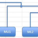
Making room
At some point it is almost inevitable that you’ll need to move items around to make space for new ones. You can click a shape with the mouse to select it. If you hold the control key, you can select multiple objects. The trick is to be systematic; select the sample name shapes first then all the nodes. Then go for the elbow connectors, as you select these you should see some small (probably green) selection “knobs” appear at the ends of the elbow lines, these help to spot that you’ve selected them. Once you have got all the items you want try an arrow key and the items should move together.
Fourth connection
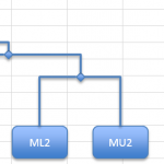
The next dissimilarity is 0.55 but this is between ML1 and MU2, which are already represented. Similarly, 0.59 (ML2 & ML1) is represented. The next “available” dissimilarity is 0.61 between SU1 and SU2. This will make a completely new pair.
Make new shapes for the SU1 and SU2 samples and join them as you did for the very first pair. Place them to the right of the existing block of samples. The crossbar needs to be a bit higher, as the dissimilarity is larger.
The latest pair does not connect to any existing samples. Eventually the blocks will be connected.
You can now check off the 0.61 item from the dissimilarity matrix.
More connections
The next largest dissimilarity is 0.66 between SL1 & SU1. This means that you’ll need to make a new shape for SL1 and join it to the pair on the right.


You can now check-off the 0.66 dissimilarity.
The next largest dissimilarity is 0.69, between SL2 & SU1. You need to make a new shape for SL2 and join it to the right-hand block.
Now check-off the 0.69 dissimilarity.
The next largest dissimilarity is 0.72, between PU2 and MU1. Now, MU1 is already represented so you’ll need to make a new shape for PU2 and join it to the left-hand block.


Now check-off the 0.72 dissimilarity.
The next largest is 0.75, which is there twice (if you are looking at 2 decimal places). Both pairings are already represented. Keep going, you’ll check off 0.76 and 0.77.
The next largest is 0.79, between PL2 and SL1. This means you’ll need to make a new shape for PL2, which you can place on the right and join to the right-hand block.
PL2 is the final sample you need to add but you still have two blocks of samples in the dendrogram. Use the top two node shapes and join them with a single elbow connector. Alternatively, make a new node in the middle and two connectors. This is not necessary but makes it a little easier to shift things around if you need to tweak the positions.
Now the dendrogram is completed. You can check to see that the remaining dissimilarity values are represented but you can see that there are 10 samples in the data and 10 in the dendrogram.
Final touches
The dendrogram is completed but it would be good to have an axis to show the dissimilarity. The simplest way is to draw a vertical line and add some text annotations to show the dissimilarity. The gridlines in the worksheet are useful aids to help you align the crossbars.
Rearranging branches
The important thing about the dendrogram is the connections between the sample blocks and the nodes, as well as the position of the crossbars. You could draw the dendrogram with the samples in a different order. Essentially you could “reflect” or rotate the branches around any of the nodes, as long as the objects have the “correct” joins the appearance can alter.
Look at the following dendrogram, drawn using R.

Dendrogram produced using R.
It is essentially the same as the example done with Excel but the branches are arranged subtly differently. This makes it appear different
Comments are closed.