Tally plots for data visualisation in Excel

Exercise 6.2.1.

Statistics for Ecologists (Edition 2) Exercise 6.2.1

Some notes on data visualisation to supplement Chapter 6.

Tally plots for data visualisation in Excel

Introduction

Data distribution is important. You need to know the shape of your data so that you can determine the best:

  • Summary statistics
  • Analytical routines

Some statistical tests use the properties of the normal (Gaussian) distribution, whilst others use data ranks. So, it’s important to know if your data are normally distributed or otherwise.

The classic way to look at the shape of your data is with a histogram, showing the frequency of observations that fall into certain size classes (called bins). However, you can make a “quick and dirty” histogram using pencil and paper, a tally plot. The tally plot is useful as it is something you can do in a notebook in the field as you collect data.

The classic histogram

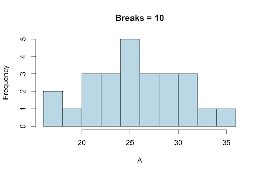
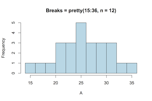
A classic histogram uses an x-axis that is a continuous variable, like the following example drawn using R:

A classic histogram has a continuous x-axis (this drawn using R).

The x-axis is split according to the bin boundaries and the bars show the frequency of observations that fall between two bin boundaries. This classic histogram is easy to draw using R with the hist() command. The command works out the axis breakpoints and calculates the frequencies for you.

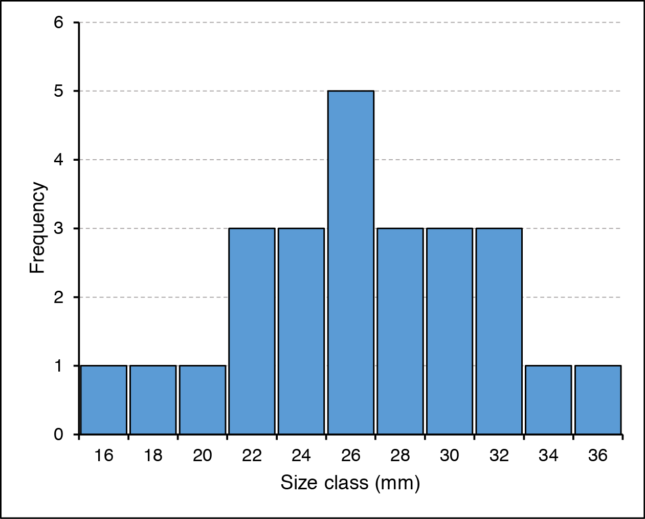
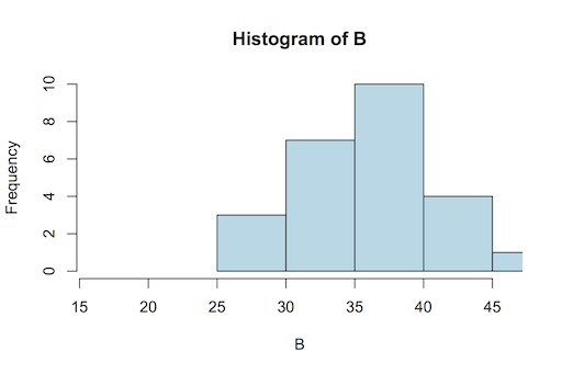
Excel cannot draw a “proper” histogram; the nearest it can get is a column chart with separate categories representing the bin classes:

In Excel the column chart is used in lieu of a true histogram. The x-axis is split into categories representing the bin sizes.

This is not so terrible, but it is not quite the same as a true histogram. In the preceding example the bars have been widened to reduce the gap width, which makes the chart appear more like a real histogram.

Using Excel to calculate data frequency

You can draw the histogram (column chart) in Excel easily enough but need to compute the frequency of observations for each bin class. To do this you need the FREQUENCY function.

FREQUENCY(data_array, bins_array)

To use the function, follow these steps:

  1. Make sure you have your data!
  2. Work out the minimum value you’ll need (the MIN function is helpful).
  3. Work out the maximum (use the MAX function).
  4. Determine the interval you need to give you the number of bins you want.
  5. Type in the values for the bins somewhere in your worksheet.
  6. Highlight the cells adjacent to the bins you just made, these will hold the frequencies.
  7. Type the formula for FREQUENCY, highlighting the appropriate cells (or type their cell range) for the data and bins.
  8. Do NOT press Enter since FREQUENCY is an array function. Instead press Ctrl+Shift+Enter (on a Mac Cmd+Shift+Enter), which will complete the function and place the result into all the cells you highlighted.

Figure 11. Frequency-array.png

The FREQUENCY function places a result into an array of cells.

Now you have the bins and the frequency so you can build your histogram (column chart), using the Insert > Column Chart button.

Frequency calculation via Analysis ToolPak

You could skip the frequency calculation stage altogether and use the Analysis ToolPak (Insert > Data Analysis), which will also draw a column chart (histogram) for you if you like.

If you cannot see the Data > Data Analysis button you may not have the ToolPak installed. Go to the Excel options and the Add-Ins section, where you can enable it.

The Histogram section of the Analysis ToolPak requires you to have some data and a range of bins. So:

  1. Make sure you have your data!
  2. Work out the minimum value you’ll need (the MIN function is helpful).
  3. Work out the maximum (use the MAX function).
  4. Determine the interval you need to give you the number of bins you want.
  5. Type in the values for the bins somewhere in your worksheet.
  6. Click the Data > Data Analysis button.
  7. Scroll down and choose the Histogram option.
  8. Fill in the boxes for the data range and the bins ranges.
  9. Click OK and the Analysis ToolPak will compute the frequencies for you.

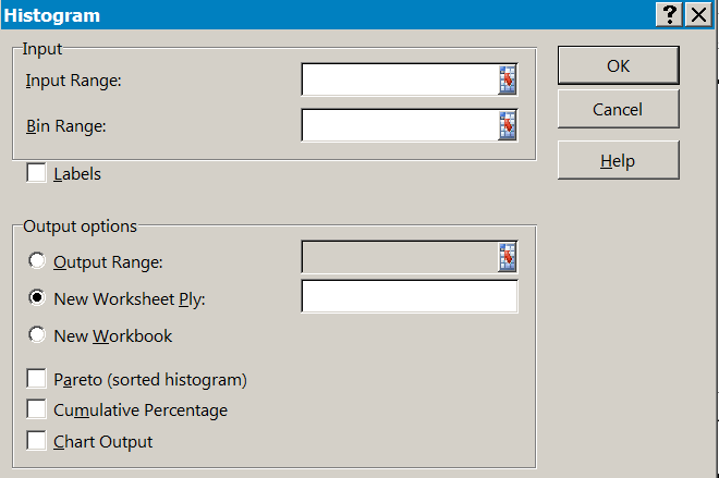
Once you’ve clicked OK you should see the results, the bins will be repeated alongside the appropriate frequencies. If you selected to have a chart output, then you’ll see a column chart too.

If you do not have Windows or indeed Excel, then you can’t use the Analysis ToolPak but you can still use the FREQUENCY function. Both FREQUENCY and REPT are part of the armoury of OpenOffice and LibreOffice (and probably others).

Making a Tally plot

You may not want a graphic and require only a simple tally plot. It is easy to do this in Excel using the FREQUENCY and REPT functions. You use the FREQUENCY function as described before to determine the frequency of observation in various bins. Once you have the frequencies you use the REPT function to repeat some text a number of times (corresponding to the frequency).

The REPT function repeats some text a number of times. Use with FREQUENCY to make a tally plot.

In the example I have set the character text I want to use in cell D6. The frequencies are in E2:E12. The REPT function takes the text I want to display as a tally mark and repeats it by the number on the frequency column. Note the cell reference D$6, which “fixes” the row so that the formula stays correct as it it copied down (from G2 to G12).

You could use the text directly in the REPT formula e.g. =REPT(“X”, E2) but then if you wanted to alter the tally plot you’d need to alter all the cells. If you point to a single cell you can alter the tally plot simply by typing a new tally character into that one cell.

The tally plot doesn’t really replace the histogram but it can be useful to have a plain text representation of your data rather than a graphic. You can copy the spreadsheet cells into various programs.

Bins
16 X
18 X
20 X
22 XXX
24 XXX
26 XXXXX
28 XXX
30 XXX
32 XXX
34 X
36 X

If it not too hard to get the tally plot oriented with the tallies vertical. You’ll need to format the tally cells so that they are oriented at 90˚ but otherwise this is straightforward. However, in the “vertical” orientation the cells do not copy/paste so nicely!

Getting data from Excel to R

Exercise 3.3.

Statistics for Ecologists (Edition 2) Exercise 3.3

Incomplete final line error on CSV import

Sometimes you can get an error message when trying to import a CSV file, most likely with the read.csv() or read.table() command. The “incomplete final line” error message arises when there is a “missing” return in the last data row of your CSV file. You need to add an extra line-feed at the end of the file.

There are two ways you can set about this:

  • Open the file in a text editor and add an extra line. Then import the file to R.
  • Send an additional line-feed directly to the file from R itself. Then import the file to R.

Whichever method you choose it is a good idea to make a backup of the file, just in case. If you open your “faulty” file in a spreadsheet it will look absolutely fine; it is only in a text editor or word processor that you can see the end-of-line characters (not all editors display hidden characters).

Edit file in text editor

The OS-based method of fixing this problem is to open the file in any kind of text editor. WordPad is a good choice in Windows as it can handle line-breaks more effectively (Windows likes end-of-line characters to be CR & LF, Mac uses LF and Linux CR, WordPad displays all correctly, Word does not). Go to the bottom of the file and if you cannot get the cursor past the end of the final line there is a missing linefeed. Simply press the Enter key on the keyboard to add the final linefeed and save the file.

Now when you try to import the file you should not get the error.

Send extra linefeed from R

You can send a linefeed to a file directly from R using the cat() command. Use a command like so:

cat("\n", file = file.choose(), append = TRUE)

The “\n” is a “newline” character (you do need the quotes). Note that you need to use append = TRUE otherwise you will overwrite the file with nothing except your newline character. If you are using Linux then you’ll need to specify the filename explicitly but in Windows or Mac the file.choose() part will allow you to choose the file.

Data Analytics Articles

These articles cover a range of topics in data science, including Using R, Using Excel, quantitative data analysis, predictive data analysis and a lot more besides.

You can browse the articles or use the search facility to look for specific topics and keywords.

Learning to work with R

Learning to work with R

A question I often see in online help forums is along these lines, “I want to become an expert in R, please help”. Such messages are usually followed by replies containing plenty of links to online materials or helpful books. I have posted such replies myself. Whilst this kind of reply is undoubtedly useful it doesn’t really address the issue of how someone sets about learning to work with R.

This made me think about how I set about learning to work with R. I wondered if I could set out the key elements of the learning experience – this essay is my attempt.

  • Key learning elements
    • Look around
    • Be active
    • Solve your own problems
    • Keep a diary
    • Be persistent

This article first appeared on the Amazon tech.book store in early April 2013.

Key learning elements

The best learning experiences are practical and interactive. You learn fastest when you do something for yourself. You learn slowest when someone tells you what to do. Somewhere in-between is when someone shows you what to do.

You can split the processes involved into several inter-related parts:

  • Look around – try different resources
  • Be active – get your fingers on the keyboard
  • Solve your own problems – using your own data helps your understanding
  • Keep a diary – write down what you learn
  • Be persistent – practice makes perfect

Look around

There are many resources available to help you learn R; I have written several myself (see my website). A good start is the R website at http://www.r-project.org/ where you can access many excellent documents. Try downloading some of the contributed documents, you will find that some are more helpful to you than others. Different authors have different approaches so look around and see what suits you.

There are many online forums and articles regarding R; there are Google groups, LinkedIn groups and many others besides. Have a search and see what is going on in these. Two general sites are R-bloggers and stackoverflow.

There are also many books, including my own modest contributions (see my Amazon profile). You can easily see what is available with a quick search in Amazon. Many of the books are available in electronic format, which might suit you better than a paper book. Many Amazon books have the “search inside” feature, which can help you see something of the contents.

Be active

You learn best when you are doing something active for yourself. This can be as simple as copying the examples in an R textbook. As you read you should pause and copy the examples by typing for yourself. This helps you to consolidate your learning and makes it “stick”. If there are example exercises, then try them out; similarly, if there are summary questions then have a go and test yourself.

Solve your own problems

This comes vaguely into the previous category in that it is an active process. The point is to use your own data or at least data from your own field of study/work. Solving problems from any field is useful but if you can apply what you’ve learnt to your own area of expertise you will learn quicker.

Keep a diary

A really important element is being able to move forwards. If you keep forgetting details you will have to continually refer back to the book or resource that you’ve been using. Keeping your own “learning diary” can help enormously. I suggest a simple text document rather than a full-blown word processor. This is because R does not recognize “smart” quotes, so if you need to copy/paste you may run into problems.

As you learn new things you should try to write them into your learning diary right away. My own learning diary is still in use! You will soon find the best way to organize your learning diary – perhaps you might think of it as your own help file. I tend to have simple headings that categorize the things I want to recall, such as graphics, entering data and manipulating data. I might add the name of a command that I have just learnt and then include a few brief notes. Having an example that you can copy and paste into R is helpful.

At the beginning you’ll undoubtedly refer to your learning diary often. As you learn more you will find that you refer to it less often. I find that I add new stuff, to which I refer, whilst the older material is read less often.

Your learning diary could be in the form of an R script. This is just a plain text document saved with the .R extension to the filename. If you use Windows you can use the Filemenu to open a new or existing script (in Mac use the Filemenu to open or create a new document).

A script window is useful to keep snippets of code, examples and your learning diary. You can transfer command lines into R from the script window using Ctrl+R (on Mac use Cmd+Enter) and transfer material into the script from the R console using copy/paste.

You can easily arrange it so that you can see the R console and the script window side by side, allowing you to easily keep track of what you are doing.

Be persistent

There are two sayings that spring to mind: “Rome wasn’t built in a day” and “Use it or lose it”. You cannot expect to become perfect overnight and you cannot expect to remember how to carry out any particular analysis a year down the line without having practiced in the intervening period.

The point is that you need to keep using R to be really proficient with it. I used to use R for various statistical analyses and not for much else. These days I use it for trivial calculations (it is after all, a glorified calculator) and even to choose my lottery numbers!

Author Bio

Mark is an ecologist, lecturer and writer working in the UK and with a passion for learning new things. He is currently self-employed and runs courses in ecology, data analysis and R for a variety of organizations.

Plot two (overlapping) histograms on one chart in R

I was preparing some teaching material recently and wanted to show how two samples distributions overlapped. This meant I needed to work out how to plot two histograms on one axis and also to make the colors transparent, so that they could both be discerned.

For my teaching example I wanted to make some normally distributed data and show how the overlap changes as the means and variance of the samples alters. However, being able to plot two sample distributions on a single chart is a generally useful thing so I wrote some code to take two samples and do just that.

Transparent colors

The first step is to make transparent colors; then any overlapping bars will remain visible. The key command is rgb() but you need to get R G and B values first.

Pick a color

Select a color that you want to make transparent. Then use the col2rgb() command to get the red, green and blue values you need for the rgb() command e.g.:

> col2rgb("lightblue")
      [,1]
red    173
green  216
blue   230

This gives you a matrix with three rows (red, blue, green). This means you can get values for several colors at once:

> col2rgb(c("lightblue", "lightgreen", "pink"))
      [,1] [,2] [,3]
red    173  144  255
green  216  238  192
blue   230  144  203

Make your chosen color transparent

The rgb() command defines a color: you define a new color using numerical values (0–255) for red, green and blue. In addition, you set an alpha value (also 0–255), which sets the transparency (0 being fully transparent and 255 being “solid”).

You also need to set the maximum color value, so that the command can relate your alpha value to a level of transparency. In practice setting max = 255 works well (since RGB colors are usually defined in the range 0–255).

The following example takes the standard blue and makes it transparent (~50%):

> mycol <- rgb(0, 0, 255, max = 255, alpha = 125, names = "blue50")

Note that the names parameter sets a name attribute for your color. You cannot use the name directly but it can be useful to see a name. You can call your colors anything of course, here they are simply named c1 and c2:

> c1 <- rgb(173,216,230,max = 255, alpha = 80, names = "lt.blue")
> c2 <- rgb(255,192,203, max = 255, alpha = 80, names = "lt.pink")

Make your histograms

The hist() command makes a histogram. Here is an example using some defaults.

> A # a numeric vector
[1] 17 26 28 27 29 28 25 26 34 32 23 29 24 21 26 31 31 22 26 19 36 23 21 16 30

> hist(A, col = "lightblue")

The defaults set the breakpoints and define the limits of the x-axis too. The histogram is plotted by default but you can alter this and save the histogram to a named object, which is going to be useful.

Histogram breakpoints

The breakpoints are set using the breaks parameter. There are 3 main options:

  • A character string giving one of the in-built algorithms: “Sturges”, “Scott” or “FD” (“Freedman-Diaconis”).
  • A number giving the desired number of breaks (you can also give a formula that produces a single number).
  • A numerical vector giving the explicit breakpoints (or a formula that results in a numeric vector).

For example:

> hist(A, col = "lightblue", breaks = 10, main = "Breaks = 10")

The previous example used a set number of breakpoints. You can set explicit values too (which also means you can have unequal bar widths!):

> range(A)
[1] 16 36

> pretty(15:36, n = 12)
[1] 14 16 18 20 22 24 26 28 30 32 34 36

> hist(A, breaks = pretty(15:36, n = 12), col = "lightblue", main = "Breaks = pretty(15:36, n = 12)")

Note that the second breakpoint is the right edge of the first histogram bar. In the previous example the pretty() command was used to set the breaks. This command splits up a range of values into a tidy set of values, and is generally used internally by graphics commands to set axes.

Histogram x-axis width

The limits of the x-axis are set by the breakpoints but you can over-ride them as you need. There are two ways you can control the width, either way will permit you to make the space for two histograms on the one axis:

  • Use the xlim parameter: you can set the axis width to cover the range of the combined samples.
  • Use the breaks parameter: you can set the breaks to cover the range of the combined sample.

Using xlim to set axis limits

The xlim parameter allows you to specify the limits of the x-axis by giving a vector of two values, the start and end.

> A
[1] 17 26 28 27 29 28 25 26 34 32 23 29 24 21 26 31 31 22 26 19 36 23 21 16 30

> B
[1] 27 36 38 37 39 38 35 36 44 42 33 39 34 31 36 41 41 32 36 29 46 33 31 26 40

> range(c(A,B))
[1] 16 46

Unfortunately, simply using the range of the combined samples is not always sufficient!

> hist(B, xlim = range(c(A,B)), col = "lightblue")

In the previous example you can see that the x-axis is not quite large enough to accommodate the entire range of the histogram. If you save the histogram to a named object you can see the data:

> hgB <- hist(B, plot = FALSE)

> hgB
$breaks
[1] 25 30 35 40 45 50

$counts
[1] 3 7 10 4 1

$density
[1] 0.024 0.056 0.080 0.032 0.008

$mids
[1] 27.5 32.5 37.5 42.5 47.5

$xname
[1] "B"

$equidist
[1] TRUE

attr(,"class")
[1] "histogram"

So, if you want to use xlim to set the axis limits you should use the histogram $breaks data, rather than the original sample data.

Using pretty() to set axis limits

The pretty() command is useful to set your x-axis limits because it moves the breakpoints about and makes tidy intervals. For example:

> range(c(A,B))
[1] 16 46

> pretty(16:46)
[1] 15 20 25 30 35 40 45 50

If you used this method your x-axis would encompass the entire histogram range.

You can set the “desired” number of breaks in the pretty() command:

> pretty(16:46)
[1] 15 20 25 30 35 40 45 50

> pretty(16:46, n = 10)
[1] 15 20 25 30 35 40 45 50

> pretty(16:46, n = 12)
[1] 16 18 20 22 24 26 28 30 32 34 36 38 40 42 44 46

You set n = your desired optimal number and the command does its best to create approximately that number of intervals.

If you subtract a tiny value from the minimum value you’ll be certain to encompass the entire dataset:

> b <- min(c(A,B)) – 0.001
> e <- max(c(A,B))

> b;e
[1] 15.999
[1] 46

> pretty(b:e, n = 12)
[1] 14 16 18 20 22 24 26 28 30 32 34 36 38 40 42 44 46

Don’t try to set the xlim parameter with the pretty() values, use them as explicit breakpoints:

> hist(B, col = "lightblue", breaks = pretty(b:e, n = 12))

Using the pretty() command has an additional benefit: the interval will be the same for both histograms so that when plotted the bars will be the same width.

Histogram chart data

In order to plot two histograms on one plot you need a way to add the second sample to an existing plot. You cannot do this directly via the hist() command.

You need to save your histogram as a named object without plotting it. To do this you specify plot = FALSE as a parameter. If you save the histogram to a named object you can plot it later. Actually you can save the histogram data and plot it at the same time but you cannot add to an existing plot in this way.

> A
[1] 17 26 28 27 29 28 25 26 34 32 23 29 24 21 26 31 31 22 26 19 36 23 21 16 30

> hgA <- hist(A)
> hgA
$breaks
[1] 15 20 25 30 35 40

$counts
[1] 3 7 10 4 1

$density
[1] 0.024 0.056 0.080 0.032 0.008

$mids
[1] 17.5 22.5 27.5 32.5 37.5

$xname
[1] "A"

$equidist
[1] TRUE

attr(,"class")
[1] "histogram"

You can see that the data are stored in $ components and that you can access the frequency or density data. The breakpoints are set at this time and you cannot alter them unless you re-run the command and specify different values.

In order to plot a histogram object you simply use plot(). You can specify add = TRUE to plot a second histogram in the same plot window.

Plot two histograms

If you have a histogram object, all the data you need is contained in that object. Using plot() will simply plot the histogram as if you’d typed hist() from the start. However, you can now use add = TRUE as a parameter, which allows a second histogram to be plotted on the same chart/axis.

To make sure that both histograms fit on the same x-axis you’ll need to specify the appropriate xlim() command to set the x-axis limits. Alternatively, (and probably better) is to set the breakpoints for both histograms to cover the combined range of the samples.

Inevitably some bars will overlap, which is where the transparent colors come in useful. The following steps illustrate the process using the data examples you’ve already seen.

> A;B # The data
[1] 17 26 28 27 29 28 25 26 34 32 23 29 24 21 26 31 31 22 26 19 36 23 21 16 30
[1] 27 36 38 37 39 38 35 36 44 42 33 39 34 31 36 41 41 32 36 29 46 33 31 26 40

> b <- min(c(A,B)) – 0.001 # Set the minimum for the breakpoints
> e <- max(c(A,B)) # Set the maximum for the breakpoints
> ax <- pretty(b:e, n = 12) # Make a neat vector for the breakpoints
> ax
[1] 14 16 18 20 22 24 26 28 30 32 34 36 38 40 42 44 46

> hgA <- hist(A, breaks = ax, plot = FALSE) # Save first histogram data
> hgB <- hist(B, breaks = ax, plot = FALSE) # Save 2nd histogram data

> plot(hgA, col = c1) # Plot 1st histogram using a transparent color
> plot(hgB, col = c2, add = TRUE) # Add 2nd histogram using different color

The result looks something like the following:

In this example the y-axis is sufficient to cover both samples but if your data contain quite different frequencies you can use the ylim parameter to set the appropriate size for the y-axis.

If you want to plot the densities instead of the frequencies you can use freq = FALSE as you would when using the hist() command. This means you could also add the density lines to your plots as well as the histograms. Note that you cannot set the breaks in this manner.

Histograms with different breakpoints

If your histograms have different breakpoints, you’ll need to juggle the xlim parameter to get the right size for the x-axis. The ylim parameter may also need tweaking if frequencies are different.

> hgA <- hist(A, breaks = 12)
> hgB <- hist(B)

> range(c(hgA$breaks, hgB$breaks)) # Get range for x-axis
[1] 16 50

> max(c(hgA$count, hgB$count)) # Get range for y-axis
[1] 10

> plot(hgA, col = c1, xlim = c(16, 50), ylim = c(0,10))
> plot(hgB, add = TRUE, col = c2)

In the previous example both xlim and ylim parameters needed to be altered. Note that although the xlim parameter set the minimum to 16, the axis ended up with a minimum of 15. This is because the plot() command has used pretty() internally to “neaten” the axis intervals.

You only need to alter the xlim and ylim parameters for the first plot because the plot dimensions are already set by the time you add the second histogram.

Combine multiple columns as row names in R

Sometimes your data contains more than one column that you want to use as labels. You may want “combination” labels for graphs or perhaps to use as row names.

This is where the paste() command comes in useful, as it allows you to combine items into a new item.

Use paste() to combine elements

The paste() command allows you to combine several items and reform them into a single item. There are many uses for this command such as making labels for plots or row names for a data object. Look at these example data for example (you can get/view the datafile here):

Colour    Coat Obs Ratio
 Green  Smooth 116     9
 Green Wrinkle  40     3
Yellow  Smooth  31     3
Yellow Wrinkle  13     1

The data shows some phenotype data. There are four varieties of pea plants with two main characteristics, the colour and the smoothness. The Obs column shows the observed frequency of plants in an experiment. The Ratio column shows the expected ratio of the four phenotypes under standard genetic theory.

It would be helpful to have the Colour and Coat combined into one and used as the row names. You can use the paste() command to achieve this.

The paste() command in its simplest form requires the names of the objects to combine and the separator (a text character).

Start by getting the data from the .txt file:

> peas <- read.table(file.choose(), header = TRUE, sep = "\t")
> peas
  Colour    Coat Obs Ratio
1  Green  Smooth 116     9
2  Green Wrinkle  40     3
3 Yellow  Smooth  31     3
4 Yellow Wrinkle  13     1

Then you need to combine the Colour and Coat columns, the separator will be a colon “:”.

> rownames(peas) <- with(peas, paste(Colour, Coat, sep = ":"))

Now you’ve got the rownames sorted you can remove the original Coat and Colour columns:

> peas <- peas[, -1:-2]
> peas
               Obs Ratio
Green:Smooth   116     9
Green:Wrinkle   40     3
Yellow:Smooth   31     3
Yellow:Wrinkle  13     1

Now you have a combination of coat and colour as a single element.

Read column names as numbers when importing a data file to R

When you read in a data file from CSV or some other text format, R will examine the column headings and ensure that they are in correct “R-format”. If your headings are all numbers, for example years, then R will convert them to character strings and prepend “X” to each heading.

You can overcome this behaviour and force R to read the headings as they come. Your headings are still converted to character strings but these are easier to coerce to a numeric value.

Use check.names = FALSE

Look at these data (you can view/get the datafile here):

Spp     1996 1997 1998 1999 2000
M.bro     88   47   13   33   86
Or.tip    90   14   36   24   47
Paint.l   50    0    0    0    4
Pea       48  110   85   54   65
Red.ad     6    3    8   10   15
Ring     190   80   96  179  145

The first column contains species names and the rest are numbers. The column names are mostly years (the sampling year). If you read these data into R the column names will be prepended with “X”, which is not helpful.

If you add check.names = FALSE as a parameter to read.xxxx() you’ll force R to accept the names of the columns as they are.

> bfy <- read.table(file.choose(), header = TRUE, sep = "\t", check.names = FALSE, row.names = 1)

> bfy
        1996 1997 1998 1999 2000
M.bro     88   47   13   33   86
Or.tip    90   14   36   24   47
Paint.l   50    0    0    0    4
Pea       48  110   85   54   65
Red.ad     6    3    8   10   15
Ring     190   80   96  179  145

> as.numeric(colnames(bfy))
[1] 1996 1997 1998 1999 2000

The data object will contain column names that are character but it is easy to coerce them to numeric with the as.numeric() command.

Of course this is a bit of a cheat… the column names are not real numbers. You cannot make the column names “properly” numeric but in this (character) form you can easily coerce them to be numeric when you need with the as.numeric() command.

Make transparent colors in R

You can easily make transparent colors using R and the rgb() command. These colors can be useful for charts and graphics with overlapping elements.

The rgb() command is the key: you define a new color using numerical values (0–255) for red, green and blue. In addition, you set an alpha value (also 0–255), which sets the transparency (0 being fully transparent and 255 being “solid”).

You also need to set the maximum color value, so that the command can relate your alpha value to a level of transparency. In practice setting max = 255 works well (since RGB colors are usually defined in the range 0–255).

The following example takes the standard blue and makes it transparent (~50%):

mycol <- rgb(0, 0, 255, max = 255, alpha = 125, names = "blue50")

Note that the names parameter sets a name attribute for your color. You cannot use the name directly but it can be useful to see a name, e.g.

> mycol
     blue50
"#0000FF7D"

Get the RGB values

Use the col2rgb() command to get the red, green and blue values you need for the rgb() command e.g.:

> col2rgb("lightblue")
      [,1]
red    173
green  216
blue   230

This gives you a matrix with three rows (red, blue, green). This means you can get values for several colors at once:

> col2rgb(c("lightblue", "lightgreen", "pink"))
      [,1] [,2] [,3]
red    173  144  255
green  216  238  192
blue   230  144  203

Custom function for transparent colors

It is fairly easy to make a custom function that takes a named color and makes a transparent version. Here is some code that makes a single color. It could be extended to make a matrix of several colors quite easily:

## Transparent colors
## Mark Gardener 2015
## www.dataanalytics.org.uk

t_col <- function(color, percent = 50, name = NULL) {
  #      color = color name
  #    percent = % transparency
  #       name = an optional name for the color

## Get RGB values for named color
rgb.val <- col2rgb(color)

## Make new color using input color as base and alpha set by transparency
t.col <- rgb(rgb.val[1], rgb.val[2], rgb.val[3],
             max = 255,
             alpha = (100 - percent) * 255 / 100,
             names = name)

## Save the color
invisible(t.col)
}
## END

Example of using transparent color

Here is a quick example of the function in action:

> opar <- par(mfrow = c(1,2))
> set.seed(1)
> hist(rnorm(100), col = "pink")
> mycol <- t_col("pink", perc = 50, name = "lt.pink")
> hist(rnorm(100), col = mycol)
> par(opar)

Save all objects to disk as separate files

You can easily save one or more objects to disk using save() or save.image(). However, if you want to save many items, each as a separate file, you have to use a loop and a paste() command…

It is easy to save the objects you have stored in the R Console. You can save individual items with save().

save(..., list = character(), file = "filename")

You can either type the names of the items to save, separated by commas, or provide a list. The list can be any object or command that produces names of objects.

If you want to save all items, you have then you can use:

save(list = ls(), file = "filename")

A convenience function save.image() does the same thing. You just specify the filename to hold the data. If you omit the filename R saves to a default file: this is what is opened when R starts up and what happens when you say “yes” when asked if you want to save the workspace.

Both save() and save.image() will create a single file when you run them. In most cases this is helpful but there are times when you want to save objects as separate files. One such occasion might be when you are making an R package. You will need to save data items as separate .RData files and functions as .R files.

You can use a simple loop and the paste() function to save all objects to a folder as separate files.

obj <- ls()

for(i in 1:length(obj))
 {
save(list = (obj[i]),
file = paste(obj[I], ".RData", sep = ""))
 }

rm(i, obj)

You start by listing everything and saving the result to a named object (obj in this case).

The loop runs for as many times as there are items in the listing; length(obj). Each time the loop goes around it takes the name of an item; list = obj[i] and saves it to a file.

The filename is built using the paste() command. This joins things together, with the sep =parameter telling R what character to use (if any) between items. In the example I used the name of the item; obj[i] and added .RData to the name. Note that “.RData” is in quotes. The sep = “” part tells R to use no character in the joining.

The result is that every item obtained by ls() is saved to disk as a separate .RData file. The files will go to your working directory unless you alter it, either using the setwd() command or by prepending a pathname to the paste() command.

Separate listing for functions and variables

If you have both data and functions in your workspace, you’ll need to split them. I found these custom functions on the [R] Help forum via a web search:

ls.funs <- function(env=sys.frame(-1)) unlist(lapply(ls(env=env),
function(x) if(is.function(get(x)))x))

ls.vars <- function(env=sys.frame(-1)) unlist(lapply(ls(env=env),
function(x) if(!is.function(get(x)))x))

# To use type:
ls.funs()
ls.vars()

You can use these new functions instead of ls() and make a new object containing the names. Simply use “.RData” for varaibles (data) and “.R” for functions to get the correct file extensions.

Sending R output to disk files

Sometimes you want to get the results of an analysis from your R console to a word processor. Copy and paste does not work well unless you are prepared to use fixed width font in the target document. The trick is to send the output to a disk file using the sink() command first.

The sink() command

The sink() command allows you to send anything that would have gone to the console (your screen) to a disk file instead.

sink(file = NULL, append = FALSE, split = FALSE)

You need to supply the filename, setting file = NULL closes the connection and stops sink()ing. To add to an existing file use append = TRUE. If you set split = TRUE the output goes to the console and the file you specified.

When you issue the command a file is created, ready to accept the output. If you set append = FALSE and the file already exists, it will be overwritten. If you set file = TRUE a connection is opened and subsequent output goes to the file.

# Send output to screen and file
> sink(file = "Out1.txt", split = TRUE, append = FALSE)

> summary(lm(Fertility ~ . , data = swiss))

Call:
lm(formula = Fertility ~ ., data = swiss)
Residuals:
     Min       1Q   Median       3Q      Max
-15.2743  -5.2617   0.5032   4.1198  15.3213

Coefficients:
                 Estimate Std. Error t value Pr(>|t|)
(Intercept)      66.91518   10.70604   6.250 1.91e-07 ***
Agriculture      -0.17211    0.07030  -2.448  0.01873 *
Examination      -0.25801    0.25388  -1.016  0.31546
Education        -0.87094    0.18303  -4.758 2.43e-05 ***
Catholic          0.10412    0.03526   2.953  0.00519 **
Infant.Mortality  1.07705    0.38172   2.822  0.00734 **
—
Signif. codes:  0 ‘***’ 0.001 ‘**’ 0.01 ‘*’ 0.05 ‘.’ 0.1 ‘ ‘ 1

Residual standard error: 7.165 on 41 degrees of freedom
Multiple R-squared:  0.7067,     Adjusted R-squared:  0.671
F-statistic: 19.76 on 5 and 41 DF,  p-value: 5.594e-10

# Stop sending output to file
> sink(file = NULL)

Note that even if you set append = FALSE subsequent output is appended to the file. Once you issue the command sink(file = NULL) output stops and you can see your file using any kind of text editor.

If you only want to send a single “result” to a disk file you can use the capture.output() command instead.

capture.output(..., file = NULL, append = FALSE)

You provide the commands that will produce the output and the filename. If you set append = TRUE and the target file exists, the output will be added to the file. If you set append = FALSE (the default) the file will be “blanked” and the output will therefore overwrite the original contents.

Note that there is no equivalent of the split argument, all output goes to the file and cannot be “mirrored” to the console. You can supply several commands, separated by commas.

> capture.output(ls(), search(), file = "Out1.txt")

This example sent the ls() command followed by search(), with the results being output to the disk file.

Once you have your output in a text file you can transfer it to your word processor with a little pre-processing via Excel.

Processing sink() output text files

Your sink()ed file will be space separated but not exactly fixed width. In any event you’ll need to open the file in Excel and do a little processing so that you can get the results into Word in table form.

Most times it is the regression or ANOVA table that you want. So, open Excel then File > Open to bring up the Text Import Wizard.

You can add column boundaries with a click and move them by dragging with the mouse. Once you are done you get the results in cells of the spreadsheet.

Now you can copy the cells to the clipboard and switch to Word. In Word you need the Home > Paste button, then you can select various options.

You can also use Paste Special and select the RTF format option, which takes Excel cells and transfers them as table cells in Word.

If you have other elements to transfer, you can deal with them separately. This is not an ideal method but the amount of user intervention is fairly minimal. You might also try opening the file in Word to start with and replacing spaces with Tab characters. You want to keep single spaces as spaces so start by replacing 3-space with 2-space until there are no more double spaces left. Then replace 2-space with Tab (^t in the Word replace box). You’ll need to do some manual editing as this will not produce a perfect result but it will do most of the work automatically. Then save the file and use Excel again, setting the delimiter to Tab.