Using colour in graphs and charts
Exercise 6.3.
Statistics for Ecologists (Edition 2) Exercise 6.3
On this page you’ll find some additional notes regarding the use of colour in graphs and charts. These items did not quite make the final edit to the book itself but make a useful (I hope) addition to the topic in Chapter 6.
Colouring in: Using colour in graphs and charts:
Introduction
Colour is very important in presenting data and results. Both Excel and R have a wide range of colours you can use when creating your graphs and charts (certainly more than 50 shades of gray!).
Controlling and managing the colours you display is an important element in presenting your work. With an increasing volume of work being presented via the Internet, colour is something not to take for granted. Using default colours is “easy” but for maximum impact you should think carefully about how to present the best colours for the job.
Traditional journals generally use monochrome, which you can think of as just another set of colours, but even if you are “stuck” with shades of grey you need to think carefully. Pattern filling can be an especially useful option when using monochrome.
Using colour in Excel charts
You can set colours in Excel in several ways:
- General color can be set from the Page Layout menu, which sets overall color themes.
- When you make a chart the Chart Tools > Design > Change Colors button allows you to “override” the general colors and set your own.
- You can format elements in charts directly from the Chart Tools > Format
- Right-click or double-click a chart element directly.
When you set a colour explicitly you can also incorporate fill effects, with Pattern Fill being the most useful.
Quick settings in Excel charts
Whenever you make a chart in Excel it will have a default colour palette. You can alter the general colour theme for an existing chart from the Chart Tools menu. The exact option you select depends on the version of Excel you use e.g.
- 2013: Chart Tools > Design > Change Colors button.
- 2010: Chart Tools > Design > Chart Styles section.
This gives you a few options for altering the general flavour of the chart.
The colour options you get depend on the overall color theme that’s in operation; you set this from the Page Layout menu.

Overall setting of colours in Excel

You can set the general colour theme using the Page Layout > Colors button. This sets the default colors for charts as well as other Excel items (such as headings in Pivot Tables). Once you’ve set an overall theme and created a chart you can alter the chart colors using the Design > Change Colors button.
Once you have a general color set you can of course still tinker with the individual colors by formatting chart elements directly. Don’t just settle for the defaults; your graphs are important and it is worth spending a little bit of time to get the “best” look you can. If you use basic defaults your chart will look lacklustre and people will think that your work is similarly lacking. Your results graphs are the most important aspect of your work, make them count!
Setting colour explicitly in Excel charts
Whatever color theme you have set or applied you can always alter the individual colors of the chart elements. Usually this means altering colors for the various data series but you can also set colors for axis lines and labels.
The most reliable method of selecting a chart element is to use the Chart Tools > Format > Format Selection menu item. However, you can also right-click or double-click on the chart directly.
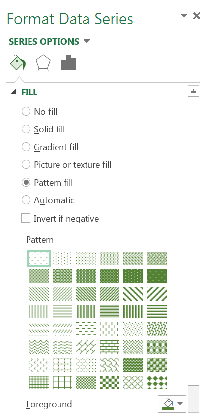
Once you have selected a data series you’ll most likely have opened the Format Data Series dialogue box. You can alter the Fill settings by using solid colors and choosing the color you want.
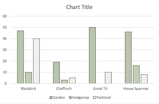
You can also choose a Pattern Fill. The pattern is especially helpful with monochrome charts, such as those intended for paper publication.


You can set the general color for the pattern (the Foreground button); the background defaults to white but you can set it separately if you like.
There are plenty of options for patterns, look to keep things simple though.
Using a Pattern Fill is helpful in monochrome charts.
Generally, you want to avoid crazy effects, your aim is to help make the chart readable, not to assault the senses!
Using color in R plots
R has over 650 named colors to choose from. You can see the colors using the colors() command.
colors()
 [1] "white"          "aliceblue"      "antiquewhite"
 [4] "antiquewhite1"  "antiquewhite2"  "antiquewhite3"
 [7] "antiquewhite4"  "aquamarine"     "aquamarine1"
[10] "aquamarine2"    "aquamarine3"    "aquamarine4"
[13] "azure"          "azure1"         "azure2"
[16] "azure3"         "azure4"         "beige"
[19] "bisque"         "bisque1"        "bisque2"
[22] "bisque3"        "bisque4"        "black"
[25] "blanchedalmond" "blue"           "blue1"
[28] "blue2"          "blue3"          "blue4"
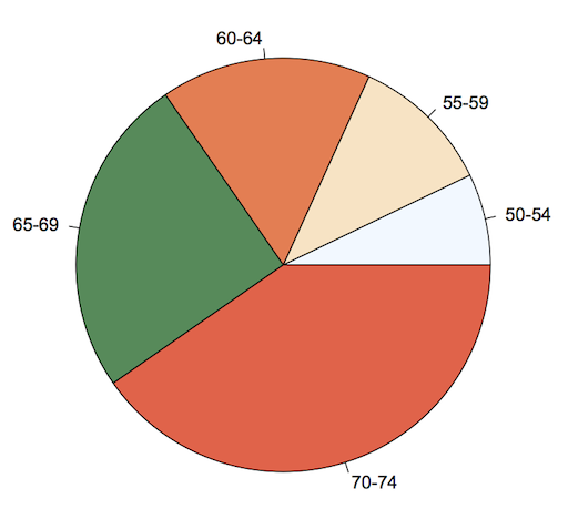
The colors used for most graphical commands are taken from a default palette, which can be different for different commands. For example the barplot() command uses shades of gray whilst the pie() command uses a palette of pastel shades.
In most graphical commands you can set the colors for the plot using the col parameter. Colors can be named explicitly or given numbers, in which case the numbers are taken to be the colors of the existing color palette().
Specifying color
You can set the colors of an R plot in several ways:
- Give color names (in quotes) as in the colors()
- Give numbers – the numbers will refer to the colors in the currently set palette().
- Give the name of a built-in color palette (and the number of shades).
You can set the colors directly in a plotting command using the col parameter and a vector of names (in quotes), for example:
> barplot(VADeaths, beside = TRUE,
col = c("aliceblue", "bisque", "coral", "seagreen", "tomato"))
If you plan to use the colors more than once you might want to save your vector of colors as a named object.
> mycol = c("aliceblue", "bisque", "coral", "seagreen", "tomato")
> pie(VADeaths[1,], col = mycol)
If you don’t provide enough colors then they are recycled. If there are too many colors the un-required ones are ignored.
If you give the colors as numbers the plotting command will take the colors from their position in the vector of colors that are in the color palette(), not the position of the color from the colors() command.
You can also use one of the built-in palettes by specifying the palette name and the number of shades needed.
Setting a color palette
The palette() command allows you to set a default color palette. The default palette() can be viewed using an empty command:
> palette()
[1] "black"   "red"     "green3"  "blue"    "cyan"
[6] "magenta" "yellow"  "gray"
Now, whenever a color is referred to by an integer value the color is taken as the position in the current palette(). Some plotting commands have their own default colors, which are used if you do not specify the colors explicitly.
- The barplot() command uses a palette() of gray.
- The pie() command uses a palette() of pastel shades.
You can set the palette() by giving a vector of colors:
> palette(mycol)
> palette()
[1] "aliceblue" "bisque"    "coral"     "seagreen"  "tomato"
To restore the default palette():
> palette("default")
To use the colors in your palette() you can either give the numbers of the position of the colors in the palette() or specify col = palette().
> palette()
[1] "black" "red" "green3" "blue" "cyan"
[6] "magenta" "yellow" "gray"

> mycol
[1] "aliceblue" "bisque"    "coral"     "seagreen"  "tomato"

> palette(mycol)
> pie(VADeaths[,1], col = palette())
The pie() command uses a set range of colors unless told otherwise. Here a custom palette() has been used.
Once you have set a palette() the colors remain “operational” until you change the palette(). Any colors referred to by number will refer to the current palette() but of course you can over-ride the palette() by specifying colors by name.

Built-in color palettes
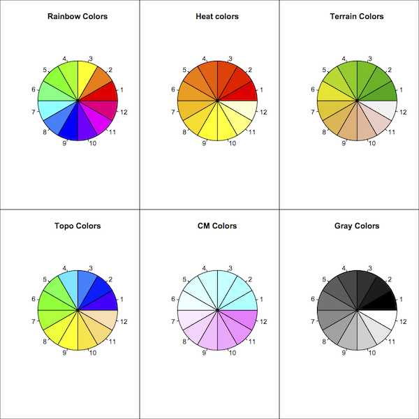
You can make your own color palette() by specifying color names explicitly. However, R has several built-in palettes that you can use to create a series of “co-ordinated” colors.

There are six built-in palettes.
- rainbow()
- colors()
- colors()
- colors()
- colors()
- colors()
In general you specify how many colors you require in the palette and the command produces a series of colors graded across the range, however, with rainbow() and gray.colors() you can specify starting and ending points.
Type help(palette) to get more information from within R.
Shading lines
In some chart types it may be helpful to have shading lines, especially when using monochromatic color palettes. The barplot() and pie() commands allow you to specify shading lines from within the command. There are two parameters:
- density – gives the density of the shading lines in lines per inch. If not specified or negative the color is solid, even if angle is given.
- angle – gives the angle to draw the shading lines measured anti-clockwise, 0 is horizontal and the default is 45 degrees.
Shading is not available in the boxplot() command. If is rather less useful there anyhow, as the bars are all labelled. It is possible to find a solution using the polygon() command but this is not for the faint hearted.
Summary
Don’t just rely on the default colors for your graphs and charts. If you are presenting a graphic that uses color then think carefully about how easy it will be for readers to differentiate the colors. Think about the colors themselves, perhaps a particular color theme would be especially suitable for your presentation.
You can use color to highlight a particularly important finding, making some data stand out from the rest. You can also make some data “disappear” into obscurity!
For monochrome charts try a wide range so that individual series are identifiable. This is where pattern fills are especially useful.
Don’t forget that the purpose of your chart is to help a reader understand the data/results easily.
Comments are closed.