Use Excel for Wilcoxon matched pairs

Exercise 7.3.3.

Statistics for Ecologists (Edition 2) Exercise 7.3.3

This exercise is concerned with matched pairs tests (Section 7.3) and in particular how to carry out the non-parametric Wilcoxon Matched Pairs test using Excel (Section 7.3.3).

Use Excel for Wilcoxon matched pairs test

Introduction

There is no in-built function that will carry out the Wilcoxon Matched Pairs test in Excel. However, you can rank the data and compute the rank sums you require using the RANK.AVG function.

You do need to omit zero differences from the calculations and also to separate ranks of positive differences from ranks of negative differences. In this exercise you can see how to use the IF function to help you do this separation.

The example data

You can get the sample data here: Wilcoxon.xlsx. There are two worksheets, one has the data only and the other has a completed set of calculations so you can check your progress.

Here’s what the data look like:

Matched pairs data for use in Wilcoxon matched pairs analysis

Obs A B
1 8 11
2 6 8
3 12 4
4 2 9
5 3 3
6 3 5
7 1 2
8 7 2


You can see that there are 8 pairs of data.

Show the direction of the difference

Start by making a column to show the direction of the difference. Make a heading in cell D1, Dir will do as a heading name.

Now in cell D2 type a formula to show if the difference between B2 and C2 is positive or negative. You’re going to subtract the second column from the first. You also want to take into account possible zero differences:

=IF(B2<C2, "-", IF(B2=C2, "", "+"))

So if cell C2 is larger than cell B2 you’ll get a minus symbol. If the cells are equal, then you get a blank. If B2 is larger than C2 you’ll get a + symbol. You will use these symbols to separate the ranks later.

Copy the formula down the rest of the column to show the direction of each of the differences.

The final column shows the direction of differences between A and B (i.e. A-B).

Obs A B Dir
1 8 11
2 6 8
3 12 4 +
4 2 9
5 3 3
6 3 5
7 1 2
8 7 2 +


Note that observation 5 (row 6 of the spreadsheet) shows a blank because the items are the same (i.e. a zero difference).

Calculate the differences

Make a column for the difference between samples, make the heading in cell E1, D(A-B) or something similar.

You want to subtract the values in the second column of data from the first column of data (i.e. Col B – Col C). So in cell E2 type a formula to do that. You’ll need to omit any zero difference, so use an IF function to place a blank “” if the difference is zero:

=IF(B2-C2=0, "", ABS(B2-C2))

You are not interested in the sign of any difference, just the magnitude, so the ABS function is needed.

Copy the result down the rest of the column.

The final column shows the absolute magnitude of differences between A and B.

Obs A B Dir D(A-B)
1 8 11 3
2 6 8 2
3 12 4 + 8
4 2 9 7
5 3 3
6 3 5 2
7 1 2 1
8 7 2 + 5


You can see that you have 7 values, with one blank (a zero difference, observation 5).

Calculate ranks of differences

Now you want to work out the ranks of the differences. That is the ranks of the absolute value of the differences that you just worked out (column E) and called D(A-B).

Make a new column label in cell F1, call it Rd or something similar.

Now in cell F2 type a formula to work out the ranks of the items from column E:

=IF(E2="", "", RANK.AVG(E2,$E$2:$E$9,1))

Note that you need to take care of any possible blank cells (corresponding to zero differences). You also need to “fix” the cell range E2:E9 using $ since you will be copying the cell down the rest of the column. The final 1 makes sure that your ranks are sorted ascending order, with the smallest difference getting the smallest rank.

The final column shows the rank of the (absolute) differences between A and B.

Obs A B Dir D(A-B) Rd
1 8 11 3 4
2 6 8 2 2.5
3 12 4 + 8 7
4 2 9 7 6
5 3 3
6 3 5 2 2.5
7 1 2 1 1
8 7 2 + 5 5


You can see that there are some tied ranks (each given a value of 2.5).

Ranks of + and of – differences

Now you need to separate the ranks due to the positive differences and the ranks due to negative differences. Mae two more column headings in cells G1 and H1, R+ and R- will do fine.

In cell G2 type a formula that shows the rank if it is due to a positive difference but leaves the cell blank is not:

=IF(D2="+", F2,"")

Copy the cell down the rest of the column G.

In cell H2 type a formula that shows the rank if it is due to a negative difference but leaves the cell blank is not:

=IF(D2="-", F2,"")

Copy the cell down the rest of the column H.

The last two columns show the ranks due to positive differences and negative differences.

Obs A B Dir D(A-B) Rd R+ R-
1 8 11 3 4 4
2 6 8 2 2.5 2.5
3 12 4 + 8 7 7
4 2 9 7 6 6
5 3 3
6 3 5 2 2.5 2.5
7 1 2 1 1 1
8 7 2 + 5 5 5


You should now see the ranks split according to the sign of the difference between the samples.

Rank sums

Now you need to add up the ranks for the positive and negative differences (columns G & H). You can use the SUM function for this.

In cells A11 and A12 type labels for the counts and sums, n and Sum, will do nicely.

In cell B11 type a formula to work out the number of observations:

=COUNT(B2:B9)

Copy this into cells C11 and F11. The latter being the number of non-zero differences.

In cell B12 type a formula to sum the data in column 12:

=SUM(B2:B9)

Copy the cell into cells C12, F12, G12 and H12. Cells F12:H12 contain the ranks sums; overall, +ve and -ve. Note that the overall sum of ranks should equal the two other rank sums combined.

The final two rows show some summary (count and sum). The test statistic is the smaller of the two rank sums (12 & 16).

Obs A B Dir D(A-B) Rd R+ R-
1 8 11 3 4 4
2 6 8 2 2.5 2.5
3 12 4 + 8 7 7
4 2 9 7 6 6
5 3 3
6 3 5 2 2.5 2.5
7 1 2 1 1 1
8 7 2 + 5 5 5
n 8 8 7
42 44 28 12 16

Final result

The two rank sums are 12 and 16 so the 12 is the test statistic, W. You’ll need the number of non-zero differences to look up the appropriate critical value (see Table 7.13 in the book).

For Nd = 7 the critical value is 2. The calculated value of W is 12, which is larger than the critical value so the result is not significant.

Using R for the t-test

Exercise 7.1.2.

Statistics for Ecologists (Edition 2) Exercise 7.1.2

This exercise is concerned with how to carry out the t-test (Chapter 7) using R (Section 7.1.2).

Using R for the t-test

Introduction

The t-test is used to compare the means of two samples that have a normal (parametric or Gaussian) distribution. The t.test() command carries out the t-test in R. The default is to compute the Welch two-sample test (unequal variances).

You can have your data in several forms:

  • Two separate samples as two data vectors.
  • Two separate samples but in a single data.frame object (i.e. sample format).
  • A response variable and a predictor variable (i.e. scientific recording format)

In any event you can use the t.test() command to carry out the t-test. The example data for this exercise are the same as in the book and you can get the data in the three forms as an RData file: ridge furrow.RData.

Once you have the data you can type the commands shown here for yourself and so follow along.

Separate data objects

When you have two separate samples (probably as vector objects), you can just name them in the t.test() command.

ridge ; furrow
[1] 4 3 5 6 8 6 5 7
[1]  9  8 10  6  7

t.test(ridge, furrow)

Welch Two Sample t-test

data:  ridge and furrow
t = -2.7584, df = 8.733, p-value = 0.02279
alternative hypothesis: true difference in means is not equal to 0
95 percent confidence interval:
 -4.5598309 -0.4401691
sample estimates:
mean of x mean of y
      5.5       8.0

The default carries out the Welch two-sample test (with modified degrees of freedom).

To carry out a t-test with the assumption that the variances are equal, you need to add var.equal = TRUE like so:

t.test(ridge, furrow, var.equal = TRUE)

The result gives a slightly different value for t, df and p-value.

Sample format

If your data are separate samples but contained within a data.frame, you’ll need to alter your approach very slightly so that you can “get at” the variables in the data.frame.

There are three main ways:

  • Use $ syntax to specify the frame and sample name explicitly.
  • Use attach() to place the variables in the search path.
  • Use with() to open the frame temporarily.

Here are the example data:

rf2
  Ridge Furrow
1     4      9
2     3      8
3     5     10
4     6      6
5     8      7
6     6     NA
7     5     NA
8     7     NA

Note that the shorter sample is padded with NA items.

Use $ syntax

You can specify a variable by using the name of the enclosing object, a $ and the variable name:

t.test(rf2$Ridge, rf2$Furrow)

Welch Two Sample t-test

data: rf2$Ridge and rf2$Furrow
t = -2.7584, df = 8.733, p-value = 0.02279

Note that R presents the name exactly as you typed it in the command.

Use attach()

If you try to use a variable that is “inside” a data.frame you get an error:

Ridge
Error: object ‘Ridge’ not found

One way around this is to use attach() to “open” the data.frame and allow the separate variables to be found in the search path. Once you have attached an object its contents appear when you use the search() command and can be used without needing the $ syntax.

Type search() to see the current search path (this is an example):

search()
[1] ".GlobalEnv"        "tools:RGUI"        "package:stats"
[4] "package:graphics"  "package:grDevices" "package:utils"
[7] "package:datasets"  "package:methods"   "Autoloads"
[10] "package:base"

Use attach() to open the data object you want:

attach(rf2)

The rf2 object now appears in the search path:

search()
[1] ".GlobalEnv"        "rf2"               "tools:RGUI"
[4] "package:stats"     "package:graphics"  "package:grDevices"
[7] "package:utils"     "package:datasets"  "package:methods"
[10] "Autoloads"        "package:base"

Now you can use the variables within rf2 in your t-test:

t.test(Ridge, Furrow)

Welch Two Sample t-test

data: Ridge and Furrow
t = -2.7584, df = 8.733, p-value = 0.02279

Note that R presents the names exactly as you typed them.

You should use detach() after you are done. This removes the item from the search() path. You can get confusion if you have data objects with the same name as those contained within data.frames.

detach(rf2)

The attach() command will not overwrite any data objects, but if you open a data.frame and it contains items with the same names as existing objects, the attach()ed ones mask the others until you use detach().

Use with()

The attach() command is useful but you do need to be careful to use detach() after you are done. An alternative approach is to use the with() command, which acts like attach() but only for the duration of one command line.

with(data.name, ...)

So, you give the command the name of the data object you want to “open”, followed by the command you want to execute. In that command you can give the variable names as they are and don’t need the $ syntax.

with(rf2, t.test(Ridge, Furrow, var.equal = TRUE)

In the example the variance is considered equal.

So, you don’t have to use detach() afterwards.

Recording format

If your data are in scientific recording format, then you’ll have the data in a different form from that shown previously (sample format). You will have response variables and predictor variables. For a t-test you will have one response and one predictor e.g.

rf1
   count   area
1      4  Ridge
2      3  Ridge
3      5  Ridge
4      6  Ridge
5      8  Ridge
6      6  Ridge
7      5  Ridge
8      7  Ridge
9      9 Furrow
10     8 Furrow
11    10 Furrow
12     6 Furrow
13     7 Furrow

This layout is more flexible than sample format but you need a slightly different way to specify the variables in your t-test. Essentially you give a formula of form: y ~ x where y is the response (count) and x is the predictor (area). You can also give the name of the enclosing data object.

t.test(count ~ area, data = rf1)

Welch Two Sample t-test

data:  count by area
t = 2.7584, df = 8.733, p-value = 0.02279

Note that R presents the names of the variables as they appear in the enclosing data object.

The formula syntax is very powerful and is used in many statistical and graphical commands. You can extend the formula for more complicated scenarios, such as analysis of variance and multiple regression.

Welch two-sample t-test

Exercise 7.1.1

Statistics for Ecologists (Edition 2) Exercise 7.1.1

This exercise is concerned with using Excel for the t-test in Chapter 7 (Section 7.1). In particular you’ll see how to modify the degrees of freedom for cases when the variance of two samples is not equal (which is often).

Welch two-sample t-test

Introduction

The t-test is used to compare the means of two samples that have a normal (parametric or Gaussian) distribution. The “classic” t-test has two major variants:

  • Assumption of equal variance for the two samples.
  • Adjustment of degrees of freedom (Satterthwaite modification).

In the first case the common variance is calculated and used in place of the variance in the regular formula. The calculation for this is relatively simple but it is also pointless, since you still have to determine the variance of the two samples.

The most commonly used modification is to adjust the degrees of freedom to make the result of the t-test a little more conservative. The degrees of freedom are reduced slightly using the Satterthwaite modification. This version of the t-test is generally called the Welch 2-sample t-test.

The calculations are relatively easy. You can then use the modified df for looking up critical values or for computing the exact p-value. The Welch 2-sample t-test is carried out by default in R via the t.test() command. In Excel the TTEST function will give you the exact p-value but it will not provide the modified degrees of freedom.

The Excel functions TDIST and TINV will give incorrect results as they assume equal variance and use un-modified degrees of freedom. This exercise works through the t-test and shows how to use the Satterthwaite modification to alter degrees of freedom. This allows you to get the “proper” result in Excel. The calculation matches that used in the Analysis ToolPak, which is available in Windows versions of Excel and later Mac versions.

The exercise uses the data that you can see in the following table:

Abundance of R. repens in ridges and furrows of a mediaeval meadow

A B C
1 ridge furrow
2 4 9
3 3 8
4 5 10
5 6 6
6 8 7
7 6
8 5
9 7


The data show the abundance of a plant species in two different habitats. The two samples are small but are normally distributed. You can get a copy of the data in Excel .xlsx format here: ridge furrow.xlsx.

Calculation

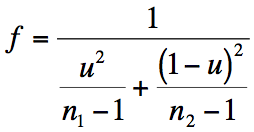
The calculation of the modified degrees of freedom are in two parts. To start with you determine a statistic called u, which you can think of as a kind of proportion (it varies from 0–1).

Once you have a value for u, you can determine f, the modified degrees of freedom.

The formula gives the same value whichever sample you choose to be #1 and which #2. The df are reduced slightly from the original: original df = (n1 – 1 + n2 – 1).

Once you have a modified df you can use it to look up the critical value, either in a table or using the TINV function in Excel. The equivalent in R would be the qt() function.

Carry out basic t-test

Start by opening the ridge furrow.xlsx data file. Go to the Data worksheet (the t-test completed worksheet is provided for you to check your results). The two samples are in columns B and C.

  1. In cell A10 type a label for the number of observations in each sample, “n” will do nicely.
  2. In cell B10 type a formula to determine the number of observations =COUNT(B2:B9)
  3. Copy cell B10 into C10 so that you have a result for each sample
  4. In cell A11 type a label for the mean values, “mean” will do fine.
  5. In cell B11 type a formula to work out the mean = AVERAGE(B2:B9).
  6. Copy cell B11 into C11 so that you have a result for each sample.
  7. In cell A12 type a label for the variance, “variance” seems logical.
  8. In cell B12 type a formula to calculate the variance =VAR(B2:B9)
  9. Copy the variance formula from B12 to C12.
  10. In A13 type a label for the t-value, “t” or “t-value” will do.
  11. In cell B13 type a formula to work out the value of t: =ABS(B11-C11)/SQRT(B12/B10+C12/C10)
  12. In A15 (yes, leave a blank row) type a label “p-value”.
  13. In B15 type a formula to work out the p-value based on the t you calculated: =TDIST(B13,B10+C10-2,2)
  14. The p-value from step 13 (p = 0.019) is based on equal variance (and un-modified degrees of freedom) and so is not really correct. Carry on and calculate a critical value.
  15. In A17 type a label “t-crit”.
  16. In B17 type a formula to work out a critical value for t: =TINV(0.05,B10+C10-2)

The critical value from step 15 (t = 2.201) is also based on equal variance and un-modified degrees of freedom.

  1. In A18 type another label “p-value”, for the exact p-value computed by Excel’s TTEST function.
  2. In B18 type a formula to compute the exact p-value for a t-test with un-equal variance: =TTEST(B2:B9,C2:C6,2,3)

Note that the TTEST function gives a more conservative p-value (of 0.023) because it has calculated the modified degrees of freedom. However, you cannot extract the df directly and will have to compute it if you want to report a more appropriate critical value you’ll need to compute it longhand.

Compute modified degrees of freedom

The calculation of the modified degrees of freedom (Satterthwaite modification) will require some simple maths using the equations from earlier:

  1. In Cell A20 type a label “u” for the result of the first calculation.
  2. In B20 type a formula to calculate u: =(B12/B10)/((B12/B10)+(C12/C10)).
  3. In A21 type a label “f” for the result of the second calculation.
  4. In B21 type a formula to calculate f: =1/(((B20^2)/(B10-1))+(((1-B20)^2)/(C10-1)))
  5. Your result from step 21 should be 8.733. Excel cannot deal with degrees of freedom that are not integer values so you need to round up (Excel always rounds the df value upwards):
  6. In A22 type a label “df” for the integer df result.
  7. In B22 type a formula to round up the value from step 21: =CEILING(B21,1)
  8. Now you have a modified df (df = 9) you can use it to calculate a critical value. You can also see how the modified df can be used in TINV and TDIST functions.
  9. In A24 type a label “t-crit” for the new critical value.
  10. In B24 type a function to compute the critical value based on the new df: =TINV(0.05,B22)
  11. Note that the critical value from step 25 (t = 2.262) is higher than the value from step 15, and so a bit more conservative.
  12. In A25 type a label “p-value” for the exact p-value based on the modified df.
  13. In B25 type a formula to work out the exact p-value: =TDIST(B13,B22,2)

Note that the exact p-value from step 27 (p = 0.022) is very similar to that you obtained from the TTEST function in step 17. If you have a p-value you can get the value of t but only if you have the modified degrees of freedom.

  1. In A26 type a label “t-value” for the t calculation.
  2. In B26 type a formula that calculates the value of t based on the p-value and modified df: =TINV(B25,B22)

The final t-value you calculated in step 29 (t = 2.758) is the same as the one from step 11. Unfortunately, because of slight rounding errors you usually get a slightly different p-value using the TTEST function compared to the “long” method. The upshot is that it is always better to calculate the value of t using the means and variance, rather than indirectly via TTEST and TINV.

Use the Analysis ToolPak

You can use Analysis ToolPak add-in to carry out a t-test. This allows you to get the value of t, the critical value and the exact p-value all at once. The ToolPak is not always “activated” so you need to go to the options and find the Add-Ins (the exact method will depend on your version of Excel).

  1. Open the ridge furrow.xlsx data file.
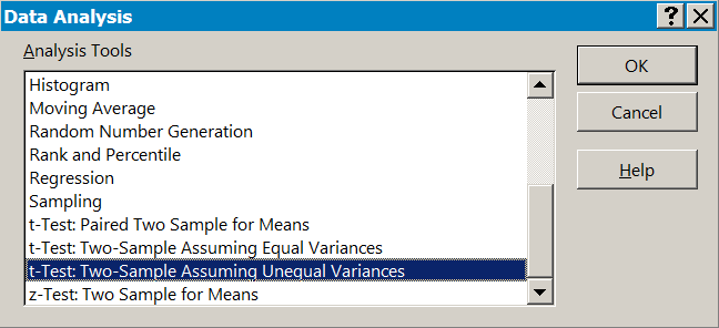
  2. Click the Data > Data Analysis button to open the Data Analysis dialogue window.
  3. Choose the t-test: Two-Sample Assuming Unequal Variances
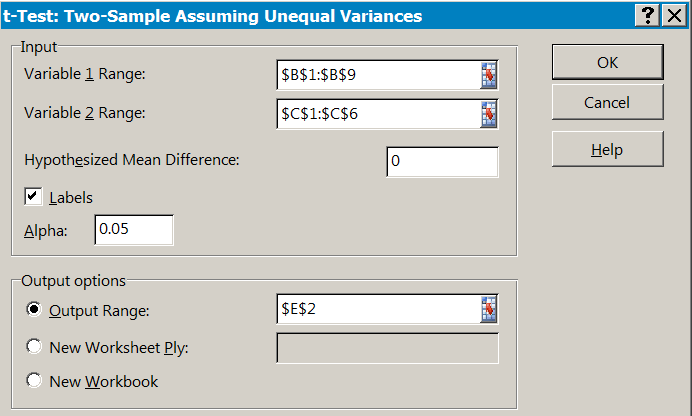
  4. Now select the appropriate data and fill in the boxes. Make sure you type a zero in the box labelled Hypothesized Mean Difference


  5. Choose the location to place the results. This can be a new workbook or worksheet. In the example above the results are placed in cell E2 of the existing sheet.

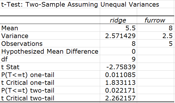
Now you just have to interpret the results!:

You can ignore the sign for the t Stat result, if the samples were in different column order the result would be the same value but with opposite sign.

Note that the df are shown as an integer and the exact value is always rounded upwards.

You want the two-tail results in most cases, which are in the last two rows.

Interactive labels in R pie() charts

Exercise 6.5.1.

Statistics for Ecologists (Edition 2) Exercise 6.5.1

These notes relate to Chapter 6, exploring data using graphs. They are especially relevant to Section 6.5.1, which is about using pie charts to show association data. However, the notes are generally relevant as they show how you can place text onto an existing R plot in an interactive manner, using your mouse as a pointer.

Interactive labels in R pie() charts

Introduction

The locator() command is used to “read” the mouse position and generate x, y co-ordinates. These can be used in various ways, in commands that require those x, y co-ordinates. For example, sometimes the default placement of labels on a plot is not quite what you want. You can use the text() command with locator() to place the labels exactly where you want.
In this exercise you’ll see the locator() command used to place labels on a pie() chart. You can download the example data file birds.RData and use the data to follow along.
A basic pie() chart

Here are some data on bird species and habitat selection:

birds
               Garden Hedgerow Parkland Pasture Woodland
Blackbird          47       10       40       2        2
Chaffinch          19        3        5       0        2
Great Tit          50        0       10       7        0
House Sparrow      46       16        8       4        0
Robin               9        3        0       0        2
Song Thrush         4        0        6       0        0

The data are in matrix form, which you can see using the class() command:

class(birds)
[1] "matrix"

We’ll plot a pie() chart of the 2nd row:

pie(birds[2,])

The resulting plot uses the names attribute for the labels (here the colnames of the original matrix).

Simple locator() placement

The locator() command accepts x, y co-ordinates from a mouse click. You can use the locator() command in text() to place labels where you click the mouse. You need to state in locator() how many “clicks” you want.

In the current example there are 5 categories (one has a value of zero), so we want 5 labels.

First of all, you need to suppress the default labels. Each plotting command has a slightly different way of doing this, in the pie() command you use labels = “”.

pie(birds[2,], labels = "")

Now you can add the labels separately. There are 5 categories so you’ll need locator(5) in this example.

text(locator(5), colnames(birds))

Note that the labels are centred over the spot you click, and they are not displayed until the command is finished.

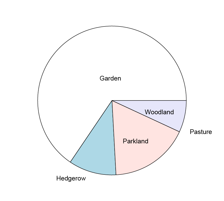
In this pie() chart the labels have been placed with the aid of the locator() command.

It can be a bit tricky to get the placement exactly how you want but there are some additional tools to help you.

Alignment with the text() command

The text() command allows you to tweak the position of the text, relative to the co-ordinates. The pos parameter allows you to specify an integer (or vector of integers) which align the text like so:

  • pos = 1 text is placed below the point (centred).
  • pos = 2 text is placed to the left of the point (the last character next to the point).
  • pos = 3 text is placed above the point (centred).
  • pos = 4 text is placed to the right of the point (the first character next to the point).

In our example the labels need a vector of pos values, as the 2nd is best aligned by the final character and the 4th by the first. The following commands should do the job:

pie(birds[2,], labels = "") # no labels
text(locator(5), colnames(birds), pos = c(1, 2, 1, 4, 1))

To place the labels, you need to click in the plot. The first click will place the “Garden” label, which will be centred just below where you click. The second click will align the last character of the “Hedgerow” label to the left of where you click. The third click is below (centred). The fourth click places the “Pasture” label aligned with the first character to the right of the click-point. The final (fifth) click will be centred just below the click-point.

Custom labels

You can use any label you like by specifying the text explicitly. In a pie() chart you’ll generally want the category label and the frequency or percentage. You can use the prop.table() command to get the proportions (and therefore percentages). The paste() command is useful to join things together to make custom labels.

Use prop.table() to get row or column proportions (margin = 1 for rows, margin = 2 for columns):

prop.table(birds, margin = 1)
                  Garden  Hedgerow  Parkland    Pasture   Woodland
Blackbird      0.4653465 0.0990099 0.3960396 0.01980198 0.01980198
Chaffinch      0.6551724 0.1034483 0.1724138 0.00000000 0.06896552
Great Tit      0.7462687 0.0000000 0.1492537 0.10447761 0.00000000
House Sparrow  0.6216216 0.2162162 0.1081081 0.05405405 0.00000000
Robin          0.6428571 0.2142857 0.0000000 0.00000000 0.14285714
Song Thrush    0.4000000 0.0000000 0.6000000 0.00000000 0.00000000

Use the round() command to display fewer decimal places and let’s x100 to get percentage values:

round(prop.table(birds, margin = 1)*100,1)
                Garden Hedgerow Parkland Pasture Woodland
Blackbird        46.5      9.9     39.6     2.0      2.0
Chaffinch        65.5     10.3     17.2     0.0      6.9
Great Tit        74.6      0.0     14.9    10.4      0.0
House Sparrow    62.2     21.6     10.8     5.4      0.0
Robin            64.3     21.4      0.0     0.0     14.3
Song Thrush      40.0      0.0     60.0     0.0      0.0

Since we are only plotting the 2nd row let’s display only the 2nd row data:

round(prop.table(birds, margin = 1)*100,1)[2,]
Garden Hedgerow Parkland  Pasture Woodland
  65.5     10.3     17.2      0.0      6.9

Now you can use the paste() command to make a custom label containing the name and percentage:

pie.perc <- round(prop.table(birds, margin = 1)*100,1)
pie.labels <- paste(colnames(pie.perc), ", ", pie.perc[2,], "%", sep = "")

The paste() command combines items, which you separate with commas. The sep parameter determines which character (if any) is used to separate the items (none in this case. A comma or space would not be appropriate as we want the % to be adjacent to the percentage value).

Look at the labels you made:

pie.labels
[1] "Garden, 65.5%"   "Hedgerow, 10.3%" "Parkland, 17.2%" "Pasture, 0%"
[5] "Woodland, 6.9%"

You can now use the locator() command as before but specifying your new custom labels.

Making room for labels

Sometimes the labels are simply too large to fit. You may be able to make room by shrinking the text with the cex parameter:

pie(birds[2,], labels = "")
text(locator(5), pie.labels, pos = c(1, 2, 1, 4, 1), cex = 0.8)

The resulting pie() chart resembles the following:

You can make custom labels and use the locator() command to help place them.

In this case the cex parameter was used to shrink the text, allowing it to fit better. This does not always work out and you may need to shrink the pie in its frame. To do this you use the radius parameter (default: radius = 0.8), in the pie() command.

Labels over multiple lines

Another way to make labels fit better is to split them over more than one line. In our current example the percentage value could be placed below the category labels.

The “\n” text is treated as a “newline” character. So, if you use “\n” in your paste() command you can make a custom label spread over more than one line.

pie.perc <- round(prop.table(birds, margin = 1)*100,1)
pie.labels <- paste(colnames(pie.perc), "\n", pie.perc[2,], "%", sep = "")

This is what they look like in the console:

pie.labels
[1] "Garden\n65.5%"   "Hedgerow\n10.3%" "Parkland\n17.2%" "Pasture\n0%"
[5] "Woodland\n6.9%"

Now you proceed as before and place the labels:

pie(birds[2,], labels = “”)
text(locator(5), pie.labels, pos = c(1, 2, 1, 4, 1), cex = 0.8)

The resulting pie() chart looks like this:

Placing “\n” in a custom label acts as a newline character.

This gives you another way to display the labels.

Leading lines

If you have labels around the outside of your pie() chart you may want to add leader lines to “join” the label to the appropriate segment. The locator() command can do this by itself, but you’ll have to create one line at a time.

You’ll need to specify two co-ordinates; the start and end point of the line.

locator(2, type = "l")

Note that you need type = “l” (that’s a lower case L not a number 1). Then click the plot at the start and end points. You can use additional graphics parameters to alter the appearance of the line, examples might be col (colour), lwd (line width), lty (line type).

Axis labels in R plots using expression() command

Exercise 6.4.2.

Statistics for Ecologists (Edition 2) Exercise 6.4.2

These are some notes about axis labels in R plots, particularly how you can use superscript, bold and so on.

Axis labels in R plots using expression() command

The labelling of your graph axes is an important element in presenting your data and results. You often want to incorporate text formatting to your labelling. Superscript and subscript are particularly important for scientific graphs. You may also need to use bold or italics (the latter especially for species names).

The expression() command allows you to build strings that incorporate these features. You can use the results of expression() in several ways:

  • As axis labels directly from plotting commands.
  • As axis labels added to plots via the title()
  • As marginal text via the mtext()
  • As text in the plot area via the text()

You can use the expression() command directly or save the “result” to a named object that can be used later.

Introduction

The expression() command

The expression() command takes regular characters and uses them in a special way, allowing you to build more complicated strings. You don’t need quotes (most of the time) as the usual letters and numbers are not “interpreted”. R usually takes strings that are un-quoted and tries to interpret them as objects or commands.

What the expression() command does do though, is to look for certain characters or phrases, which are treated as “switches” that do something, like turn on superscript or bold font.

  • ~ Acts as a space character (actual spaces are ignored in R commands).
  • * Acts as a connector, this allows you to join several elements.
  • “” Quotes are used to enclose items that would otherwise be treated as a special character (like ~ or *).

So, type a ~ when you want a space and “~” when you want a ~. The * is a connector, which can be used to join sections of the expression. This allows you to “turn off” superscript for example, or switch font face.

There are various “reserved” characters e.g. + – / * ? ^ (mostly they are not letters or numbers), and these should be inside quotes. Items in quotes should be bracketed by ~ and/or * characters.

When you type an expression() any spaces you type are ignored. You can type spaces to help yourself see clearly what you have typed but they are all stripped out. If you display an expression() result R will place a single space (for clarity) between various elements of your expression().

The following expression():

expression(The~"~"~character~forms~spaces)

Would appear like “The ~ character forms spaces” when used in titles or text.

Superscript & subscript

The most common thing you’ll want to do in axis labels is to make superscripts and subscripts.

  • ^ Anything following the caret is displayed as superscript.
  • [] Anything inside the square brackets is displayed as subscript.

The [] are simple enough to use, anything that you want to be subscripted goes inside the brackets.

Note that you cannot start an expression() with a [ so you have to “fool” the system and use a pair of empty quotes:

expression(""[x]*X)

Note also that if you do that you have to use a connector (*) afterwards (or a space character ~)! The preceding example would produce text like so:

xX

Superscript is “started” by the caret ^ character. Anything after ^ is superscript. The superscript continues until you use a * or ~ character. If you want more text as superscript, then enclose it in quotes. The only exception is + or – when preceded by a number.

In the following example only the word “script” would appear superscript:

expression(Super^script~text)

Superscript text

The following uses quotes to get the two words superscripted.

expression(Super^"script text")

Superscript text

The following commands produce a plot with superscript and subscript labels:

opt = par(cex = 1.5) # Make everything a bit bigger

xl <- expression(Speed ~ ms^-1 ~ by ~ impeller)
yl <- expression(Abundance ~ by ~ Kick ~ net[30 ~ sec] ~ sampling)

plot(abund ~ speed, data = fw, xlab = xl, ylab = yl)

par(opt) # Reset the graphical parameters

The expression() command used to make superscripts and subscripts in axis labels.

Note that R does not “like” subscripts beginning with numbers and continuing with letters! So [2xyz] gives an error but [2 * xyz] is fine.

Font face: bold, italic, underline

You can alter the basic font face by enclosing the items you require in a command-like element:

  • plain() Anything in the parentheses is regular plain font face.
  • italic()italic.
  • bold()Bold
  • bolditalic()Italic and bold.
  • underline()Underlined.

The font face element must be preceded by a ~ or a * so that R can recognize it as a font face element.

The title() command allows you to specify a general font face as part of the command. Similarly the par() command allows you to specify font face for various plot elements:

  • font – the main text font face.
  • lab – axis labels.
  • main – main title.
  • sub – sub-title.

You specify the font face as an integer:

  • 1 = Plain.
  • 2 = Bold.
  • 3 = Italic.
  • 4 = Bold & Italic.

You can set the font face(s) from par() or as part of the plotting command. This is useful for the entire label/title but does not allow for mixed font faces. To mix font faces use the expression() elements italic(), bold() and so on.

The following lines give some simple examples:

opt <- par(cex = 1.5)

em <- expression(Abundance~of~italic(Gammarus~pulex)plain(~a~shrimp))
ey <- expression(Abundance~30s~underline(kick~sample))
ex <- expression(Speed~bold(ms^-1))

plot(abund ~ speed, data = fw, xlab = ex, ylab = ey, main = em)

par(opt)

To get mixed font faces you need the expression() command.

Note that expression() “does not like” a mix of letters and numbers, so split them using the * character.

Maths expressions

The expression() command can also produce a range of mathematical symbols and… expressions! You can create fractions, degree signs, arrows and all manner of items. These are generally less useful in axis labels but here are a few of the expressions to whet your appetite:

x + y Produces x + y.
x – y Produces x – y.
x == y Produces x = y.
x != y Produces x ≠ y.
x %~~% y Produces x ≈ y.
x %+-% y Produces x ± y.
x %/% y Produces x ÷ y.
bar(x) Produces x with an overbar.
frac(x, y) Produces a fraction with x over y.
x %up% y Produces an up arrow, x ↑ y.
x %down%y Produces a down arrow, x ↓ y.
x %->% y Produces a right arrow, x → y.
x %<-% y Produces a left arrow, x ← y.
sum(x, a, b) Produces a sum (capital sigma) symbol, ∑, with optional sub and superscripts.
sqrt(x)
sqrt(x, y)
Produces a square root symbol, √x, with optional root, y√x.
infinity An infinity symbol, ∞.
alpha – omega Greek letters in lowercase.
Alpha – Omega Greek letters in uppercase.
180*degree Produces a degree symbol, 180˚.
x ~ y A space, x y.


There are plenty of others, type help(plotmath) into your R console to get the help entry page.

Ways to incorporate expression() into plots

There are four main ways you can incorporate expression() objects into your plots:

  • In the plot area via text()
  • As a title via title()
  • Directly via the plotting command; essentially the same as title()
  • In the margin via mtext()

As far as the expression() part goes there is no difference between these methods; the main difference is the placement.

Add text to a plot

The text() command allows you to add text, and expression() objects to an existing plot window.

text(x, y, ...)

You need to type in the co-ordinates and then the text, quoted or as an expression(). There are other graphical parameters you can add such as:

col
cex

There are a whole lot more besides, but this article is primarily about axis labels so I’ll gloss over text() for the moment, except to demonstrate some mathematical symbols.

Math symbols

The math symbols can be used in axis labels via plotting commands or title() or as plain text in the plot window via text() or in the margin with mtext().

The following commands place some text into a plot window but the expression() parts would work in axis labels, margins or titles.

opt <- par(cex = 1.5)
plot(1:10, 1:10, type = "n", xlab = "X-vals", ylab = "Y-vals")

text(1, 1, expression(hat(x)))
text(2, 1, expression(bar(x)))
text(2, 2, expression(alpha==x))
text(3, 3, expression(beta==y))
text(4, 4, expression(frac(x, y)))
text(5, 5, expression(sum(x)))
text(6, 6, expression(sum(x^2)))
text(7, 7, expression(bar(x) == sum(frac(x[i], n), i==1, n)))
text(8, 8, expression(sqrt(x)))
text(9, 9, expression(sqrt(x, 3)))

par(opt)

The expression() command used with text() to create math formulae.

You can create quite complicated formulae using expression() but it can also be confusing, especially if you are using a plotting command. Create your expression() first and save the result to a named object to help keep yourself organised.

Add axis titles

You can use the title() command to add titles to the main marginal areas of an existing plot. In general, you’ll use xlab and ylab elements to add labels to the x and y axes. However, you can also add a main or sub title too.

Most graphical plotting commands allow you to add titles directly, the title() command is therefore perhaps redundant. However, it is often easier to set your titles “” (i.e. blank) and then use title() afterwards, especially if they are complicated.

If you are using expression() to make a label/title then save the expression() result as a named object, which is easier to use in the subsequent command(s) that use them.

The title() command has an additional “trick” up its sleeve, the line parameter. This allows you to select a position for the title(s) in lines from the edge of the plot.

  • Set line = 0 to place the title beside the axis (where the tick-marks usually are).
  • Set line = 1 to place the title one line in (where the axis values usually are).

The maximum value you can set depends on the margin sizes. In practice you can get the margin value minus one. To see the currently set margin sizes:

par(mar)

You’ll get a vector of four values (bottom, left, top, right).

You can also set the title to appear inside the plot using negative values, line = -1 will be adjacent to the axis and just inside.

Add marginal text

The mtext() command allows you to place text and expression() objects into any of the margins of a plot. The mtext() command allows you a bit more control over the placement of the text, compared to the title() command.

The general form of the command is:

mtext(text, side = 3, line = 0, outer = FALSE, at = NA,
      adj = NA, padj = NA, cex = NA, col = NA, font = NA, ...)


text The text to write. This can be a character string or an expression.
side = 3 The side of the plot to use. The sides are 1= bottom, 2= left, 3 = top, 4 = right. The default is the top.
line = 0 The line of the margin to use. The default is 0, which is adjacent to the outside of the plot area. Positive values move outward and negative values inward.
outer = FALSE If outer = TRUE, the outer margin is used if available.
at = NA How far along the side to place the text in relation to the axis scale. Text is centered on this point.
adj = NA How far along the side to place the text as a proportion. The default is effectively 0.5, which places the text halfway along. If text is oriented parallel to the axis, adj = 0 will result in left or bottom placement. Text is centered.
padj = NA Adjusts the text perpendicular to the reading direction. This permits “tweaking” of the placement. Positive values place text lower; negative values higher.
cex = NA The character expansion. Values  1 make text larger; values < 1 make text smaller.
col = NA The color for the text. The default, NA, means use the current setting par(“col”).
font = NA The font to use. The default, NA, means use the current setting par(“font”). Use font = 1 for regular text; 2 = bold, 3 = italic, 4 = bold+italic.
Additional graphics parameters can be used. Of particular interest is las, which controls the text direction:·        las = 0—Text parallel to axis (default).

·        las = 1—Text horizontal.

·        las = 2—Text perpendicular to axis.

·        las = 3—Text vertical.

The following commands will demonstrate some of the parameters.

Make a basic plot

plot(1:10, 1:10, type = "n", xlab = "x-vals", ylab = "y-vals")


Add marginal text

mtext("mtext(side = 1, line = -1, adj = 1)", side =1, line =-1, adj =1)
mtext("mtext(side = 1, line = -1, adj = 0)", side=1, line=-1, adj=0)
mtext("mtext(side = 2, line = -1, font = 3)", side=2, line=-1, font=3)
mtext("mtext(side = 3, font = 2)", side=3, font=2)
mtext("mtext(side = 3, line = 1, font = 2)", line=1, side=3, font=2)
mtext("mtext(side = 3, line = 2, font = 2, cex = 1.2)", cex=1.2, line=2, side=3, font=2)
mtext("mtext(side = 3, line = -2, font = 4, cex = 0.8)", cex=0.8, font=4, line=-2)
mtext("mtext(side = 4, line = 0)", side=4, line=0)

Using mtext() to place text or expression() objects into plot margins.

The mtext() command allows for fine placement of marginal text. In the example any font face changes were applied directly and the entire text is altered. If you want to have mixed font face then replace the text in quotes with an expression().

Ordering boxes in an R boxplot()

Exercise 6.3.2.

Statistics for Ecologists (Edition 2) Exercise 6.3.2

These notes concern box-whisker plots and in particular how you can rearrange the order of the boxes in such plots.

Ordering boxes in an R boxplot()

Introduction

The boxplot() command is one of the most useful graphical commands in R. The box-whisker plot is useful because it shows a lot of information concisely. However, the boxes do not always appear in the order you would prefer. These notes show you how you can take control of the ordering of the boxes in a boxplot().

There are four main methods, which in turn depend on the layout of the data:

  • Use order() to select column order when you have separate samples (i.e. vectors, columns in a data.frame or a list).
  • Use [row, column] to select an explicit column order when you have separate samples.
  • Use reorder() to change the order of a factor variable according to a function (e.g. mean), when you have response and predictor variables.
  • Use ordered() to make a custom ordered factor variable when you have response and predictor variables.

There are subtle differences between these methods but essentially you are creating an index, which you can use in the boxplot() command to control the order the boxes appear in the plot.

Data in sample format

If your data are arranged as samples in a data.frame (or matrix) you can use boxplot() to plot the data in “one go”. The order of the boxes will depend on the order of the columns.

hog3
   Upper Mid Lower
1     3   4    11
2     4   3    12
3     5   7     9
4     9   9    10
5     8  11    11
6    10  NA    NA
7     9  NA    NA

boxplot(hog3)

You can specify an explicit order for the columns using column numbers:

boxplot(hog3[, 3:1])

The boxplot on the left uses the default column order. The boxplot on the right uses an explicit order x[, columns].

Note the [row, column] syntax to specify the order for plotting.

Order columns by a function

Rather than give an explicit order you may want to have the boxplot appear in order of some function (e.g. mean or median). You can use the order() command to arrange items in ascending (or descending) order. To proceed use these general steps:

  1. Use a command that gives you the values you require e.g. colMeans(), apply().
  2. Use the result from step 1 and make an order()
  3. Use the result of step 2 to define the order of the columns in the boxplot().

The apply() command is most flexible:

m <- apply(hog3, MARGIN = 2, FUN = median, na.rm = TRUE)
m
Upper   Mid Lower
    8     7    11

Now you can set an order based on the medians you calculated:

o <- order(m, decreasing = FALSE)
o
[1] 2 1 3

Use the x[row, column] syntax like before but use your calculated order:

boxplot(hog3[, o])

If you want decreasing order setdecreasing = TRUE.

Data in a list

If your data are in a list you can use the same principles but need a slightly modified procedure:

hogl = list(U = hog3$Upper, M = hog3$Mid, L = hog3$Lower)
hogl

$U
[1] 3 4 5 9 8 10 9

$M
[1] 4 3 7 9 11 NA NA

$L
[1] 11 12 9 10 11 NA NA

Use the lapply() command to work out the median over the list elements.

m <- lapply(hogl, median, na.rm = TRUE)

If you try to order() the result you get an error, so you must unlist() the result first:

order(unlist(m))
[1] 2 1 3

Now save the new order and use it in the plot.

o <- order(unlist(m))
boxplot(hogl[o])

Note that you don’t use [row, column] for the list, just give [element], as the list is one-dimensional.

Data in scientific recording layout

When your data are in scientific recording format you will have a column for each variable and will have response variables and predictor variables e.g.

hog2
   count  site
1      3 Upper
2      4 Upper
3      5 Upper
4      9 Upper
5      8 Upper
6     10 Upper
7      9 Upper
8      4   Mid
9      3   Mid
10     7   Mid
11     9   Mid
12    11   Mid
13    11 Lower
14    12 Lower
15     9 Lower
16    10 Lower
17    11 Lower

These are the same data as before but in a more “sensible” layout. However, when you try a boxplot() you get the boxes plotted in alphabetical order.

Order a factor using a function

You can use the reorder() command to reorder a predictor variable by a function applied to the response variable. In other words, you can determine the order of the boxes using a median or other function. Use the following general process:

Use reorder(predictor, response, FUN) to determine an order for the predictor variable.

Use the result of reorder() in place of the original predictor variable in the boxplot() command.

bpm <- with(hog2, reorder(site, count, FUN = median))
boxplot(count ~ bpm, data = hog2)

Here the with() command is used to “see inside” the hog2 data. You could use:

attach(hog2)
bpm <- reorder(site, count, FUN = median)
detach(hog2)

The result is ordered ascending. If you want a descending order simply add a minus sign in front of the response variable:

bpm <- with(hog2, reorder(site, -count, FUN = median))
boxplot(count ~ bpm, data = hog2)

The procedure works with multiple predictors but you can only reorder() one at a time.

Make a factor in an explicit order

You can make a factor variable into an explicit order using the ordered() command. You just give the name of the factor you want to order and then the names of the levels in the order you want.

The result of the ordered() command is an ordered factor. The upshot is that the order you set will take precedent over the default alphabetical order.

o <- ordered(hog2$site, levels = c("Upper", "Lower", "Mid"))
o
[1] Upper Upper Upper Upper Upper Upper Upper Mid   Mid   Mid   Mid   Mid
[13] Lower Lower Lower Lower Lower
Levels: Upper < Lower < Mid

boxplot(count ~ o, data = hog2)

Gridlines in graphs and charts

Exercise 6.3.1b.

Statistics for Ecologists (Edition 2) Exercise 6.3.1b

Here are some notes regarding the use of gridlines in graphs and charts, to supplement Chapter 6.

Gridlines in graphs and charts

Introduction

Gridlines are potentially useful items you might want to incorporate in your charts. Gridlines can help the reader to gauge the height of bars in a column chart more easily for example, and so the readability is improved.

On the other hand, gridlines can “get in the way” and hinder readability by making your chart cluttered. In scatter plots you may require both horizontal and vertical gridlines, having gridlines on one axis only can “lead the eye”. Knowing when to apply gridlines or not is part of the skill of presentation.

Gridlines are added and edited easily in Excel. In R you can add gridlines using the abline() command.

Gridlines in Excel charts

You can easily add gridlines using Excel. Many chart templates incorporate them (sometimes when you do not require) and once you have a chart you can easily add them via the Chart Tools menus. In Excel 2013 there is an Add Chart Element button (you can also use the + button that appears beside a chart you have clicked on).

In previous versions of Excel (e.g. 2010) you can find the Gridlines button on the Layout menu of the Chart Tools.

Editing Excel gridlines

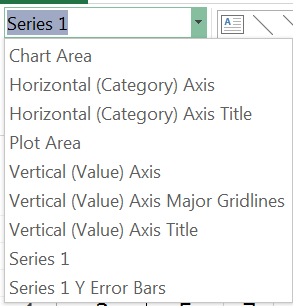
Once you have added your Excel gridlines you can choose to alter their appearance. You can double-click or right-click on the gridlines directly or you can use the Current Selection section of the Chart Tools > Format menu, which allows you to select, then format chart elements.

Once you have chosen to format the gridlines you will be presented with a range of formatting options, allowing you to choose the colour, width and style for example. You may not want the gridlines to be too bold so a mid-gray and dashed line might be more appropriate than a solid black line.

Altering Excel gridline visibility

By default, your chart colours will be solid. This means that on a column chart the gridlines will disappear behind the bars and only be visible between them.

In most cases this is exactly what you want but there may be occasions when you want to see the gridlines through the bars. You can edit the data series and choose to alter the transparency of the bars (on a column chart).

You can easily change the level of transparency to get the effect you want.

Of course generally you won’t want to allow the gridlines to be visible through the bars but it is a handy trick to have up your sleeve.

Gridlines in R plots

Use the abline() command to add gridlines to R plots. The command adds straight lines to existing plots. You can use the command to add a line of best-fit by specifying intercept and slope (indeed the command can read the results of other commands that produce coefficients), but for gridlines you can use one of the following:

  • abline(h = x, …) For horizontal lines.
  • abline(v = x, …) For vertical lines.

You specify x, which is the position of the line(s). You can use various methods to produce a set of values that define the position of the lines:

Command Detail
c(…) Give the values explicitly, separated by commas.
start:end Give the start and end points, this will produce a primitive sequence with an interval of 1.
seq(from = , to = , by = ) Make a sequence, you specify start and end points and the interval.
pretty(start:end, n) Makes a sequence from a simple range (start:end) that is split into “pretty” intervals. You also give n, which is an idealized number of intervals. The command does its best to produce n items.


The seq() command is probably the easiest to use as the results are completely defined by the user. The pretty() command is generally used internally to make the plot axes intervals so using it would likely match the axis. However, you may not want gridlines at exactly the same intervals so it’s probably best to stick to seq().

You can use various additional parameters to alter the appearance of the lines for example:

Parameter Detail
col The colour of the line(s). Usually as a “name” but you can specify an integer, which will use a colour from the current colour palette.
lwd The width of the line. Think of it as an expansion factor. Values >1 make the line wider, whilst values <1 make it thinner.
lty The line type, 0 = none, 1 = solid, 2 = dashed, 3 = dotted, 4 = dotdash, 5 = longdash, 6 = twodash. You can also specify the type as a “string” that matches the names given here.


The abline() command thus gives you good control over the position and format of gridlines.

Place gridlines behind other R plot elements

When you add gridlines to an R plot your lines will usually over-top any points or bars that were present.

It may be that this is what you want, but generally it is desirable to have the gridlines disappear behind the bars. If you are drawing gridlines to a barplot() or a boxplot() then you can easily achieve this by re-plotting and adding add = TRUE in the plotting command.

If you are using a scatter plot and the regular plot() command you take a different approach.

  1. Use the plot() command but set type = “n” to create the plot but not any points.
  2. Add the gridlines using abline()
  3. Add the data points using the points()

These simple “tricks” should ensure that your gridlines end up where you want them.

Example code

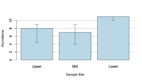
The bar chart with error bars shown earlier was drawn using the following code:

hog3 # The data
  Upper Mid Lower
1     3   4    11
2     4   3    12
3     5   7     9
4     9   9    10
5     8  11    11
6    10  NA    NA
7     9  NA    NA
Get median values for each column
med <- apply(hog3, MARGIN = 2, median, na.rm = TRUE)
Get the upper and lower quartiles, which will form the error bars
up <- apply(hog3, MARGIN = 2, quantile, na.rm = TRUE, prob = 0.75)
dn <- apply(hog3, MARGIN = 2, quantile, na.rm = TRUE, prob = 0.25)
dat <- rbind(med, up, dn) # Make a matrix of the data and error bars
dat
    Upper Mid Lower
med   8.0   7    11
up    9.0   9    11
dn    4.5   4    10
Draw the bar chart
barplot(dat["med",], col = "lightblue")
Add the gridlines
abline(h = seq(2,10,2), lty = "dashed", col = "gray30")
Add axis titles
title(xlab = "Sample Site", ylab = "Abundance")
Re-plot bars over gridlines

Note that the plot is given a name, which allows the x-values for the error bars to be calculated. Use add = TRUE to allow the bars to be plotted over the existing ones, thus ending up “on top” of the gridlines.

bp <- barplot(dat["med",], col = "lightblue", add = TRUE)
Draw the error bars using the inter-quartile values
arrows(bp,dat["up",], bp,dat["dn",], length = 0.1, angle = 90, code = 3)

Legends on graphs and charts

Exercise 6.3.1a.

Statistics for Ecologists (Edition 2) Exercise 6.3.1a

These notes about legends in graphs/charts supplement the text in Chapter 6.

Legends on graphs and charts

Introduction

A legend is a tool to help explain a graph. You are most commonly going to want to add one to a bar chart where you have several data series. You’ll also want to add one to a line or scatter plot when you have more than one series. Essentially you use a legend to help make a complicated plot more understandable.

In R you can add a legend to any plot using the legend() command. You can also use the legend = TRUE parameter in the barplot() command. The barplot() command is the only general plot type that has a legend parameter (the others need a separate legend).

The legend() command has a host of parameters, which can be tweaked to produce the finished article. Generally, the most difficult part is making room on the chart for the legend itself!

Legend Essentials

The legend() command has a wealth of parameters at its disposal. This gives it a great deal of flexibility and customizability <sic> but this also makes it daunting and hard to get to grips with.

The legend() command has the following general form:

legend(x, y = NULL, legend, col, pch, lty, lwd, fill, border, bty, ncol, y.intersp)

x, y = NULL The co-ordinates to place the legend (its top-left corner). You can also specify a shortcut location as a text string: “top”, “right”, “bottomleft” and so on, which allows a general spot to be filled quickly.
legend The text to be used for the legen entries. The default is taken from the data.
col The colors to be used for lines or points that appear in the legend.
pch The plotting character(s) to use.
lty The line type (style) to use.
lwd The line width to use.
fill = NULL A set of colors to appear in boxes beside the legend text entries. If NULL (the default) an empty box is placed. To suppress the box omit the fill parameter.
border = “black” The border color for the box if fill is specified (as a color or NULL).
bty = “o” The border type for the overall legend, use bty = “n” for no border.
ncol = 1 The number of columns for the legend, the default is 1 (i.e. a vertical legend).
y.intersp = 1 The width between legend lines, set >1 to space the lines out. There is also a x.intersp parameter, which operates horizontally.


There are a number of other parameters that I’ve not listed. The ones here are the most essential.

When adding a legend you need to make sure that the items in the legend() command match the parameters you set in the plotting command. It helps to specify pch, col, lty and so on explicitly in the plotting command, as you can match the parameters more easily than if you relied on the defaults.

The barplot() command is the only general plotting command that has a legend parameter. You can pass additional parameters to the legend using the args.legend parameter, as you’ll see shortly.

Adding legends from the barplot() command

The barplot() command allows use of a legend parameter, which calls legend() with its basic settings. You can pass parameters to the legend() command by adding args.legend and giving the details as a list().

The biggest problem is usually how to make appropriate space for the legend to fit in the plot window. There are two main options:

  • Alter the axis size to give extra room (vertically or horizontally).
  • Place the legend into the plot margin.

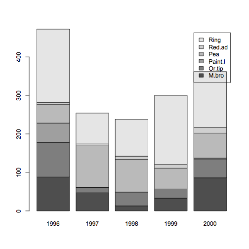
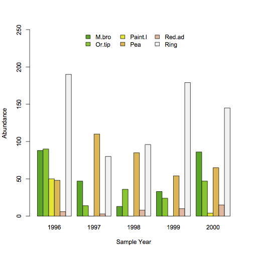
The following examples use a matrix dataset that gives the abundance of some butterfly species at a site over several sample years:

> bf
        1996 1997 1998 1999 2000
M.bro     88   47   13   33   86
Or.tip    90   14   36   24   47
Paint.l   50    0    0    0    4
Pea       48  110   85   54   65
Red.ad     6    3    8   10   15
Ring     190   80   96  179  145
> class(bf) # Check you have a matrix
[1] "matrix"

You can get the sample data here: butterfly.RData.

Altering the y-axis to make room

In a basic plot there will often not be enough room to accommodate the legend:

> barplot(bf, legend = TRUE)

Note that the default location for the legend is “topright”. In this case the simplest way to make room is to resize the y-axis using the ylim parameter.

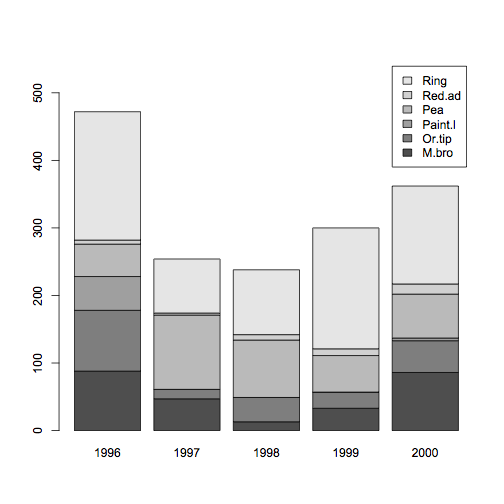
> barplot(bf, legend = TRUE, ylim = c(0,550))

A simple rescale of the y-axis will often allow the legend to fit.

You may have to play around with the axis setting to get the best values to use.

Pass legend parameters via barplot()

To pass parameters (arguments) to the legend() command from barplot() the parameters need to be passed as a list() with the args.legend parameter.

> barplot(bf, beside = TRUE, col = terrain.colors(6), ylim = c(0, 250), legend = TRUE, args.legend = list(bty = “n”, x = “top”, ncol = 3))
title(xlab = “Sample Year”, ylab = “Abundance”)

In this case the y-axis is lengthened and additional parameters passed to legend(). The legend box is suppressed (bty = “n”), placed at the top center (x = “top”), and made into 3 columns (ncol = 3).

Altering the x-axis to make room

You can alter the x-axis using the xlim parameter, which allows you to place the legend at the right.

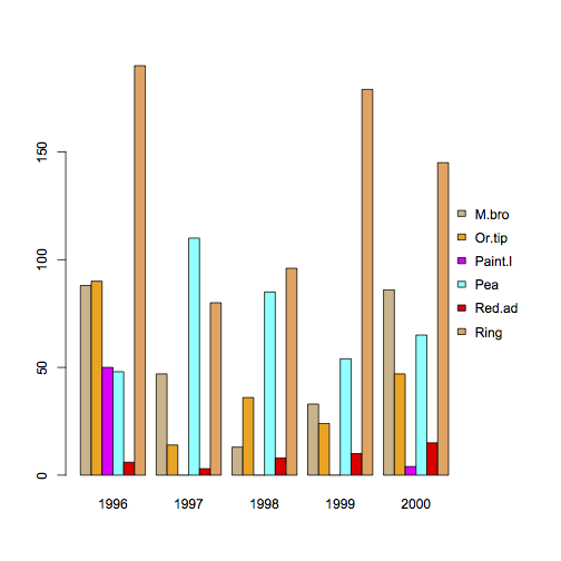
> mycols = c("tan", "orange1", "magenta", "cyan", "red", "sandybrown")
> barplot(bf, beside = TRUE, col = mycols, legend = TRUE, xlim = c(0, 45))

Note that the xlim parameter in this example set the axis from 0 to 45. Each bar in the barplot() takes up a space, so you need to allow about 1 unit per bar plus a bit extra for the legend itself.

Note also that the colparameter set the colors for the plot, which were passed automatically to legend() without requiring the args.legend parameter. Of course if you wanted other parameters (such as supressing the legend box) you would require the args.legend parameter.

Place a legend in a plot margin

Altering the x-axis or y-axis size to accommodate the legend is a fairly simple matter. Sometimes however you want a legend to be at the bottom or even the left, and however you alter the axes you will not make space!

What you need is to be able to place the legend in the margin of the plot, so that it does not overlap the plotting zone at all. To do this you need to tweak the graphical parameters via the par() command.

The general running order is as follows:

  1. Set the plot margins as you need to give the space in the required margin.
  2. Make your plot (any plot).
  3. Reset the graphical parameters back to defaults.
  4. Now set the plot margins to 0 and at the same time set plotting to allow “overplot”.
  5. Use legend() to place the legend where your extra-large margin is.
  6. Reset the graphical parameters back to defaults.

Steps 3 and 6 are not absolutely essential but preferable, as you can get into an awful mess if you forget the current settings.

Legend in the plot margin for a bar chart

To make the plot margin larger use par(oma = c(b, l, t, r)) where b, l, t, r are values for the margin sizes at the bottom, left, top and right. For example:

> opar = par(oma = c(0,0,0,4)) # Large right margin for plot
> mycols = c("tan", "orange1", "magenta", "cyan", "red", "sandybrown")
> barplot(bf, beside = TRUE, col = mycols)
> par(opar) # Reset par

Now you have to set the graphical parameters again, this time set oma, mar and new = TRUE. The last parameter is important as it does not wipe the plot as the graphical parameters are set. Once you’ve altered the graphical parameters you can set the legend():

> opar = par(oma = c(0,0,0,0), mar = c(0,0,0,0), new = TRUE)
> legend(x = "right", legend = rownames(bf), fill = mycols, bty = "n", y.intersp = 2)
> par(opar) # Reset par

Place a legend in the bottom margin of a plot

The bottom margin of a plot can present some slight difficulties because the axis labels get in the way. The easiest solution is to use the inset parameter and shift the legend outwards (use a small negative value).

Start by making space in the bottom outer margin, then make the basic plot:

> opar = par(oma = c(2,0,0,0))
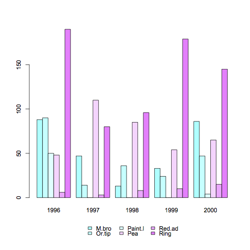
> barplot(bf, beside = TRUE, col = cm.colors(6))
> par(opar) # Reset par

Now set the margins to zero and set the overplot. The legend() command can now be used with the inset parameter:

> opar =par(oma = c(0,0,0,0), mar = c(0,0,0,0), new = TRUE)
> legend(x = "bottom", legend = rownames(bf), fill = cm.colors(6), bty = "n", ncol = 3, inset = -0.15)
> par(opar) # reset par

The inset parameter shifts the legend position slightly, to avoid the axis labels.

Note that positive values for inset shift the position upwards, a value of 0.5 is about half-way up. The direction of the inset shift is determined by the position you set in the command. If you used x = “bottom” then positive values shift the position upwards. If you used x = “right” then positive values shift the position left.

Legend in the plot margin for a scatter or line plot

If you use a line plot or a scatter plot you’ll have to contend with different plotting characters and line types. It is easier to set the parameters explicitly in the plot() command so that they are more easily matched in the legend().

In the following example a matplot() is used to create a multiple-series line plot. The legend is placed in the right margin.

> t(bf) # Rotate the data as matplot() takes columns as series
     M.bro Or.tip Paint.l Pea Red.ad Ring
1996    88     90      50  48      6  190
1997    47     14       0 110      3   80
1998    13     36       0  85      8   96
1999    33     24       0  54     10  179
2000    86     47       4  65     15  145

> mycols = c("tan", "orange1", "magenta", "cyan", "red", "sandybrown")
> opar = par(oma = c(0,0,0,5.5)) # Set right margin

## Plot without axes (because axis labels are numbers)
> matplot(t(bf), ylab = "", type = "b", pch = 1:6, lty = 1:6,
                axes = FALSE, lwd = 2, col = mycols)

> axis(2) # Use default y-axis

# Custom x-axis using years as labels
> axis(1, at = 1:5, labels = colnames(bf))

> box() # Bounding box around plot

> title(ylab = "Abundance", xlab = "Year")
> par(opar) # Reset par

> opar = par(oma = c(0,0,0,0), mar = c(0,0,0,0), new = TRUE)

# Legend pars to match matplot
> legend(x = "right", legend = rownames(bf), col = mycols,
         pch = 1:6, lty = 1:6, bty = "n",
         ncol = 1, text.col = "blue", y.intersp = 2)
> par(opar) # Reset par

Note that in this example the colour of the legend text has also been customized via the text.col parameter. For all the parameters used by legend() type help(legend) into R.

Using colour in graphs and charts

Exercise 6.3.

Statistics for Ecologists (Edition 2) Exercise 6.3

On this page you’ll find some additional notes regarding the use of colour in graphs and charts. These items did not quite make the final edit to the book itself but make a useful (I hope) addition to the topic in Chapter 6.

Colouring in: Using colour in graphs and charts:

Introduction

Colour is very important in presenting data and results. Both Excel and R have a wide range of colours you can use when creating your graphs and charts (certainly more than 50 shades of gray!).

Controlling and managing the colours you display is an important element in presenting your work. With an increasing volume of work being presented via the Internet, colour is something not to take for granted. Using default colours is “easy” but for maximum impact you should think carefully about how to present the best colours for the job.

Traditional journals generally use monochrome, which you can think of as just another set of colours, but even if you are “stuck” with shades of grey you need to think carefully. Pattern filling can be an especially useful option when using monochrome.

Using colour in Excel charts

You can set colours in Excel in several ways:

  • General color can be set from the Page Layout menu, which sets overall color themes.
  • When you make a chart the Chart Tools > Design > Change Colors button allows you to “override” the general colors and set your own.
  • You can format elements in charts directly from the Chart Tools > Format
  • Right-click or double-click a chart element directly.

When you set a colour explicitly you can also incorporate fill effects, with Pattern Fill being the most useful.

Quick settings in Excel charts

Whenever you make a chart in Excel it will have a default colour palette. You can alter the general colour theme for an existing chart from the Chart Tools menu. The exact option you select depends on the version of Excel you use e.g.

  • 2013: Chart Tools > Design > Change Colors button.
  • 2010: Chart Tools > Design > Chart Styles section.

This gives you a few options for altering the general flavour of the chart.

The colour options you get depend on the overall color theme that’s in operation; you set this from the Page Layout menu.

Overall setting of colours in Excel

You can set the general colour theme using the Page Layout > Colors button. This sets the default colors for charts as well as other Excel items (such as headings in Pivot Tables). Once you’ve set an overall theme and created a chart you can alter the chart colors using the Design > Change Colors button.

Once you have a general color set you can of course still tinker with the individual colors by formatting chart elements directly. Don’t just settle for the defaults; your graphs are important and it is worth spending a little bit of time to get the “best” look you can. If you use basic defaults your chart will look lacklustre and people will think that your work is similarly lacking. Your results graphs are the most important aspect of your work, make them count!

Setting colour explicitly in Excel charts

Whatever color theme you have set or applied you can always alter the individual colors of the chart elements. Usually this means altering colors for the various data series but you can also set colors for axis lines and labels.

The most reliable method of selecting a chart element is to use the Chart Tools > Format > Format Selection menu item. However, you can also right-click or double-click on the chart directly.

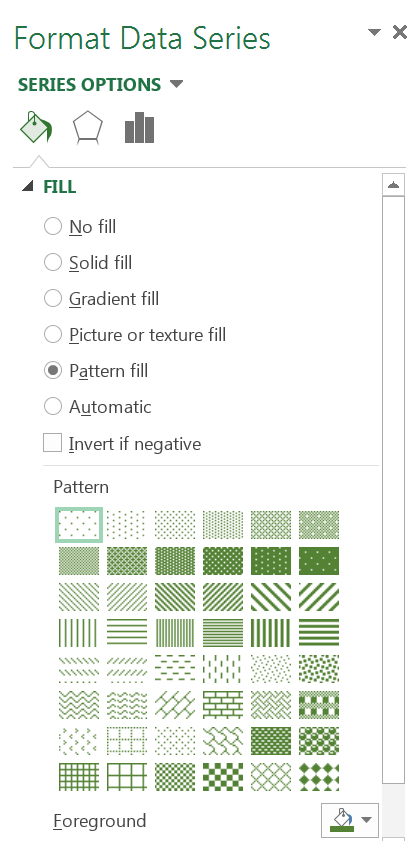
Once you have selected a data series you’ll most likely have opened the Format Data Series dialogue box. You can alter the Fill settings by using solid colors and choosing the color you want.

You can also choose a Pattern Fill. The pattern is especially helpful with monochrome charts, such as those intended for paper publication.

You can set the general color for the pattern (the Foreground button); the background defaults to white but you can set it separately if you like.

There are plenty of options for patterns, look to keep things simple though.

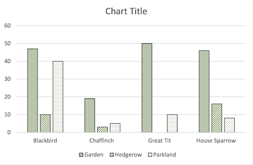
Using a Pattern Fill is helpful in monochrome charts.

Generally, you want to avoid crazy effects, your aim is to help make the chart readable, not to assault the senses!

Using color in R plots

R has over 650 named colors to choose from. You can see the colors using the colors() command.

colors() 
 [1] "white"          "aliceblue"      "antiquewhite"
 [4] "antiquewhite1"  "antiquewhite2"  "antiquewhite3"
 [7] "antiquewhite4"  "aquamarine"     "aquamarine1"
[10] "aquamarine2"    "aquamarine3"    "aquamarine4"
[13] "azure"          "azure1"         "azure2"
[16] "azure3"         "azure4"         "beige"
[19] "bisque"         "bisque1"        "bisque2"
[22] "bisque3"        "bisque4"        "black"
[25] "blanchedalmond" "blue"           "blue1"
[28] "blue2"          "blue3"          "blue4"

The colors used for most graphical commands are taken from a default palette, which can be different for different commands. For example the barplot() command uses shades of gray whilst the pie() command uses a palette of pastel shades.

In most graphical commands you can set the colors for the plot using the col parameter. Colors can be named explicitly or given numbers, in which case the numbers are taken to be the colors of the existing color palette().

Specifying color

You can set the colors of an R plot in several ways:

  • Give color names (in quotes) as in the colors()
  • Give numbers – the numbers will refer to the colors in the currently set palette().
  • Give the name of a built-in color palette (and the number of shades).

You can set the colors directly in a plotting command using the col parameter and a vector of names (in quotes), for example:

> barplot(VADeaths, beside = TRUE,
col = c("aliceblue", "bisque", "coral", "seagreen", "tomato"))

If you plan to use the colors more than once you might want to save your vector of colors as a named object.

> mycol = c("aliceblue", "bisque", "coral", "seagreen", "tomato")
> pie(VADeaths[1,], col = mycol)

If you don’t provide enough colors then they are recycled. If there are too many colors the un-required ones are ignored.

If you give the colors as numbers the plotting command will take the colors from their position in the vector of colors that are in the color palette(), not the position of the color from the colors() command.

You can also use one of the built-in palettes by specifying the palette name and the number of shades needed.

Setting a color palette

The palette() command allows you to set a default color palette. The default palette() can be viewed using an empty command:

> palette()
[1] "black"   "red"     "green3"  "blue"    "cyan"
[6] "magenta" "yellow"  "gray"

Now, whenever a color is referred to by an integer value the color is taken as the position in the current palette(). Some plotting commands have their own default colors, which are used if you do not specify the colors explicitly.

  • The barplot() command uses a palette() of gray.
  • The pie() command uses a palette() of pastel shades.

You can set the palette() by giving a vector of colors:

> palette(mycol)
> palette()
[1] "aliceblue" "bisque"    "coral"     "seagreen"  "tomato"

To restore the default palette():

> palette("default")

To use the colors in your palette() you can either give the numbers of the position of the colors in the palette() or specify col = palette().

> palette()
[1] "black" "red" "green3" "blue" "cyan"
[6] "magenta" "yellow" "gray"

> mycol
[1] "aliceblue" "bisque"    "coral"     "seagreen"  "tomato"

> palette(mycol)
> pie(VADeaths[,1], col = palette())

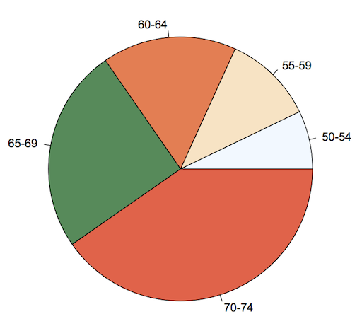
The pie() command uses a set range of colors unless told otherwise. Here a custom palette() has been used.

Once you have set a palette() the colors remain “operational” until you change the palette(). Any colors referred to by number will refer to the current palette() but of course you can over-ride the palette() by specifying colors by name.

Built-in color palettes

You can make your own color palette() by specifying color names explicitly. However, R has several built-in palettes that you can use to create a series of “co-ordinated” colors.

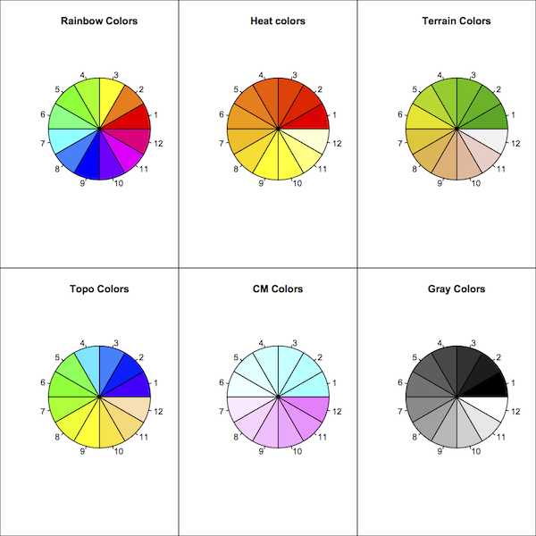
There are six built-in palettes.

  • rainbow()
  • colors()
  • colors()
  • colors()
  • colors()
  • colors()

In general you specify how many colors you require in the palette and the command produces a series of colors graded across the range, however, with rainbow() and gray.colors() you can specify starting and ending points.

Type help(palette) to get more information from within R.

Shading lines

In some chart types it may be helpful to have shading lines, especially when using monochromatic color palettes. The barplot() and pie() commands allow you to specify shading lines from within the command. There are two parameters:

  • density – gives the density of the shading lines in lines per inch. If not specified or negative the color is solid, even if angle is given.
  • angle – gives the angle to draw the shading lines measured anti-clockwise, 0 is horizontal and the default is 45 degrees.

Shading is not available in the boxplot() command. If is rather less useful there anyhow, as the bars are all labelled. It is possible to find a solution using the polygon() command but this is not for the faint hearted.

Summary

Don’t just rely on the default colors for your graphs and charts. If you are presenting a graphic that uses color then think carefully about how easy it will be for readers to differentiate the colors. Think about the colors themselves, perhaps a particular color theme would be especially suitable for your presentation.

You can use color to highlight a particularly important finding, making some data stand out from the rest. You can also make some data “disappear” into obscurity!

For monochrome charts try a wide range so that individual series are identifiable. This is where pattern fills are especially useful.

Don’t forget that the purpose of your chart is to help a reader understand the data/results easily.

Tally plots in R

Exercise 6.2.2.

Statistics for Ecologists (Edition 2) Exercise 6.2.2

Recently I saw a message in a forum asking about the difference between dot plots and histograms. This got me thinking and so I decided to work out how to make R produce a dot plot from scratch. These notes also supplement Chapter 6 (Graphics).

Tally plots in R

Dot charts as an alternative to the histogram

A histogram is a way of showing the frequency of your numeric data in a visual manner. The histogram looks more or less like a bar chart except that the bars are touching – the x-axis is a continuous scale rather than being discrete categories. Look at the following data:

> mydata = c(6, 7, 8, 7, 6, 3, 8, 9, 10, 7, 6, 9)

Stem-leaf plot

You can visualise the distribution using a stem-leaf plot:

> stem(mydata)
The decimal point is at the |
 2 | 0
 4 |
 6 | 000000
 8 | 0000
10 | 0

The stem() command does not give much flexibility when it comes to the bins separating the data categories but you can use the scale = n instruction. The default is 1 so making the value larger will increase the number of bin categories:

> stem(mydata, scale = 2)
The decimal point is at the |
 3 | 0
 4 |
 5 |
 6 | 000
 7 | 000
 8 | 00
 9 | 00
10 | 0

Making the scale smaller gives a different impression:

> stem(mydata, scale = 0.5)
The decimal point is 1 digit(s) to the right of the |
0 | 3
0 | 6667778899
1 | 0

The stem() command can be useful but it does not really match the histogram.

Make a frequency table with the table() command

Another method of looking at the data is to make a frequency table:

> table(mydata)
mydata
3  6  7  8  9 10
1  3  3  2  2  1

Not very visual but it does a job. It splits the data into chunks and shows the frequency for each. The table() command really only works sensibly on integer values (otherwise you end up with loads of “bins”).

Visualize frequency with a bar chart

The resulting table can be turned into a visual representation of the data if you make a bar chart:

> barplot(table(mydata))

The resulting bar chart gives you an impression of the frequency distribution:

The barplot is useful but can be misleading. The bars are discrete categories (bins or size classes) and are discontinuous. In the preceding barplot you can see that there is a jump from the 3-bin to the 6-bin. The barplot() command is very flexible and you can customize your plot in many ways but you cannot get around this problem.

A true histogram

A true histogram has a continuous x-axis and you can make one using the hist() command:

> hist(mydata)

The histogram can be jazzed up and customized in various ways, which I won’t delve into at this point. However, one important aspect is the control of the x-axis. The x-axis is a continuous scale and you can see the difference between this and the earlier barplot by looking at the position of the axis labels. In the barplot they are in the middle of each bar but in the histogram they are placed at the edges of the bars.

You can control the breakpoints using the breaks instruction. The default is breaks = “sturges”, which uses an algorithm to determine the breakpoints. You can also specify the number of breakpoints you want or even specify the “exact” position of the breakpoints by giving the values explicitly.

Developing a script to draw a tally plot or dot histogram

What I wanted was to make a chart that replaced the bars with dots, the number of dots in each column being equal to the frequency. One feature of the hist() command is that you can make a histogram without actually making the final plot. In other words you can calculate all the required statistics. I started by making a result object of the histogram data like so:

> hg = hist(mydata, plot = FALSE)

The result contains several elements in a list; useful elements are the mid-points of the columns and the counts (frequency):

> hg$mids
[1] 3.5 4.5 5.5 6.5 7.5 8.5 9.5

> hg$counts
[1] 1 0 3 3 2 2 1

I reasoned that I could use the $mids as the x-values in a regular plot. The y-values would come from the $counts data. A frequency of 3 would get plotted three times, at y = 1, y = 2 and y = 3. This meant I had to replicate the count data to make a sequence, which would have to be matched up to the x-data.

A loop of some sort seemed unavoidable and the number of times the loop would need to run would be equal to the number of bins, that is the number of bars. Put another way, it is the number of breaks-1. It is simplest to count the number of items in the $counts:

> bins = length(hg$counts)

To make the y-values I needed to make each frequency into a series, so a value of 3 would become 1, 2, 3. I also needed to take care of 0 values so I decided to make each frequency a series 0:frequency. Actually it was logical to do this the other way around freqency:0 so the loop becomes:

> yvals = numeric(0)
>  for(i in 1:bins) {
     yvals = c(yvals, hg$counts[i]:0)
  }

The first line simply creates a blank numeric vector. The loop creates the appropriate values and appends them to the vector. For the data under consideration this produces:

> yvals
[1] 1 0 0 3 2 1 0 3 2 1 0 2 1 0 2 1 0 1 0

Each count value is a sequence ending in zero, the count that was a zero remains so.

The x-values are derived from the $mids result, since I added an extra 0 to each y-value each item needed to be repeated a number of times equivalent to the count +1. This has the bonus of dealing with the 0 count, as a repeat of 0 would be “difficult”. A loop is needed again and it will run for as many times as there are bin categories.

> xvals = numeric(0)
>  for(i in 1:bins) {
     xvals = c(xvals, rep(hg$mids[i], hg$counts[i]+1))
  }
> xvals
[1] 3.5 3.5 4.5 5.5 5.5 5.5 5.5 6.5 6.5 6.5 6.5 7.5 7.5 7.5 8.5 8.5 8.5 9.5 9.5

The xvals and yvals cannot be used directly because there are zero items and we don’t want points plotted at 0. The simplest way to deal with this is to join up the values in a data.frame and then remove rows where y = 0.

> dat = data.frame(xvals, yvals)
> dat = dat[yvals > 0, ]

Now the data are ready to make into a plot. A regular scatter plot will do the job via the plot() command:

> plot(yvals ~ xvals, data = dat)

However, the points are too small and the plot does not look “tidy”.

The trick is to remove the axes, allow the points to spill over the plot area a little and to make the points larger. In addition, it is helpful to plot each point a little bit higher on the y-axis so that the bottom row do not overlap the axis too much. A few extra tweaks are also necessary to get the axis scales to come out right. After a bit of tweaking I get the final plot to appear thus:

The command uses the default breaks = “sturges” to work out the breakpoints, you can specify other breakpoints in exactly the same way as for the hist() command. The plotting symbols are set to pch = 19 (a solid circle) and enlarged somewhat with cex = 3. You can specify other values. The offset = 0.4 parameter plots each point slightly “upwards”. You can alter this offset and with the cex and pch parameters can get the appearance you want.

The biggest alteration you can make is with the graphics window. It seemed a lot of hassle to attempt to match the plot window size to the other parameters. It is easiest to simply use the mouse to resize the plot window to give the appearance you like. You can easily save the plot to a file once it is completed.

The hg_dot() command

When made up into a function the command lines look like the following:

## Dotplot histogram
## Mark Gardener 2013
## www.dataanalytics.org.uk
hg_dot <- function(x, breaks = "sturges",
                      offset = 0.4,
                      cex = 3,
                      pch = 19, ...) {

#   x = data vector
# ... = other instructions for plot

hg <- hist(x, breaks = breaks, plot = FALSE) # Make histogram data but do not plot
bins <- length(hg$count                      # How many bins are needed?
yvals <- numeric(0)                 # A blank variable to fill in

for(i in 1:bins) {                  # Start a loop
yvals <- c(yvals, hg$counts[i]:0)  # Work out the y-values
}                                  # End the loop

xvals <- numeric(0)                                 # A blank variable

for(i in 1:bins) {                                  # Start a loop
xvals <- c(xvals, rep(hg$mids[i], hg$counts[i]+1))  # Work out x-values
}                                                   # End the loop

dat <- data.frame(xvals, yvals)  # Make data frame of x, y variables
dat <- dat[yvals > 0, ]          # Knock out any zero y-values
 minx <- min(hg$breaks)  # Min value for x-axis
 maxx <- max(hg$breaks)  # Max value x-axis
  miny <- min(dat$yvals)  # Min value for y-axis
  maxy <- max(dat$yvals)  # Max value for y-axis

# Make the plot, without axes, allow points to overspill plot region
plot(yvals + offset ~ xvals, data = dat,
        xlim = c(minx, maxx), ylim = c(miny, maxy),
        axes = FALSE, ylab = "", xpd = NA,
        cex = cex, pch = pch, ...)
axis(1)   # Add in the x-axis

# Make results of original data, histogram and plot data
result <- list(hist = hg, original = x, plot.data = dat)
invisible(result)  # Save all the results invisibly
  } # end
## END

Once you run the command your chart will be created in whatever size your default graphics window is set to. Simply drag the window to a new size as appropriate.

The command produces a list result that contains the following:

  • the original data $original
  • the histogram statistics $hist
  • the values plotted $plot.data

If you assign a named object to the command you can access these results afterwards.

> hg = hg_dot(mydata)

> names(hg)
[1] "hist"      "original"  "plot.data"

You can get the R script here: Dot Histogram Script.